
Finding Apartments in Taipei — RaKuya Website Redesign
Finding an apartment in Taipei is a notoriously stressful process — fragmented listings, outdated ads, and unreliable information make it difficult for new residents to secure a home.
As part of my Google UX Design Certificate project, I redesigned the RaKuya property website, focusing on improving trust, usability, and exploration for people relocating to the city.
Project type: UX/UI Case Study
My role: End-to-end UX designer (Research, Wireframe, Prototype, Testing)
Year: 2021 April
Project Context & Role
-
Project: Google UX Design Certificate project
-
Time: April 2021
-
Role: Senior UX Designer
- Deliverables: Sketches, UX research artifacts, prototype, usability testing, documentation.

The Challenge
How might we help young couples find an affordable apartment in a convenient Taipei neighborhood — without the stress and uncertainty of outdated listings?
User & Persona
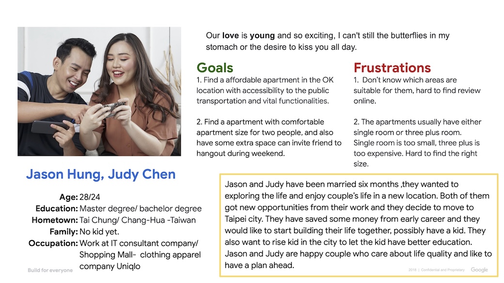
User roup: Young couple
-
- Wanted to live close to metro in a convenient location with accessible stores, good vital functions but also affordable price.
- Tend to be new residents in the areas, have just got new job need to move to Taipei.
- Comfortable apartment size for two people, and also have some extra space can invite friend to hangout during weekend.
- Possibly need one extra room for other needs(Home office or perhaps for kid)
- At least 1 Parking space has be include in the deal.
- Looking for the apartment included the essential kitchen appliances.
User Story
As a/an Young couple who just got married
I want to Find an apartment is affordable and in a convenient location at Taipei
so that,
We can enjoy our young couple life and perhaps have kid in few years
Problem statement
Jason and Judy are is a/an Young couple who just got married six month ago
who needs a better housing website that provide better selection and review or community forum
because
they want to find apartment that locate in convenient area with good vital functions & affordable price
Goal Statement
Our RaKuya property website will let users
easy to navigatie to find the property match their need And explore the area, discover experience
which will affect
The user to reduce the frustration and stress before making big decision together with their partner
by Having a easy understand filters , provide review by other users in the area ,add discover experience
We will measure effectiveness by
tracking contact forms’ conversion rate and navigating filter time
Design Process
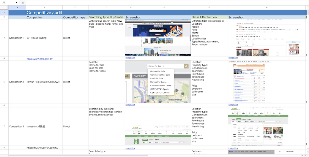
A.Competitive Audit Comparison
Click this link to view the spreadsheet.
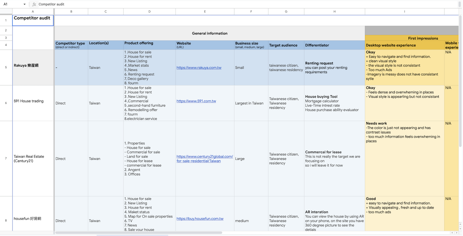
B. Competitor Audit information
Click this link to view the spreadsheet.
User Research
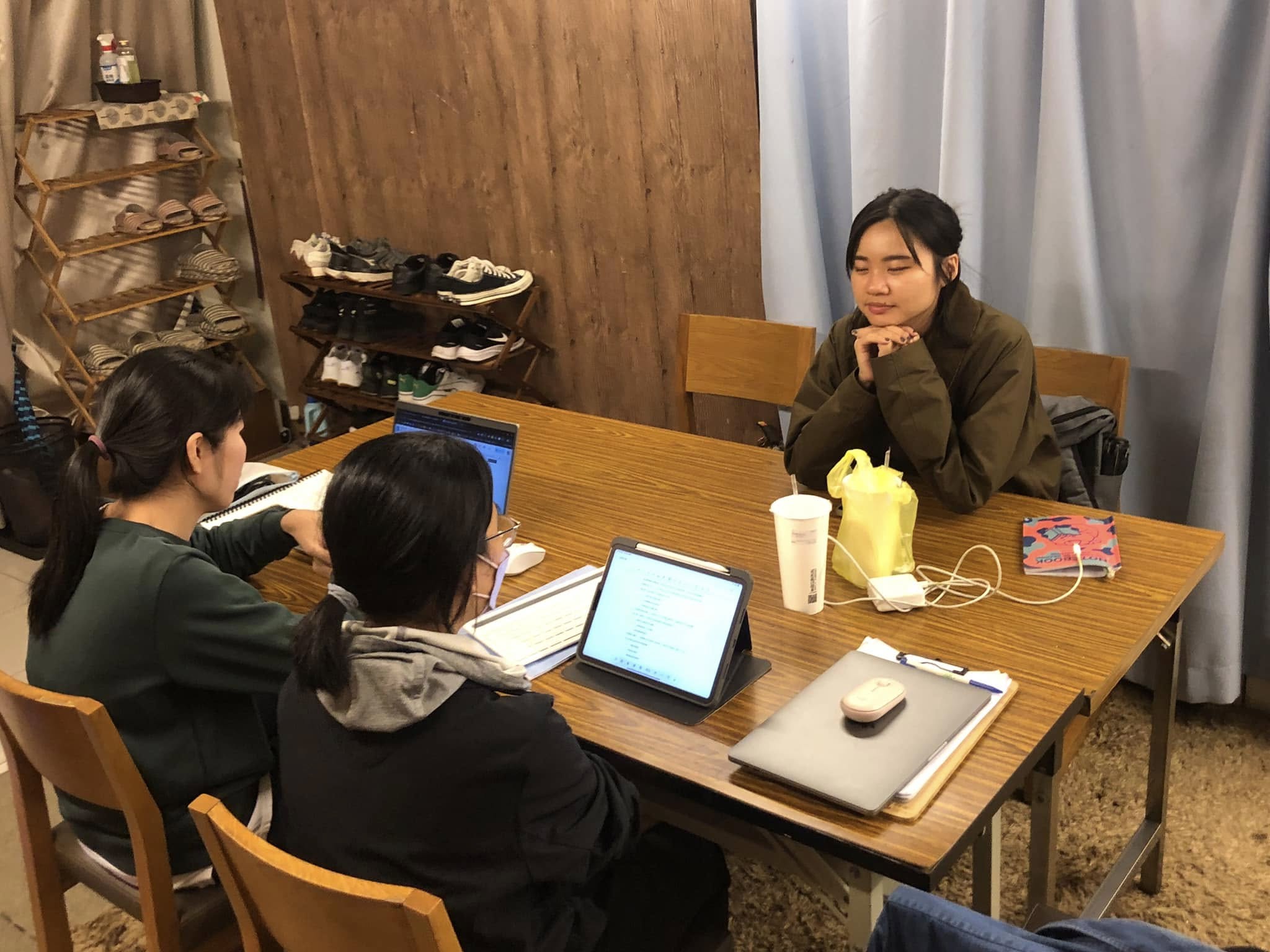
I conducted user interviews and competitive analysis across major Taiwanese rental platforms (591, HouseFun, U-Life, etc.).
Key Insights
-
Lack of trustworthy listings: Many apartments were already rented or duplicated.
-
Limited size options: Most listings were either too small (studio) or too large (3+ rooms).
-
No clear neighborhood guidance: Users had trouble choosing areas based on lifestyle and accessibility.
-
Missing emotional support: Couples often felt overwhelmed during this first big decision together.

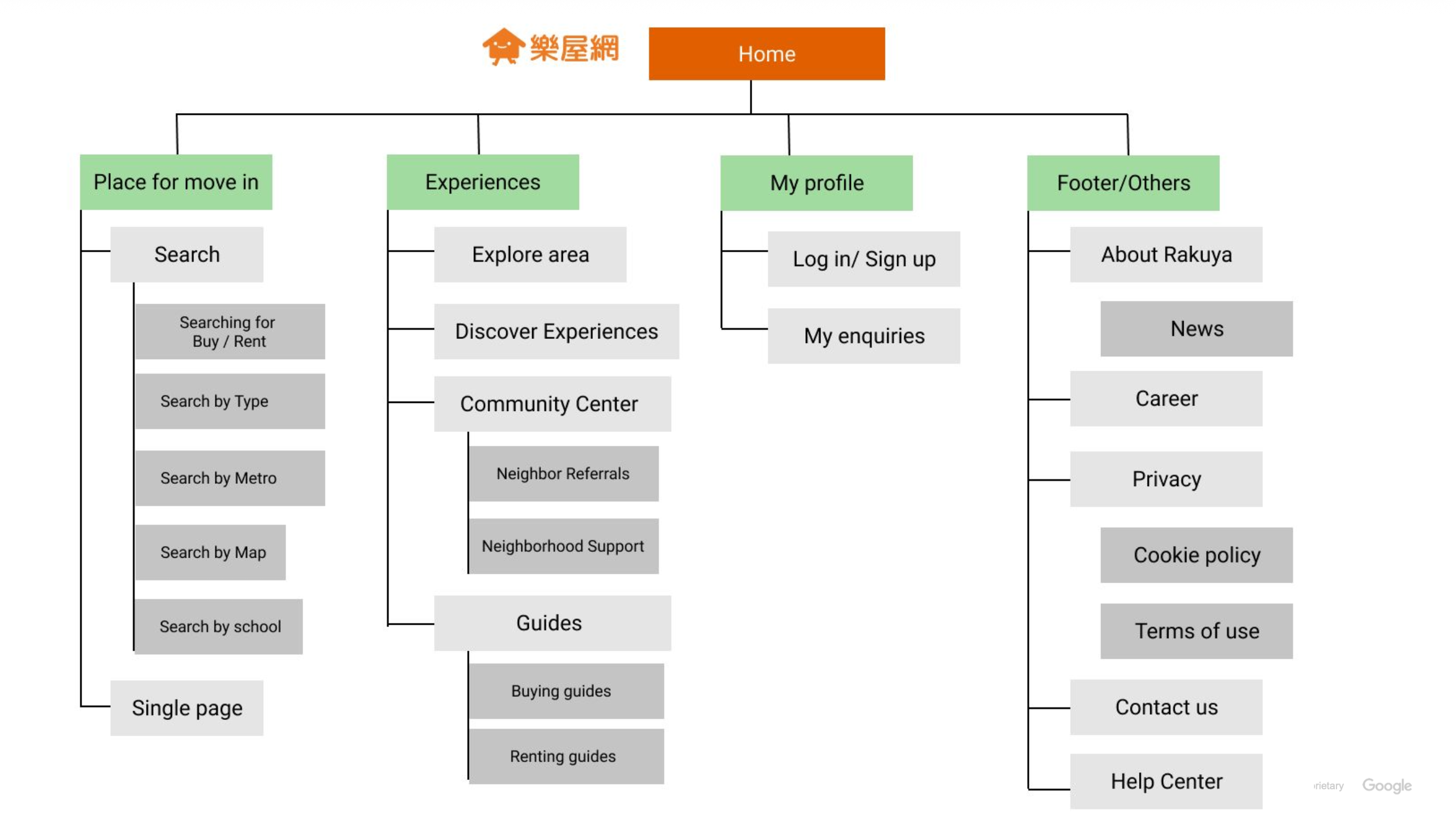
Site sturture planning
Sketches
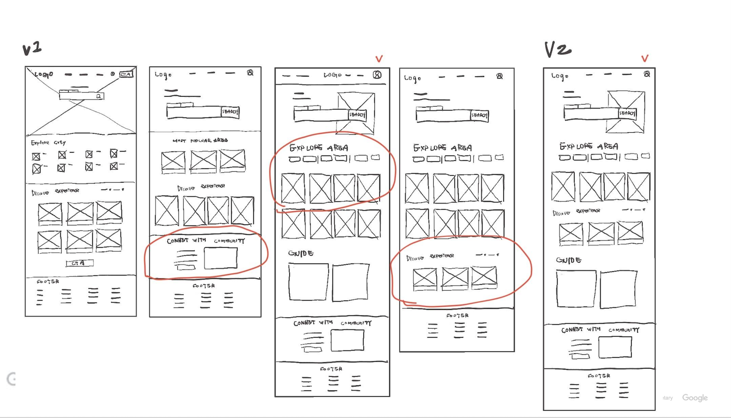
Wireframes
Focused on:
-
Clear visual hierarchy for search and results.
-
Simplified filters for budget, location, and apartment type.
-
Review section showing real user feedback about neighborhoods.
High-fidelity Prototype
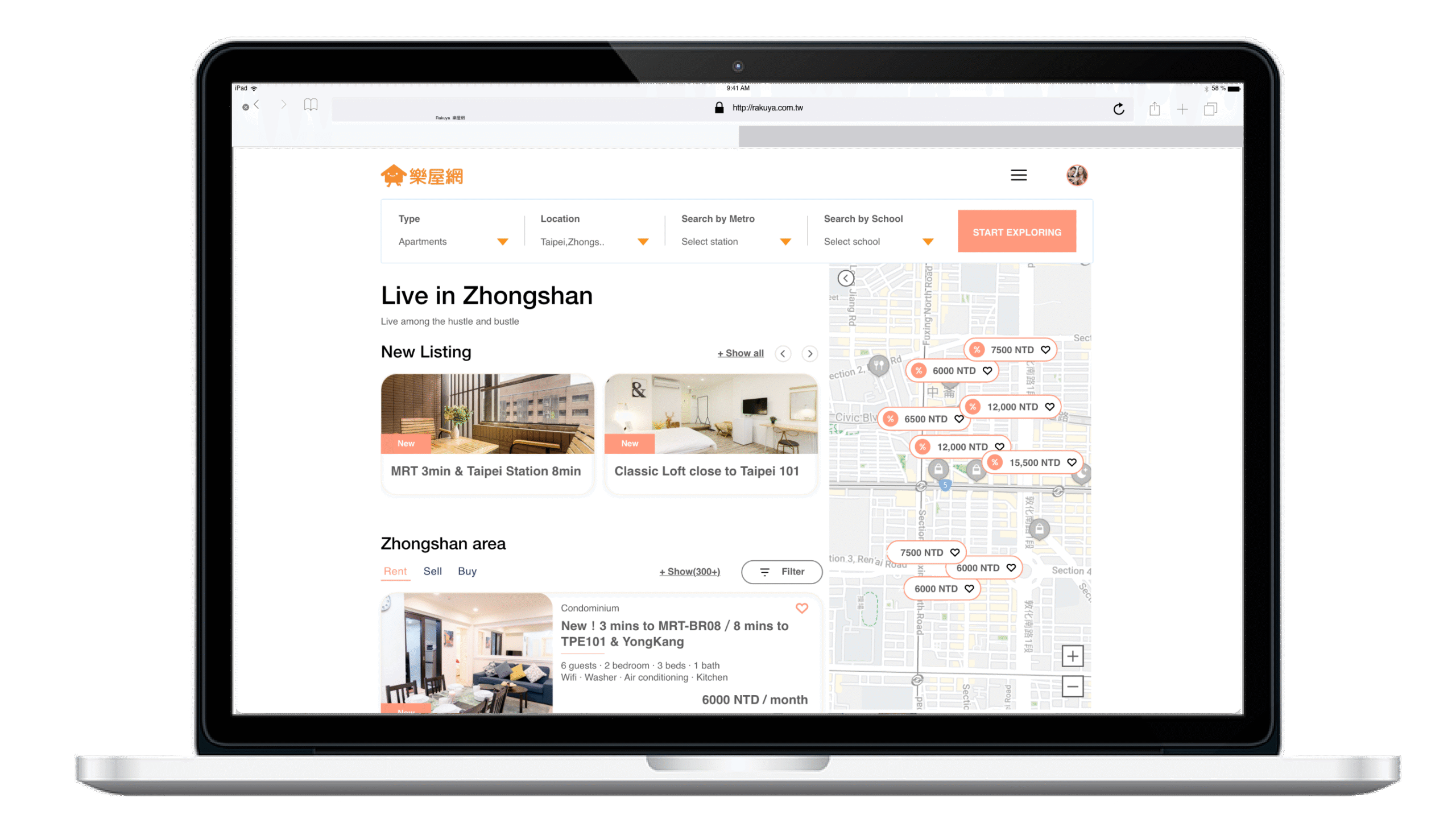
The desktop design highlights clean navigation, map integration, and easy comparison views.
Documentation & Learning
To wrap up, I documented the result and handed in to goolge.
Key Design Decisions
-
Community reviews to bring authentic insight into each neighborhood.
-
Discover mode to let users explore nearby services and transportation visually.
-
Consistent card layout for quick scanning and comparing apartments.
-
Contact tracking so users can manage inquiries efficiently.
Before-home page
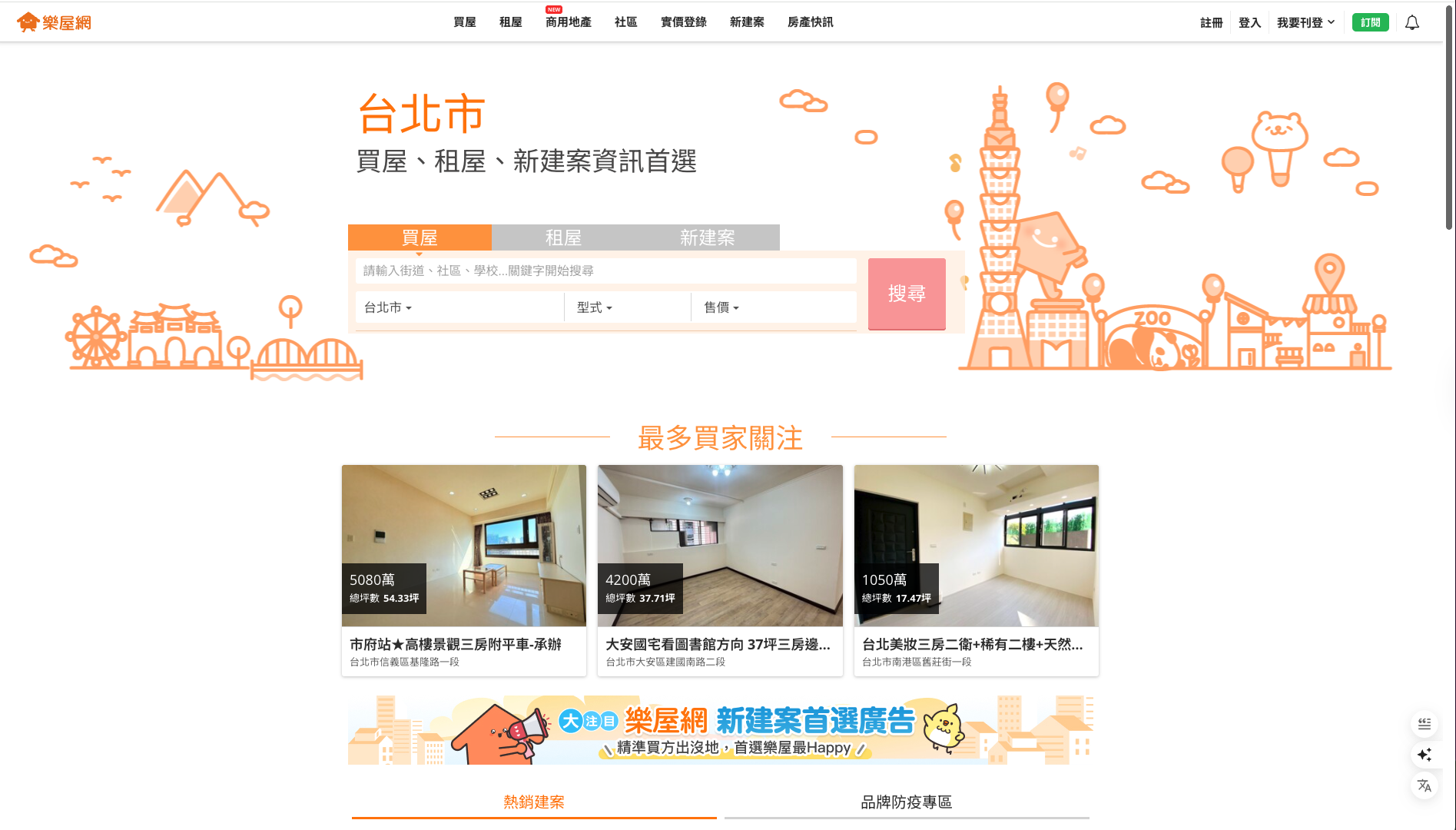
樂屋網 Rakuya https://www.rakuya.com.tw/
Cluttered layout and weak hierarchy made it hard for users to focus on the main task — searching for homes. The page felt dense, transactional, and lacked emotional appeal or breathing space.
After
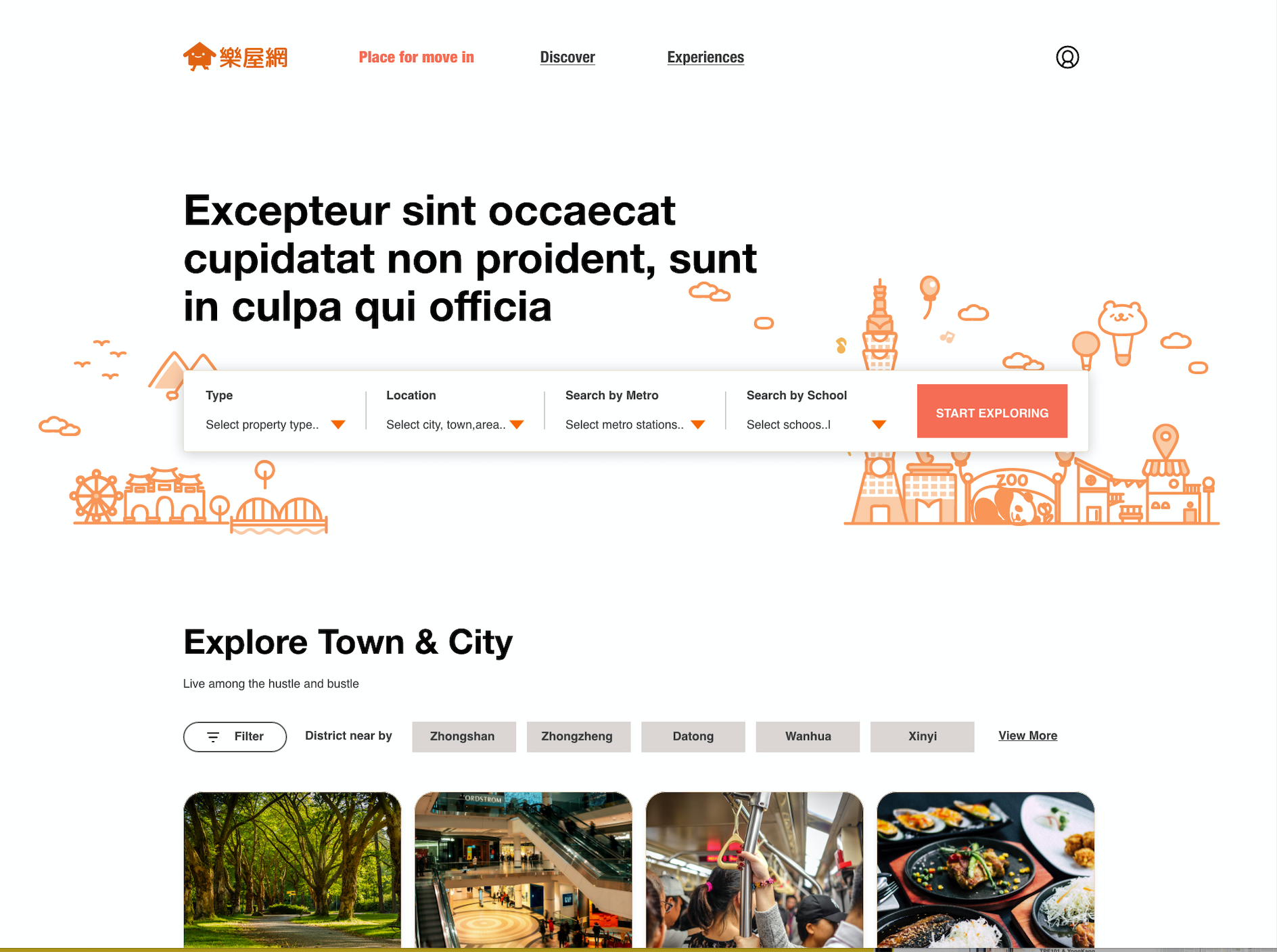
The redesign centers the search bar as the main action, adds clear hierarchy and whitespace, and introduces lifestyle content like “Explore Town & City.” It feels cleaner, warmer, and more trustworthy — turning the site from a listing database into a discovery experience.
Before- Search result/List items

Overly promotional layout focused on rankings rather than helping users browse available homes. Listings lacked context and visual connection to location.
After
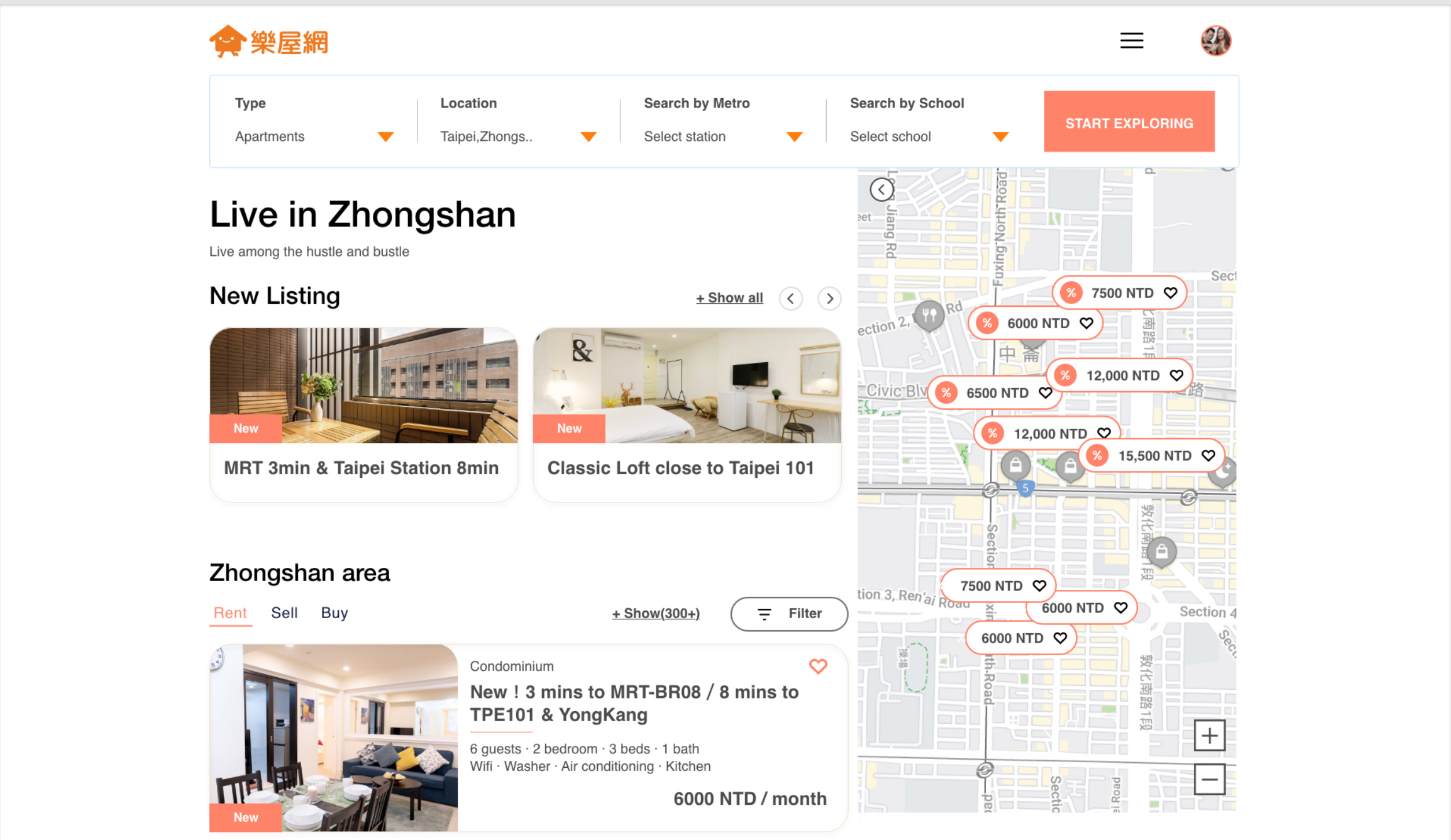
Streamlined results with integrated map view, clear filtering, and richer property cards. Users can now explore listings visually and spatially, improving decision speed and confidence.
Before- Single page
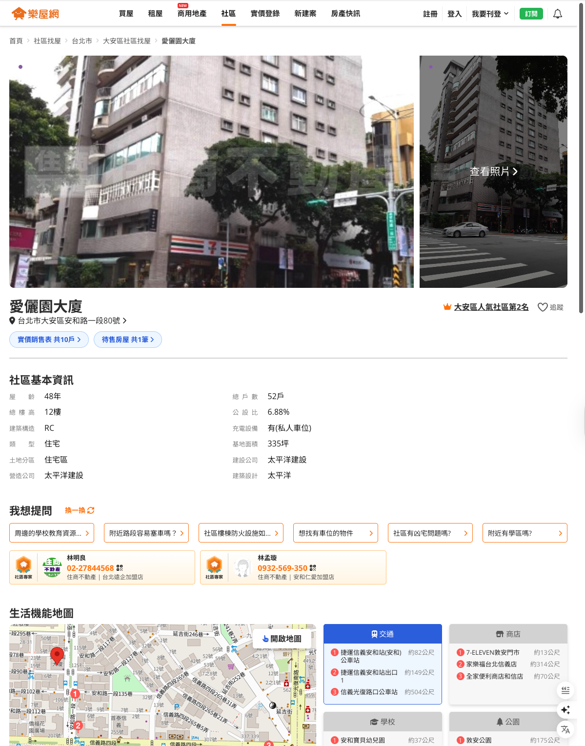
Information was scattered and text-heavy, forcing users to scroll to piece together key details. The agent’s contact info and price lacked hierarchy, making the page feel transactional.
After
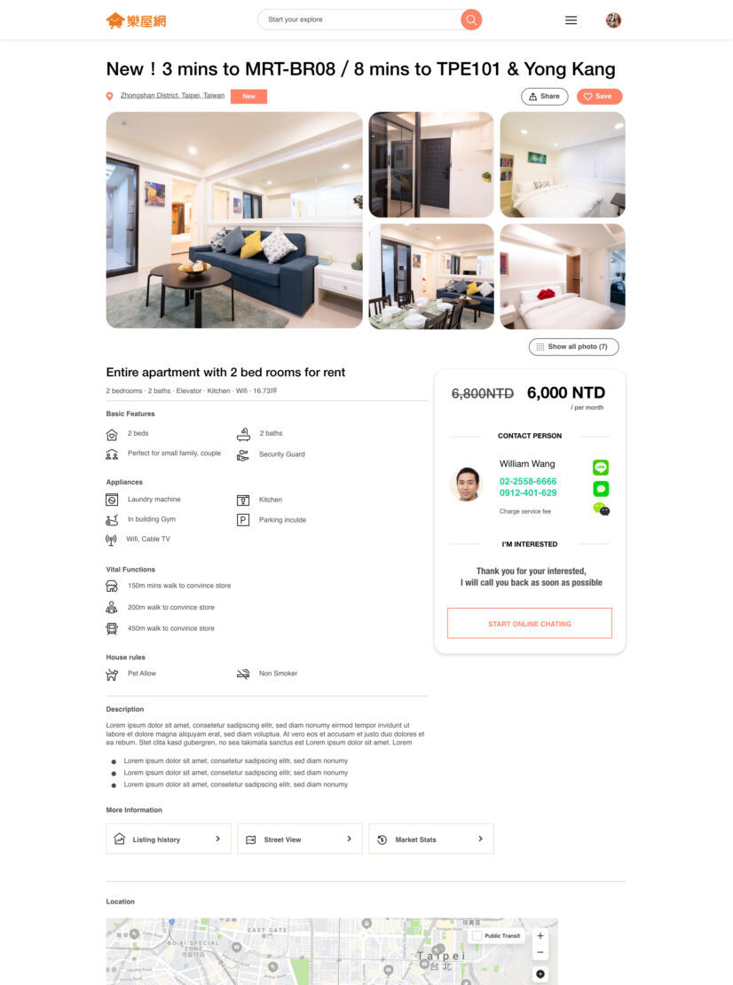
Redesigned layout brings clarity — photos, price, and contact details are grouped visually. Feature icons, clean typography, and structured sections make it easy to scan and act, creating a modern, trustworthy experience.
Reflection
This project showed me that designing for trust and emotional comfort is just as important as functional usability.For people making life-changing decisions like renting a home, the interface must communicate reliability and warmth. Designing RaKuya helped me explore how filters, transparency, and discovery can turn a stressful experience into an empowering one.

Object-Oriented UX (OOUX) for digital twins: insights to support scalable 3D view

Making 3D usable: OOUX finding from isolate & highlight features

Designing SaaS for digital twin: how discovery shaped the solution
(47) 41 33 16 51
Reach Me By Phone
Email Me
Rølivegen 367, Steinkjer, 7718, Trøndelag
📍 Based in Norway