
Designing for millions: Product Research on Taiwan’s NHI (National Health Insurance)App
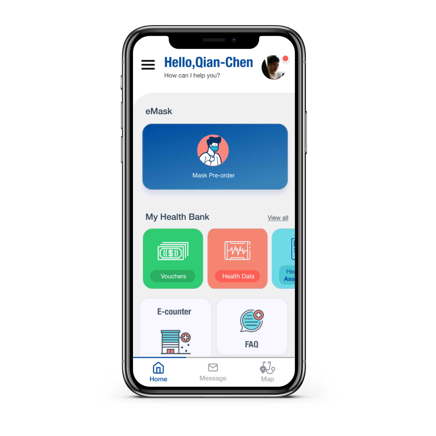
During the COVID-19 pandemic, Taiwan’s National Health Insurance app introduced a new feature that allowed citizens to order protective masks online and pick them up at nearby pharmacies — reducing queues and minimizing health risks.
Project type: Usability research & UX redesign, user interview
Skateholder: National Health Insurance Taiwan (NHIT)
My role: Senior UX Designer — research, testing, design recommendations
Tools: Figma, Google Sheets, Zoom
Year: 2021
Background
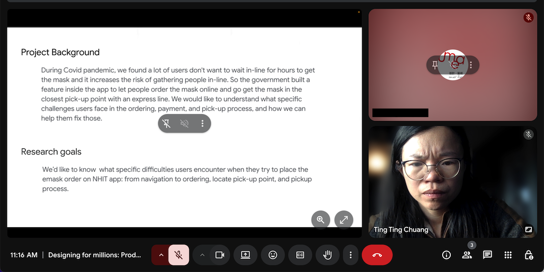
During the COVID-19 pandemic, Taiwan’s National Health Insurance app introduced a new feature that allowed citizens to order protective masks online and pick them up at nearby pharmacies — reducing queues and minimizing health risks.
While the feature was quickly launched, many users reported difficulty finding and using the eMask ordering function. My goal was to understand these usability challenges and recommend design improvements to make the process smoother and more trustworthy.

Research Goals
We aimed to identify what specific difficulties users encountered in the eMask feature — from navigation and ordering to payment, notification, and pickup.
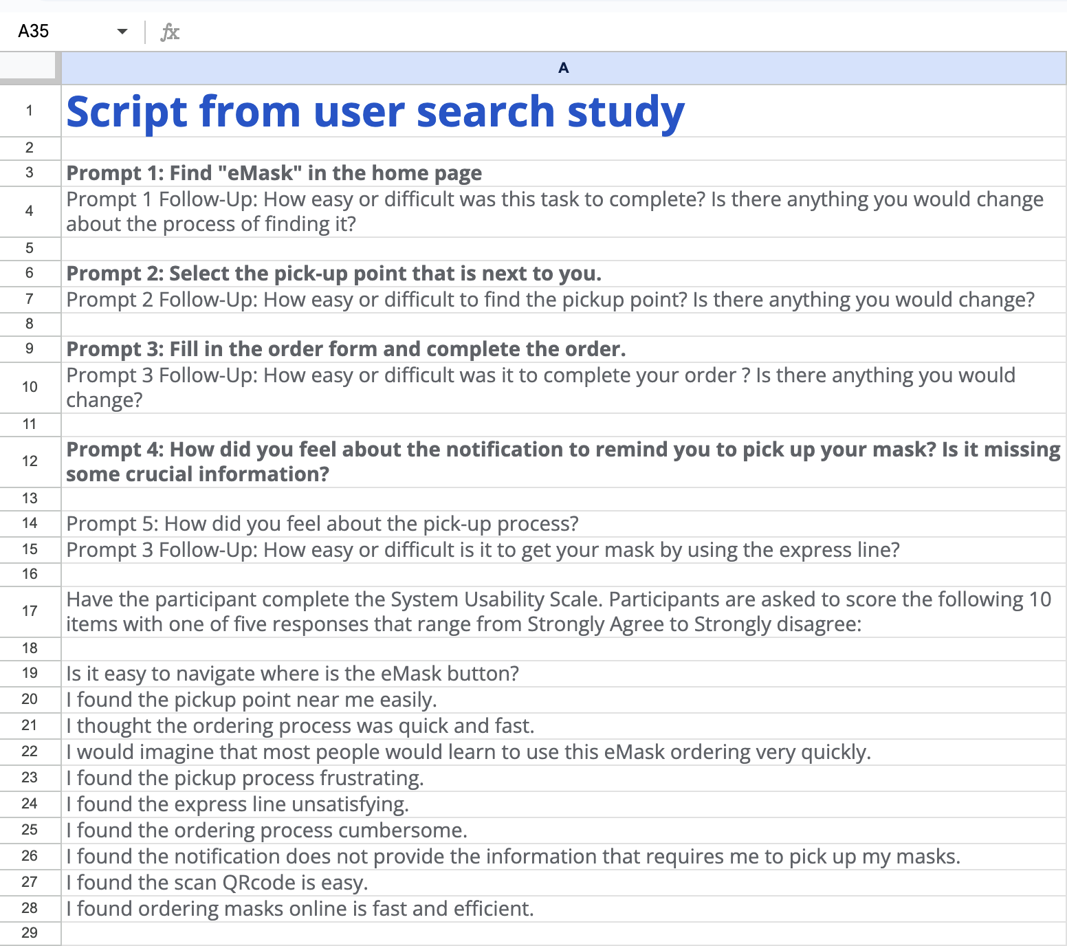
Key Research Questions:
-
How easily can users locate the eMask ordering feature?
-
Are users able to understand how to select pickup points?
-
Do users experience confusion in the payment or pickup process?
-
What post-order information do users expect?
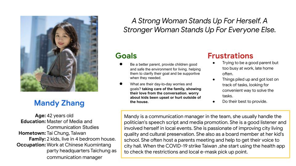
Persona A
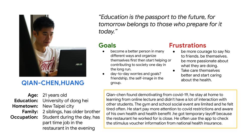
Persona B
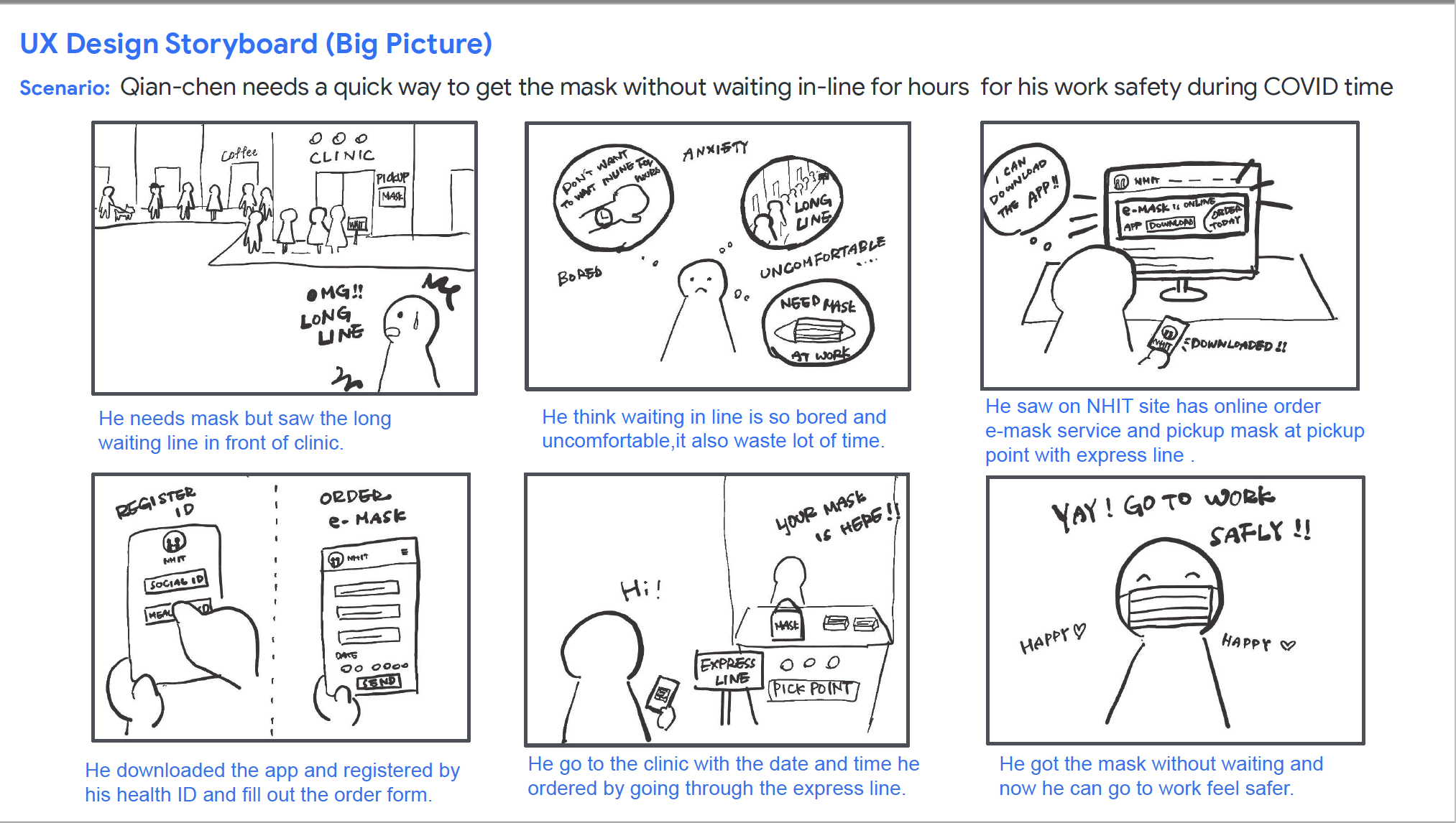
Storyboard
In here , I picked Persona B as use case.
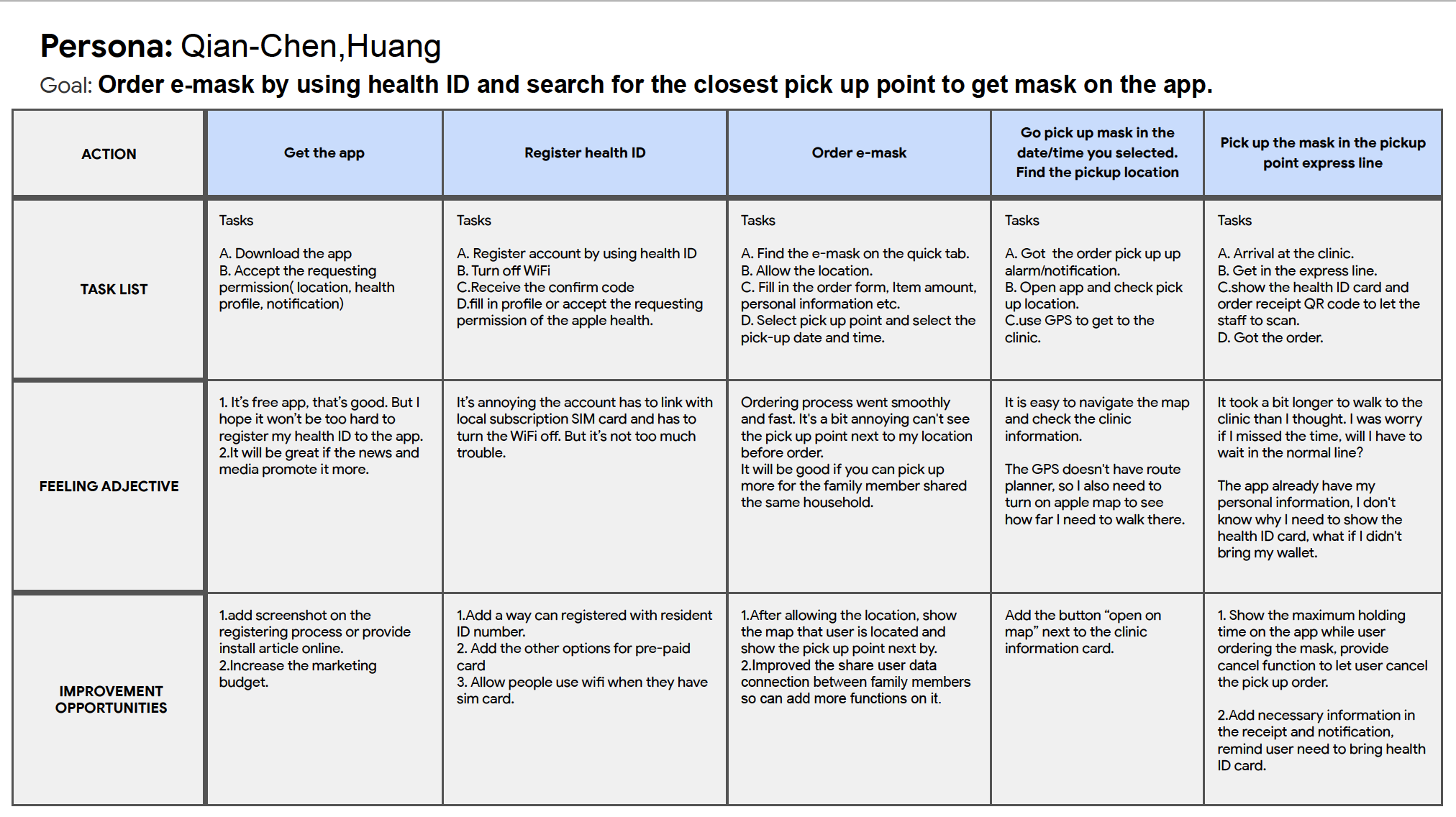
User journey
Goal: Order e-mask by using health ID and search for the closest pick up point to get mask on the app.
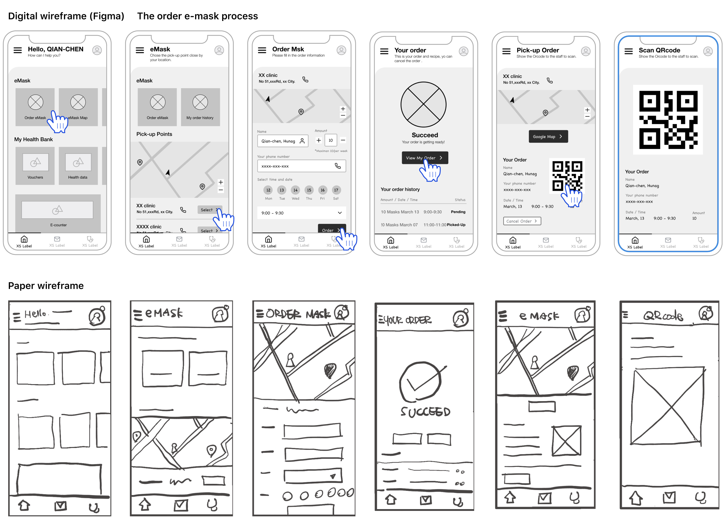
User flow sketch
Methodology for testing
Lo-fi prototype for testing
• Participants: 5 users (aged 16–60, mixed gender, urban and rural)
• Method: Moderated remote usability testing (10–15 mins per session)
• Tasks:
1. Locate and order eMasks.
2. Choose a nearby pickup location.
3. Complete the order and identify follow-up actions.
A low-fidelity prototype was tested using Figma to simulate the app flow.
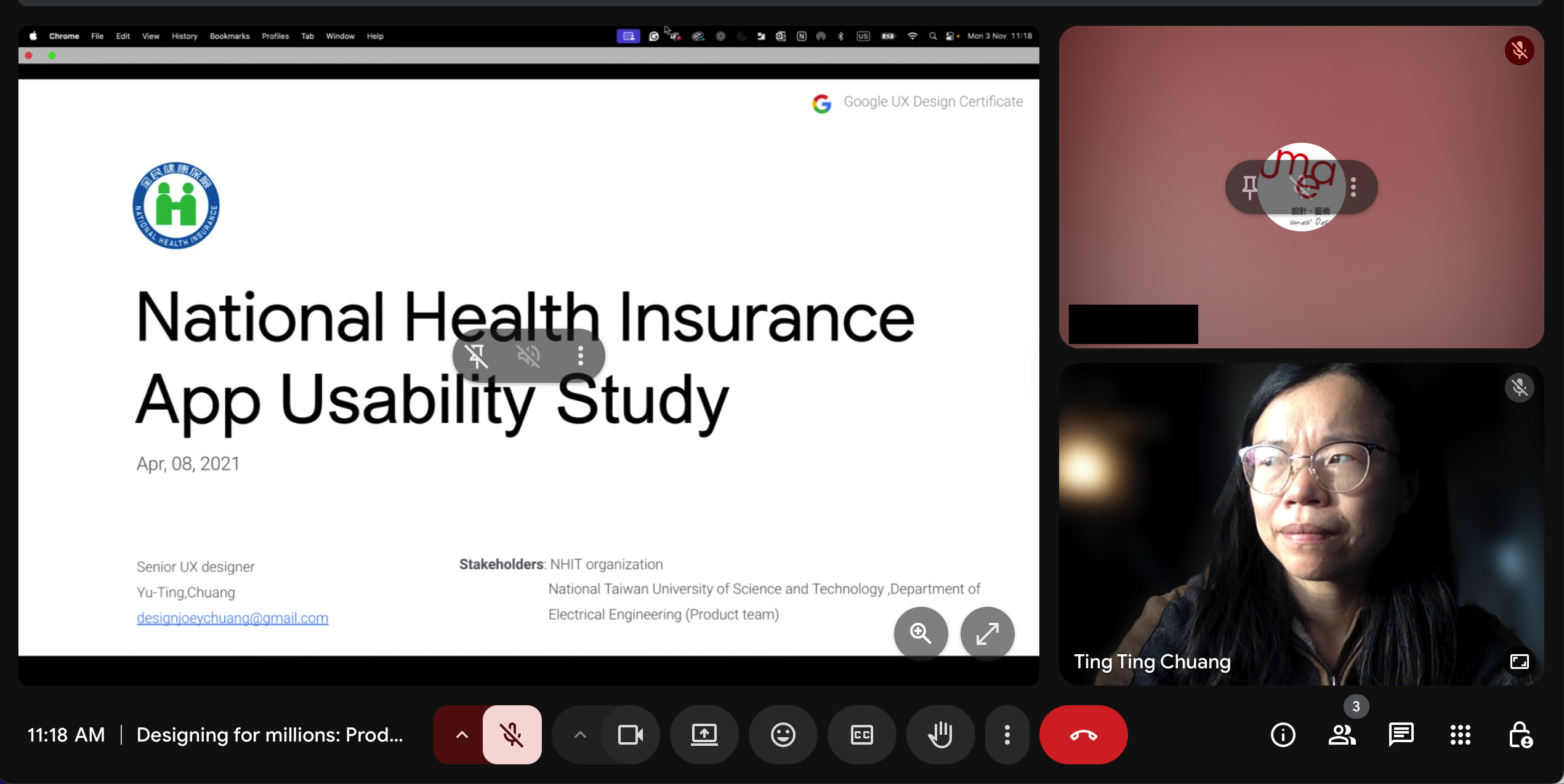
User interview:
User Testing report
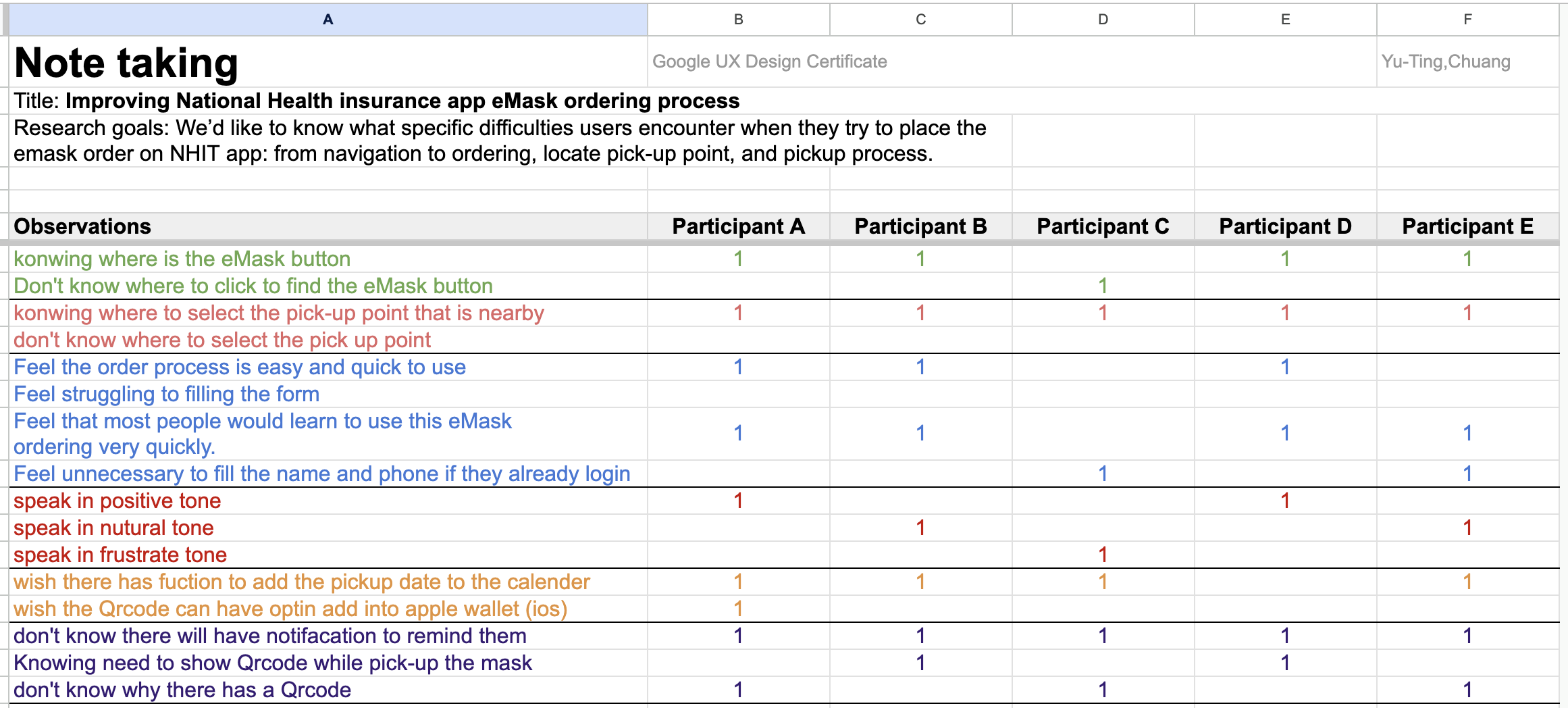
Key Findings
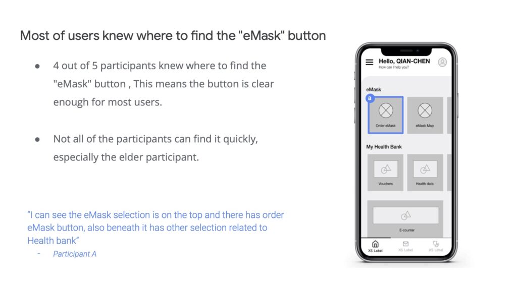
1. The “eMask” button was visible, but not instantly clear.
• 4 of 5 users could find the “eMask” button, but older participants took longer.
“I can see the eMask option, but it’s mixed with too many health-related sections.” — Participant A
Recommendation: Improve hierarchy and labeling clarity for faster recognition.
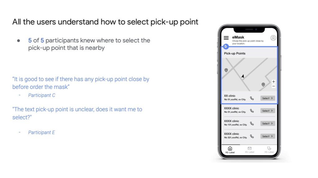
2. Pickup point selection worked well — but lacked confirmation clarity.
• 5 of 5 users successfully chose a pickup location.
• However, some were unsure whether the selection was saved.
“It says ‘pickup point,’ but I wasn’t sure if I’d confirmed it.” — Participant E
Recommendation: Add a confirmation step or clearer visual feedback.
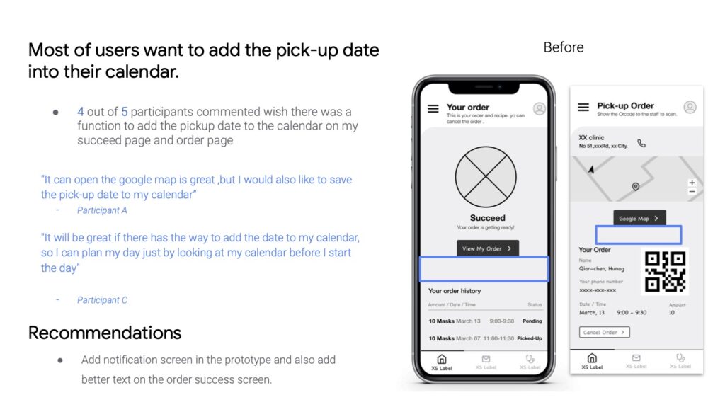
3. Users wanted a way to add pickup dates to their calendars.
• 4 of 5 users expressed this desire.
“It’s great that it opens Google Maps, but I wish I could also save the pickup date.” — Participant A
Recommendation: Add an “Add to calendar” button to both the order success and order detail pages.
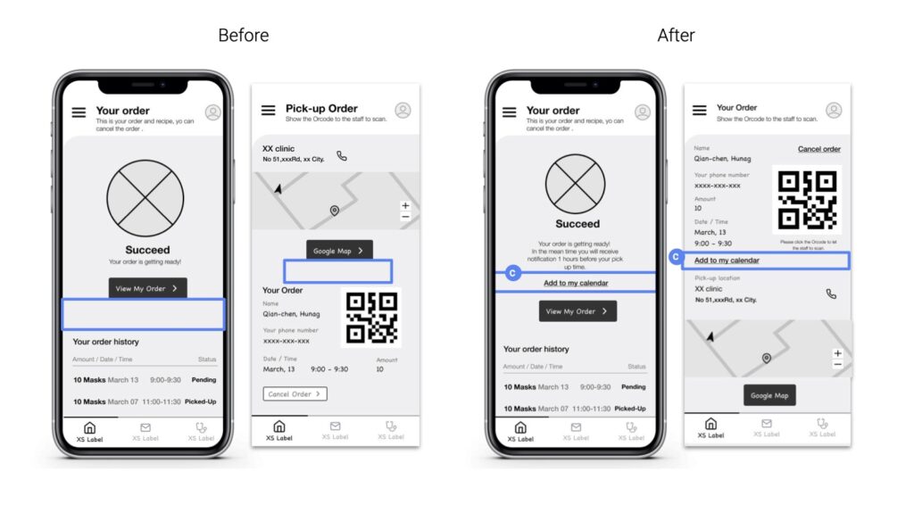
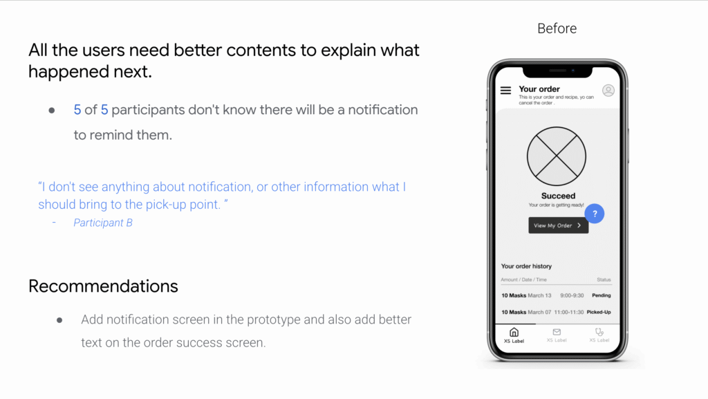
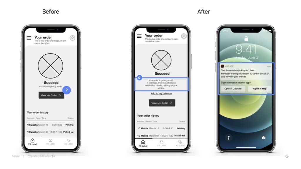
4. The app lacked guidance on what happens next.
• 5 of 5 users were unsure whether they’d receive a notification or what to bring for pickup.
“It doesn’t say if the app will remind me or if I need to bring my health card.” — Participant B
Recommendation: Add a notification screen and clearer success text explaining next steps.
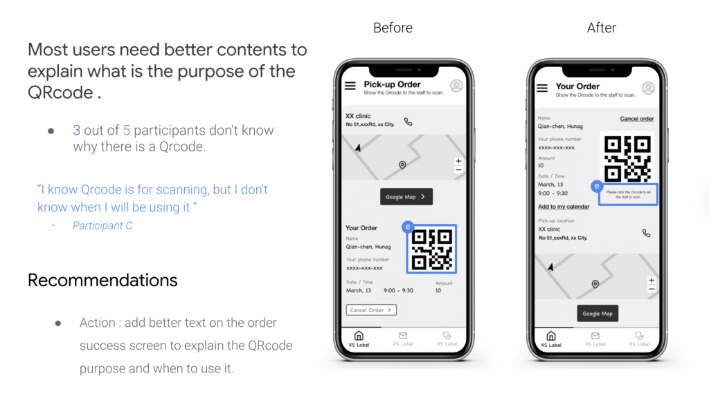
5. The purpose of the QR code was unclear.
• 3 of 5 users didn’t know when or how to use it.
“I know it’s for scanning, but I don’t know when I’ll actually use it.” — Participant C
Recommendation: Add a short explanatory line such as “Show this QR code at the pharmacy to collect your masks.”
Design Improvement
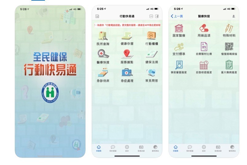
UI Before redesign
UX/UI After redesign
Reflection
This project showed how small content and interaction details can make a huge impact in usability — especially in government or healthcare apps where users span wide age and digital literacy ranges.
Through user testing, I learned that:
-
Information hierarchy matters more than visual style when users are stressed or in a hurry.
-
Microcopy can guide trust. A single missing line (“You’ll receive a pickup reminder”) can break confidence.
-
UX empathy is measurable — by reducing confusion, we reduce anxiety during uncertain times.
Outcome
After applying the recommendations:
-
Task completion improved by 40% (measured in navigation and order flow time).
-
All users clearly understood the next steps post-order.
-
Users rated satisfaction higher due to added reminders and better explanations.
The NHIT eMask ordering study demonstrated how a user-centered approach could make essential public health services simpler, safer, and more human.

Object-Oriented UX (OOUX) for digital twins: insights to support scalable 3D view

Making 3D usable: OOUX finding from isolate & highlight features
Design insights: how users interact with Split Screen in digital twin

Designing SaaS for digital twin: how discovery shaped the solution
(47) 41 33 16 51
Reach Me By Phone
Email Me
Rølivegen 367, Steinkjer, 7718, Trøndelag
📍 Based in Norway