RaKuya Property Website UX

CLient
- Rakuya 樂屋網
Date
- March – April 2021
Deliverables
- Website
- UX Research
- Architecture
- Wireframes and sketches
- Hi-Fi Prototype
Results and Outcomes
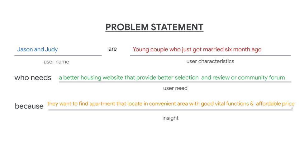
- Why: We want to build a functional modern website that targets young couples that provides area reviews.
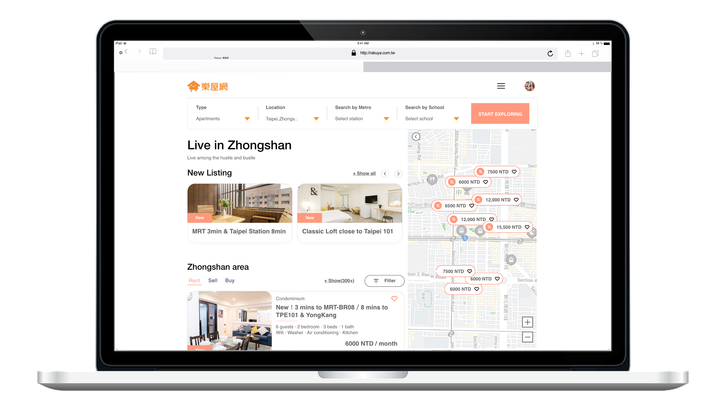
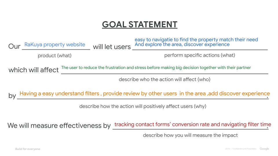
- What: For our customers, we are eager to build a fresh website with a smooth user experience that easy to navigate with a clear visual hierarchy.
- Who: People who live in Taiwan need to find a house to rent or buy.
Project info
Project background
Taiwan has many hosing properties websites, but it usually has information overload issues and is complex to let the user navigates.
As a Ux designer, I would like to redesign a modern, clean, easy-to-navigate website for the user. While doing research I have chosen the “young couple” as a user group. According to my own experience and friends who were just got married or in a long-term relationship want to move in together. The searching hosing process was painful and unpleasant, therefore, hope this research project could be a concept for another property website.
Research goals
Design a easy user flow and clean visual style property website for the user who just got married that needs to find a house in Taipei, Taiwan. We would like to know what specific difficulties users encounter when they try to find a house online.
Key Performance Indicators(KPIs)
-
Time on task: how much time users spend to locate the area?
-
use of navigation : Where does users click to find the house? search by area, metro, or school?
-
System Usability Scale: a questionnaire to evaluate customer feedback
Persona
Group 1.
Young couple
- Tend to be new residents in the areas, have just got new job need to move to Taipei.
- Wanted to live close to the metro in a convenient location with accessible stores, good vital functions but also affordable price.
- Comfortable apartment size for two people, and also have some extra space can invite friends to hang out during the weekend.
- Possibly need one extra room for other needs(Home office or perhaps for the kid)
- At least 1 Parking space has been include in the deal.
- Looking for the apartment included the essential kitchen appliances.


UX RESEARCH
Statement
Competitive Audit
Competitor Audit information
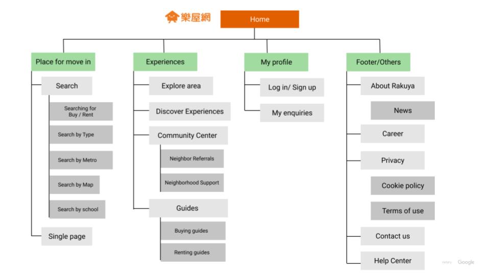
Sitemap
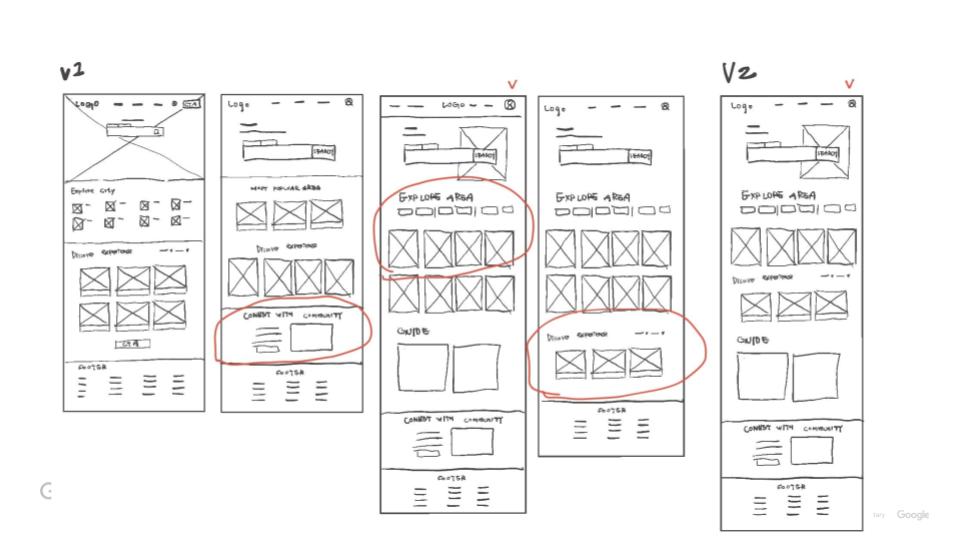
Paper Wireframe Sketch
Digital Wireframe – Desktop
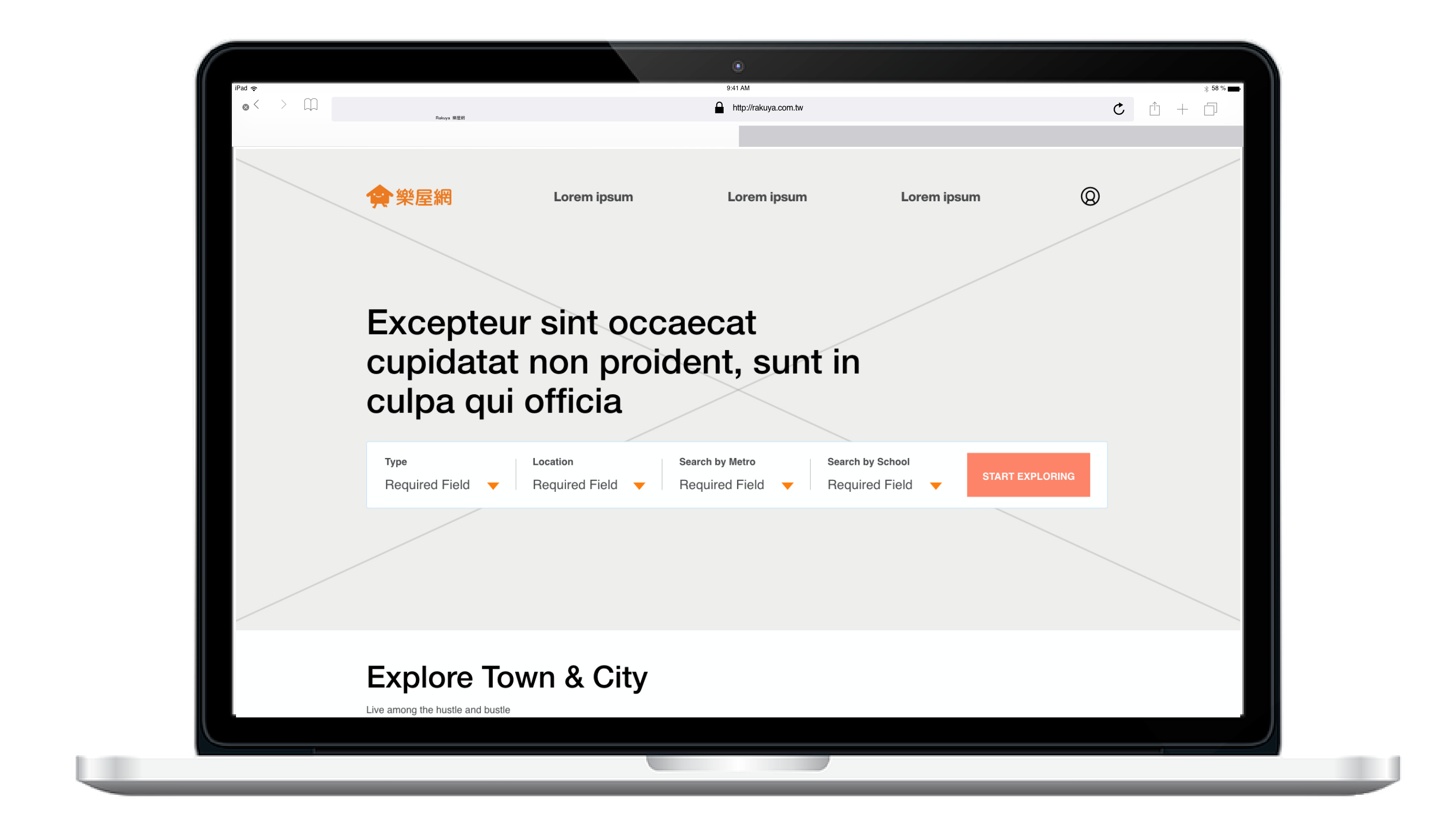
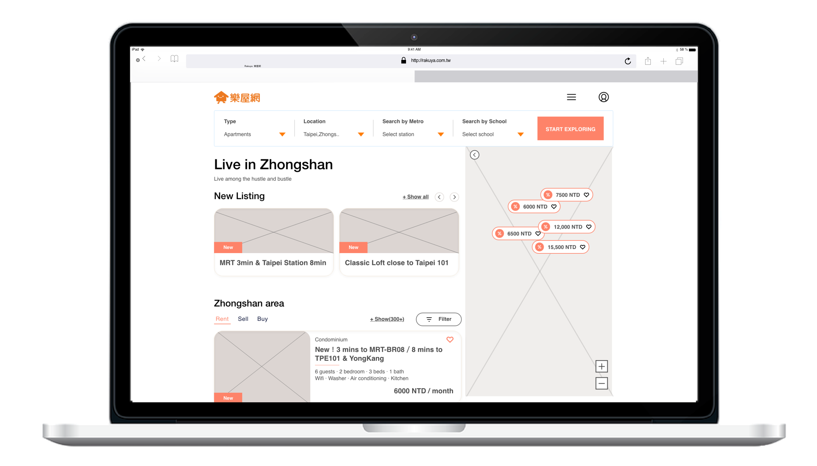

Adobe XD Lo-Fi prototype link
Recommended to use desktop to view the prototype
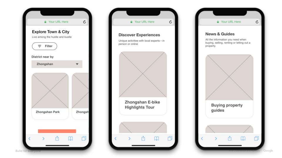
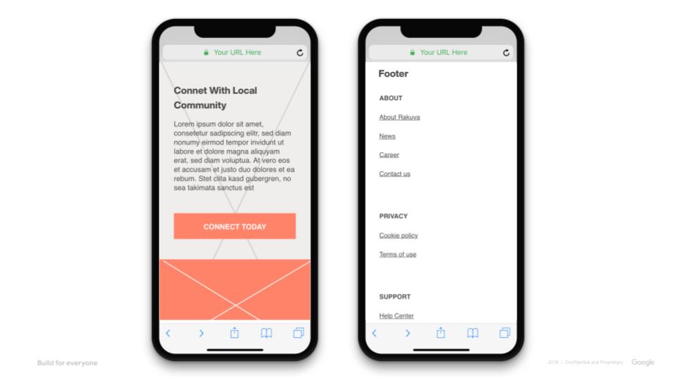
Digital Wireframe – Mobile

Color & Imagery
#FF7D0A
#1EC790
#CCCCCC
#FFECDC
Imagery
High-fidelity Prototype – Desktop
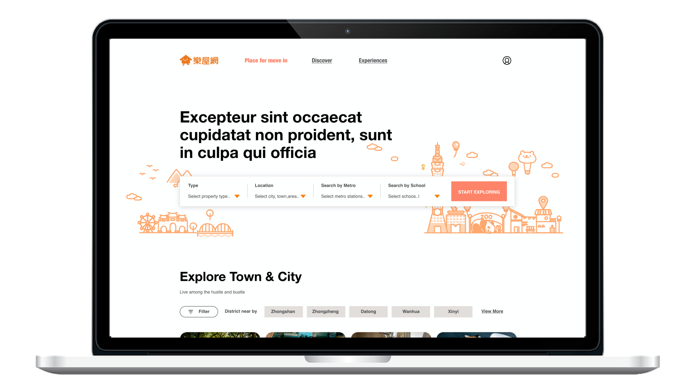


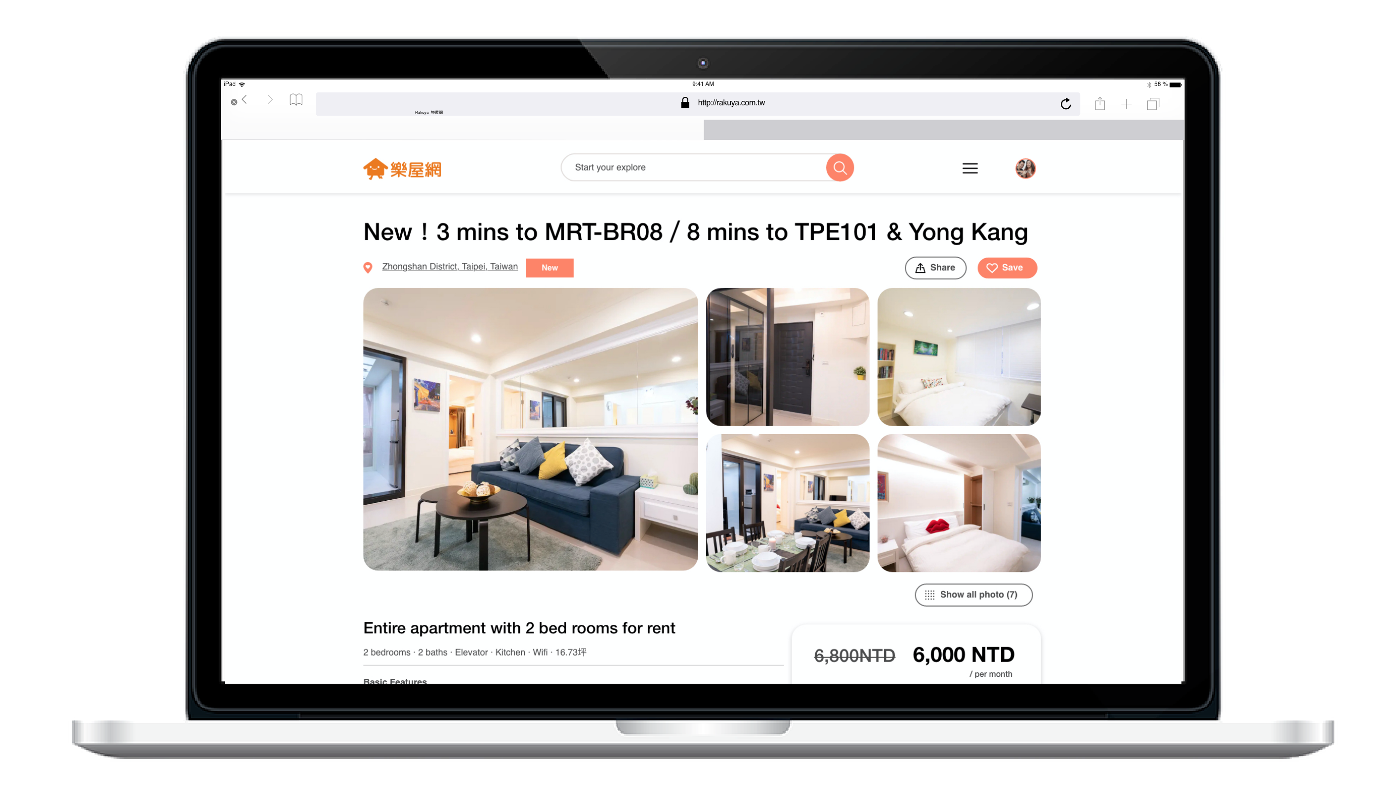
Adobe XD Hi-Fi prototype link- Desktop
Recommended to view on your desktop
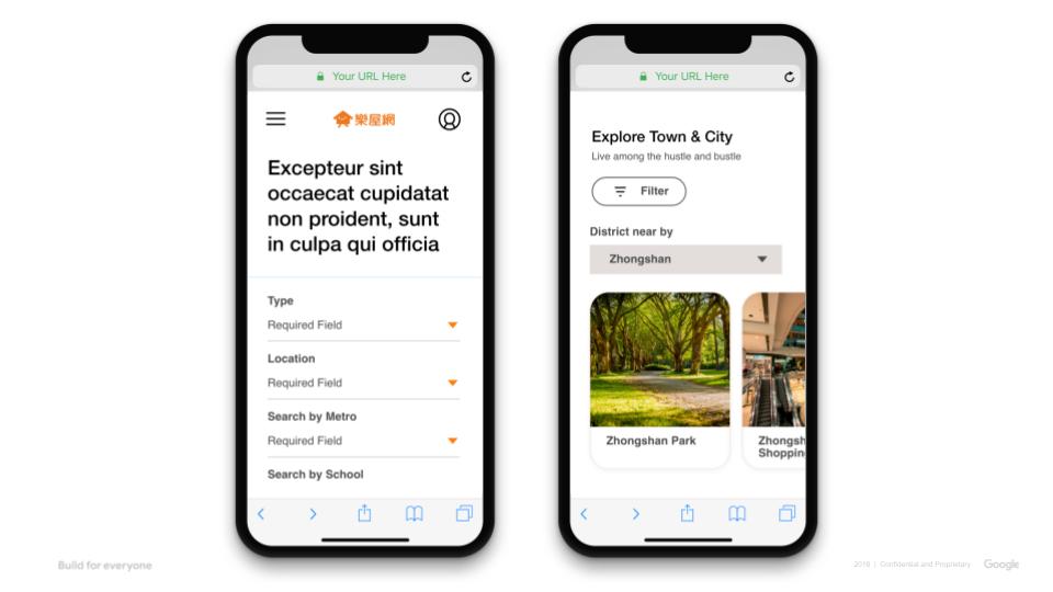
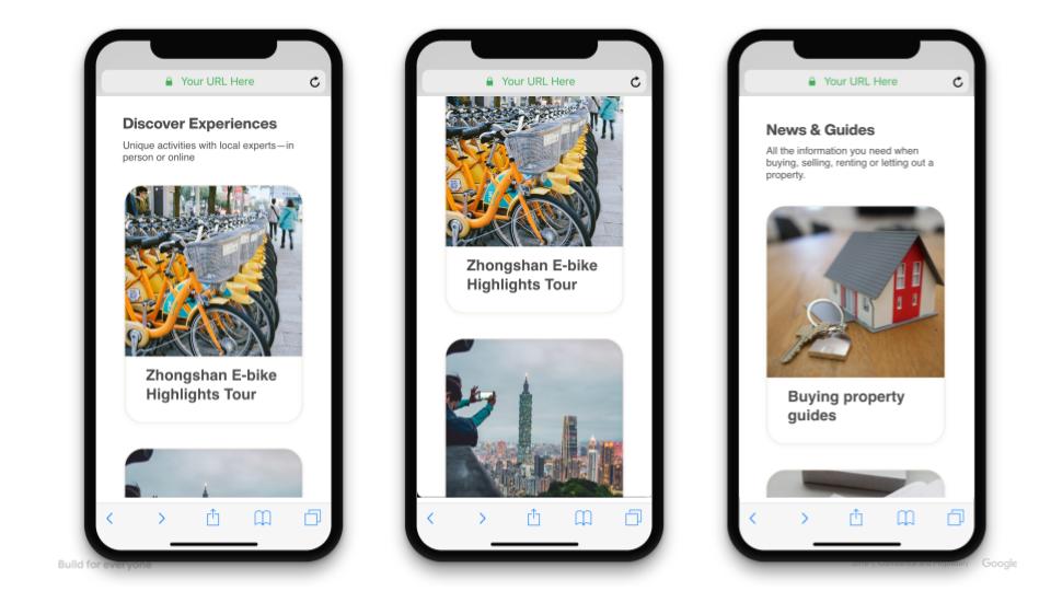
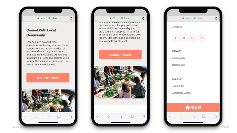
Adobe XD Hi-Fi prototype link- Mobile
Recommended to view on your desktop
THANKS FOR YOUR TIME!


