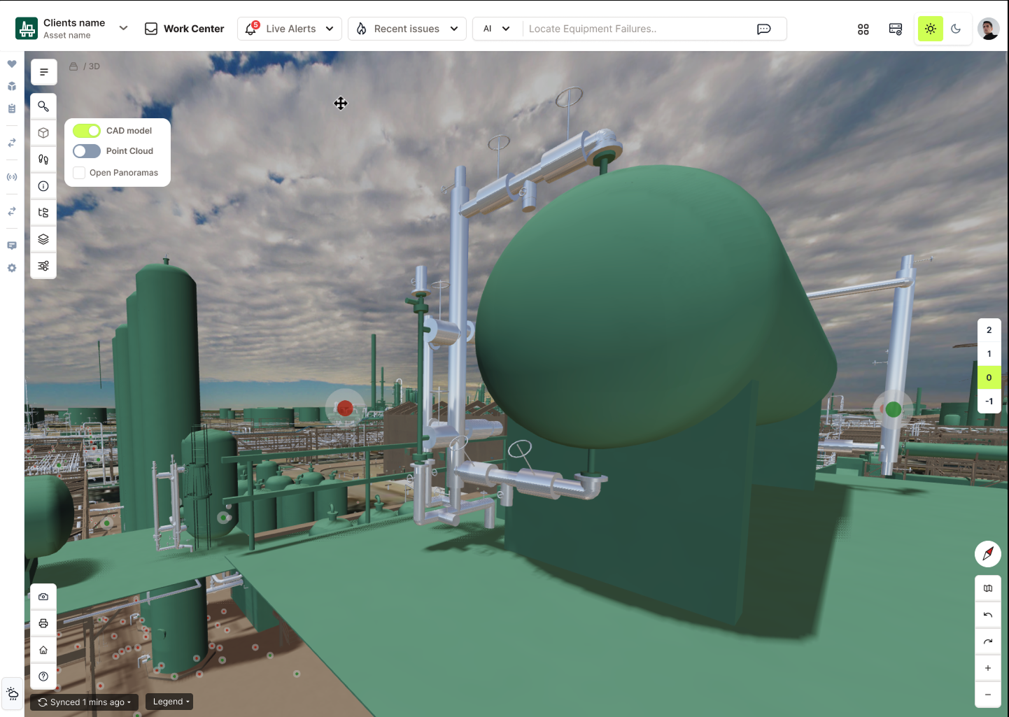
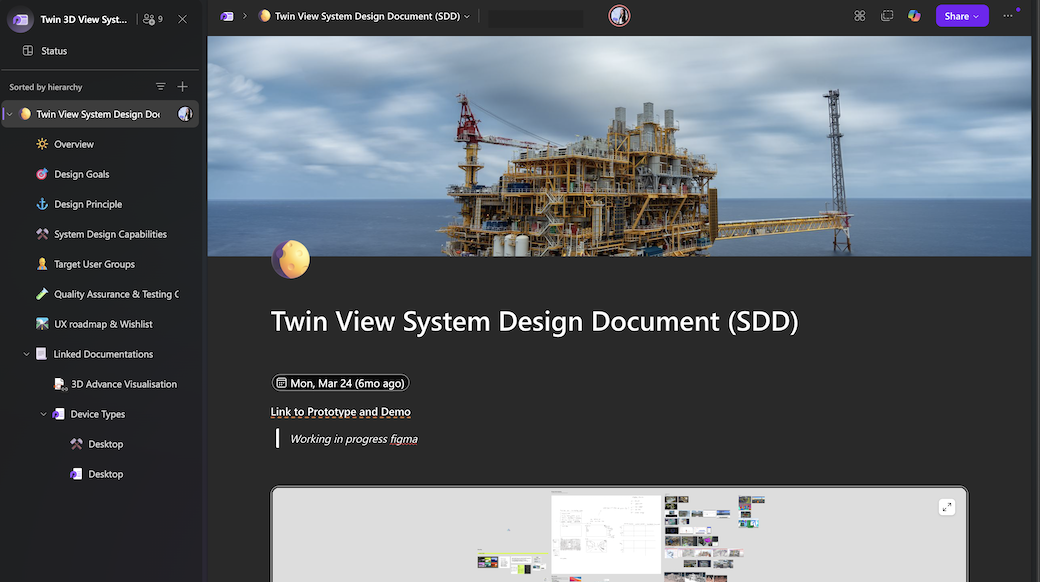
The Challenge
As our product expanded to support multiple 3D asset types and external data sources, the UI started breaking under its own complexity. Different teams used inconsistent naming, duplicated logic, and had no shared understanding of what a “twin object” actually was.
Before this initiative, teams had different interpretations of “the 3D View.”
-
To 3D developers, it was a rendering feature.
-
To designers, it was a visual workspace.
-
To leadership, it was a product differentiator.
These perspectives rarely met in the same place — resulting in disjointed priorities and unclear feasibility.My challenge was to translate complexity into shared clarity. To do this, I needed to bridge the gap between technical architecture and user experience without exposing sensitive client or system data.
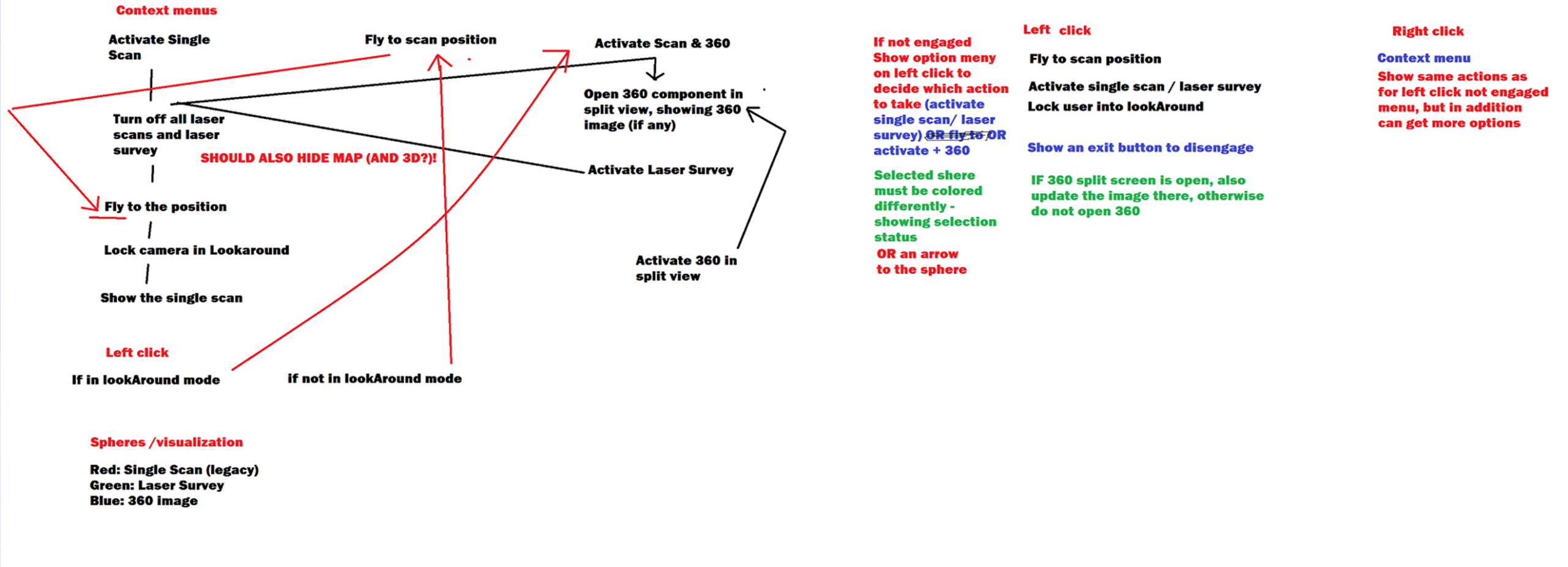
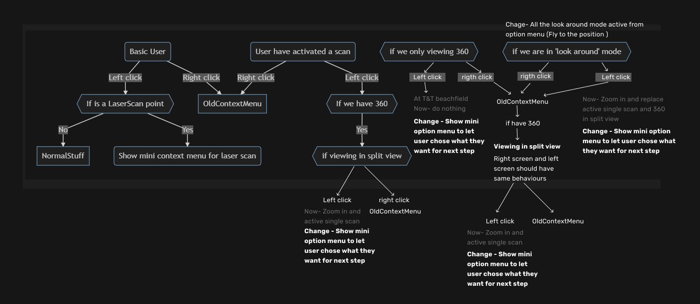
Below is a 360-degree image case; it’s just one of many inconsistent and confusing user experiences in Twin.
NB: Due to confidentiality agreements, certain visuals and data have been anonymized or recreated for demonstration purposes.
Before: Confusing mode activation
- In the 360 navigation mode, users struggled to understand which interaction mode they were currently in — fly, walk, or orbit.
- The system didn’t provide visual feedback or clear entry/exit cues.
- Switching between functions often caused disorientation and accidental view resets.
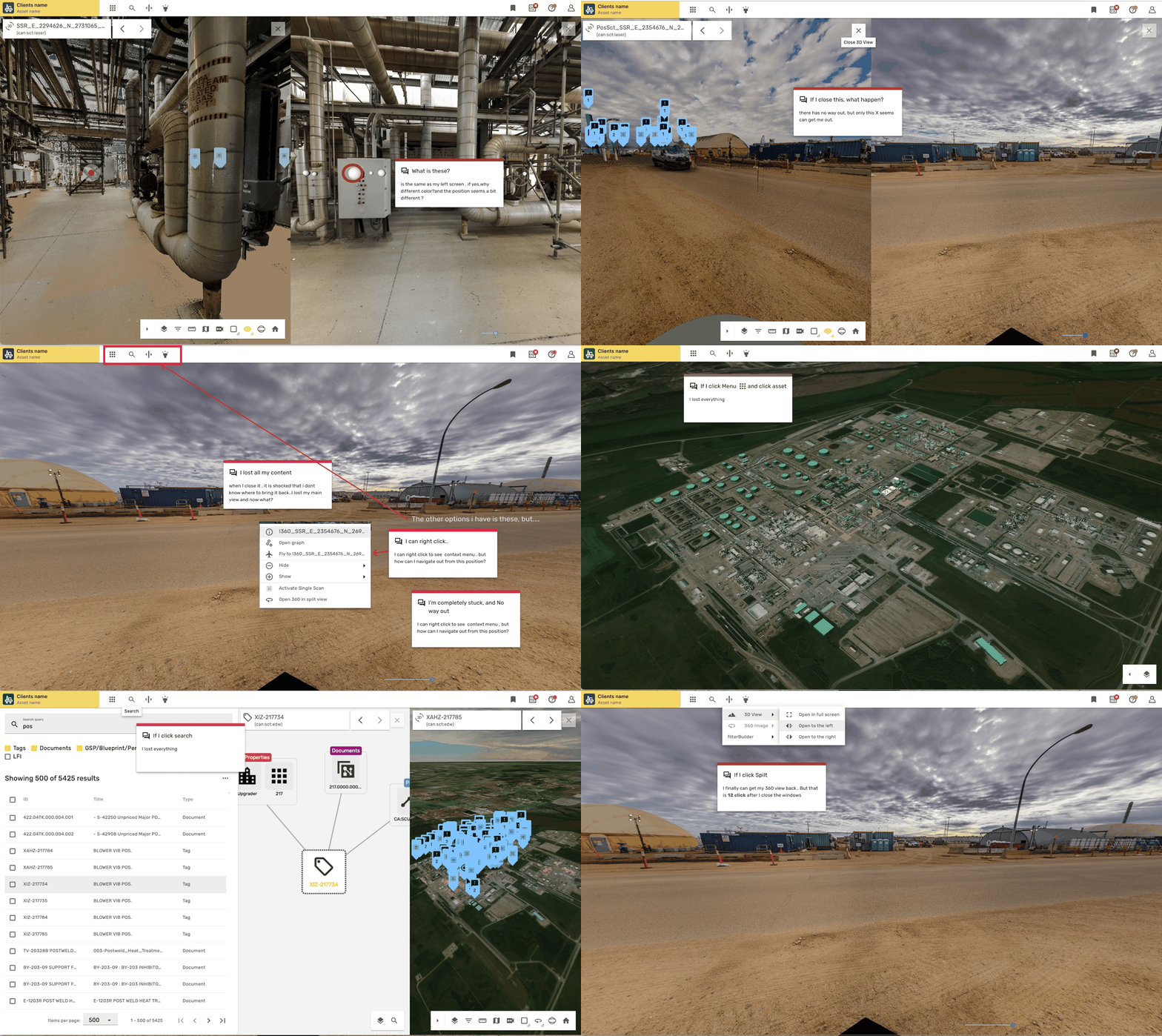
Messy , inconsistent interaction pattern
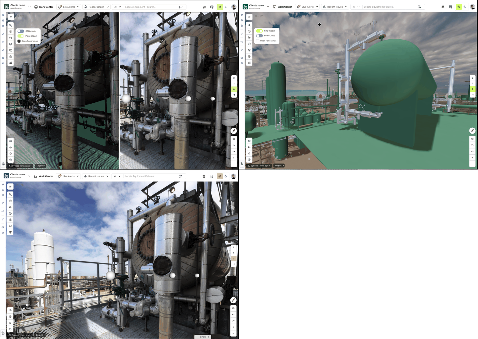
After: Contextual navigation toggle
- To reduce mode confusion, I proposed a contextual toggle system that adapts navigation behaviors based on user intent.
- Instead of hidden states, the new design lets users enter a preset environment (for example, inspection or explore mode).
- Each environment activates the most relevant navigation style automatically — flying, walking, or orbiting — while providing subtle visual feedback.
“We don’t need to teach users what mode they’re in — it just feels right.”
Unified the mental model.
The Goal
The project aimed to gain a deep understanding of how users interact with large-scale 3D environments within digital twins. My objective was to uncover hidden usability barriers, clarify visual and interaction patterns, and translate these insights into scalable UX recommendations for future twin products.
Acting as the bridge within the product trio (Design–Product–Tech), I aligned user insights with technical constraints and business outcomes — ensuring that design decisions not only improved navigation, interaction, and usability, but also empowered operations and maintenance teams to work with complex spatial data more efficiently and confidently.
My Role

Role:
3D Visualization UX Lead / Product Designer

Timeframe:
2024–2025 (foundation for UX/UI revamp)

Team:
- 3D engineers
- Product managers
- 3D Visualization developers
- Stakeholder

Scope:
- 3D environment audit
- user research
- UI recommendation

Key Methods:
- OOUX(Object-Oriented UX)
- User interviews
- User journey
- workflow mapping
- opportunity solution tree
- Sprint workshop
- prototyping

Process Highlights- Quick Navigation (Click to View Each Step)
Vision Type:
Explore to Align
Before diving into frameworks and objects, we needed a shared vision of what “a scalable 3D experience” could mean. Different teams imagined different futures — 3D developers focused on rendering quality, designers on interface consistency, and product owners on business scalability.
To bridge those worlds, I created a Vision Type exercise: a rapid, low-fidelity prototype that invited everyone to explore possibilities without debating feasibility yet.
“Let’s explore to align — not to decide.”
We tested visual metaphors (layers, portals, objects as doors) and narrative sketches that helped the team see the product from a user’s perspective, not just a technical one.
This exploration gave us language to rally around:
“A 3D view where every object knows its context.”
That phrase later guided naming, navigation, and object mapping decisions throughout the project.
Step 1 – Sense-Making
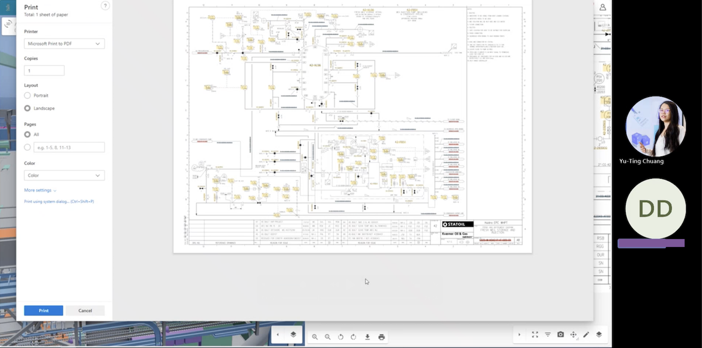
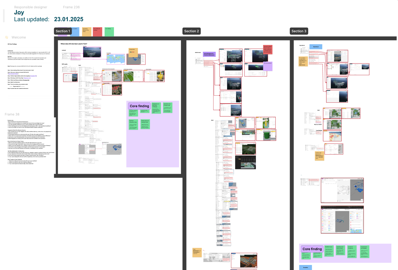
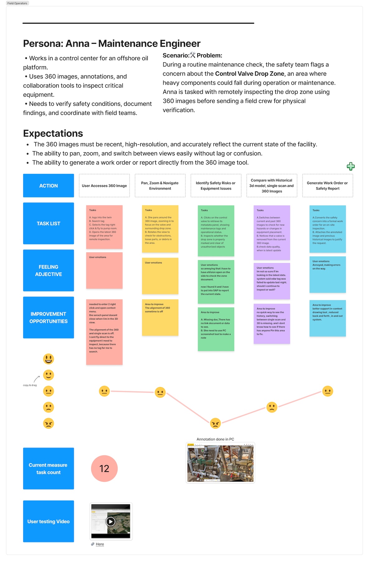
In this phase, I mapped where and how the 3D View is used across various twin products and operational contexts to understand its role in daily workflows. (Detailed examples and screenshots are omitted here due to confidential project content.)
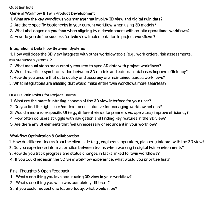
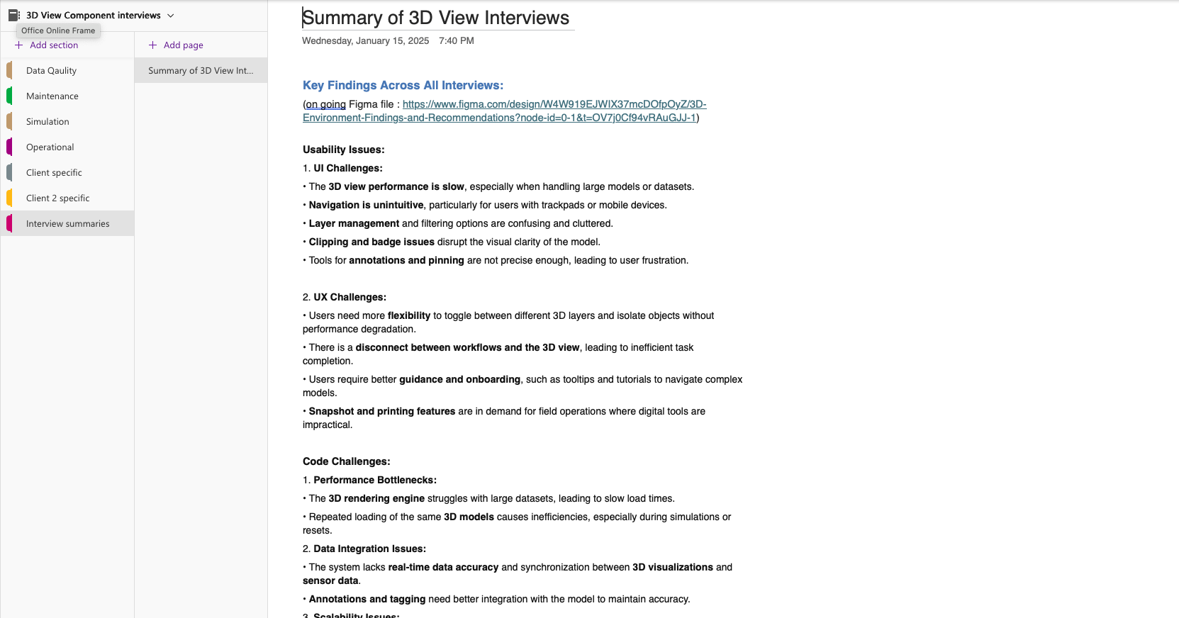
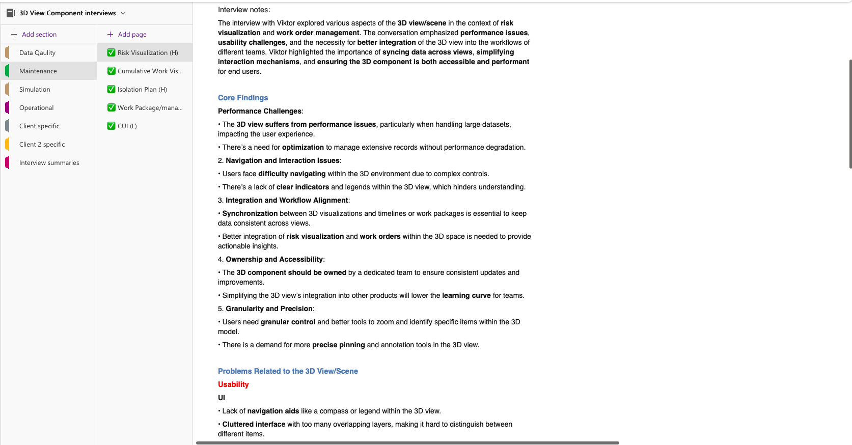
Step 2 –Discovery Interviews:
Talked with PMs, tech experts, and operators to uncover context and usability pain points.
Understanding Users
Because of strict confidentiality and safety protocols, no user recordings or screenshots could be shared externally. Instead, I ran contextual discussions with internal experts : field engineers, 3D developers, and product managers — to capture recurring pain points and mental model.
Designing for industrial digital twins means designing for professionals who rely on accuracy, speed, and clarity — often in demanding environments. Before diving into features, I focused on understanding how engineers, operators, and inspectors actually interact with 3D and 360 data during their daily routines.
These sessions helped me capture patterns such as:
-
Frequent context switching between 3D view, 360 images, and document references
-
Confusion around current navigation mode (walk, orbit, fly)
-
Limited error recovery — users often had to restart their view to re-locate context
-
Need for faster in-site data linking to reduce back-and-forth between systems
Even without raw data, anonymized insights made it clear that users weren’t just struggling with tools — they were struggling with mental continuity inside complex environments.
To communicate these findings safely, I translated them into abstracted user flows and scenarios, allowing designers, product managers, and developers to empathize with real behaviors without exposing any proprietary information.
“Explore to align — not to decide.”
This principle guided our cross-functional alignment: instead of debating the interface, we experienced the user’s journey together.
By replaying these anonymized journeys in workshops, the team aligned around a shared goal — a system that helps users always know where they are, what they’re seeing, and what action is possible next.
PM Interviews
Step 3: Defined
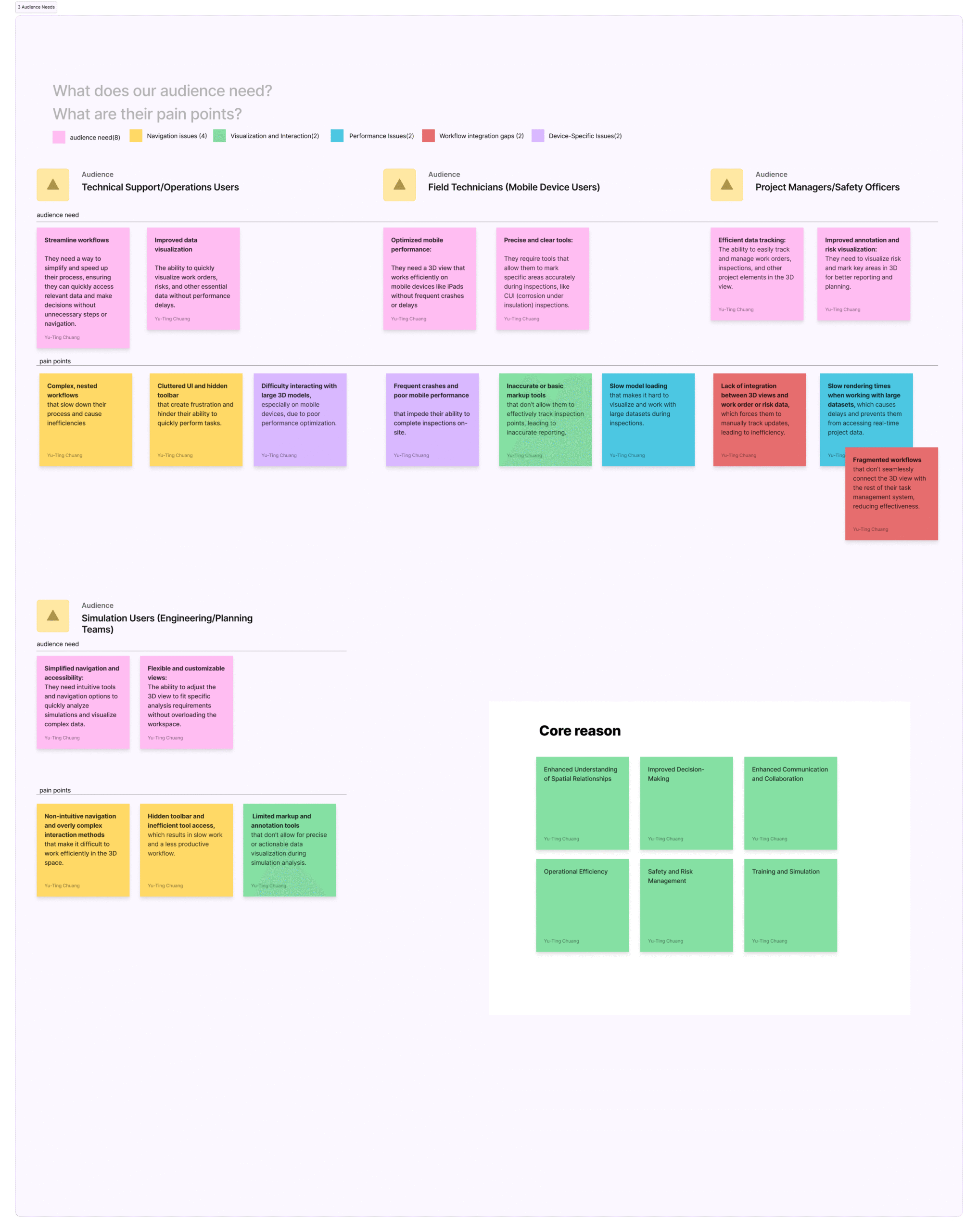
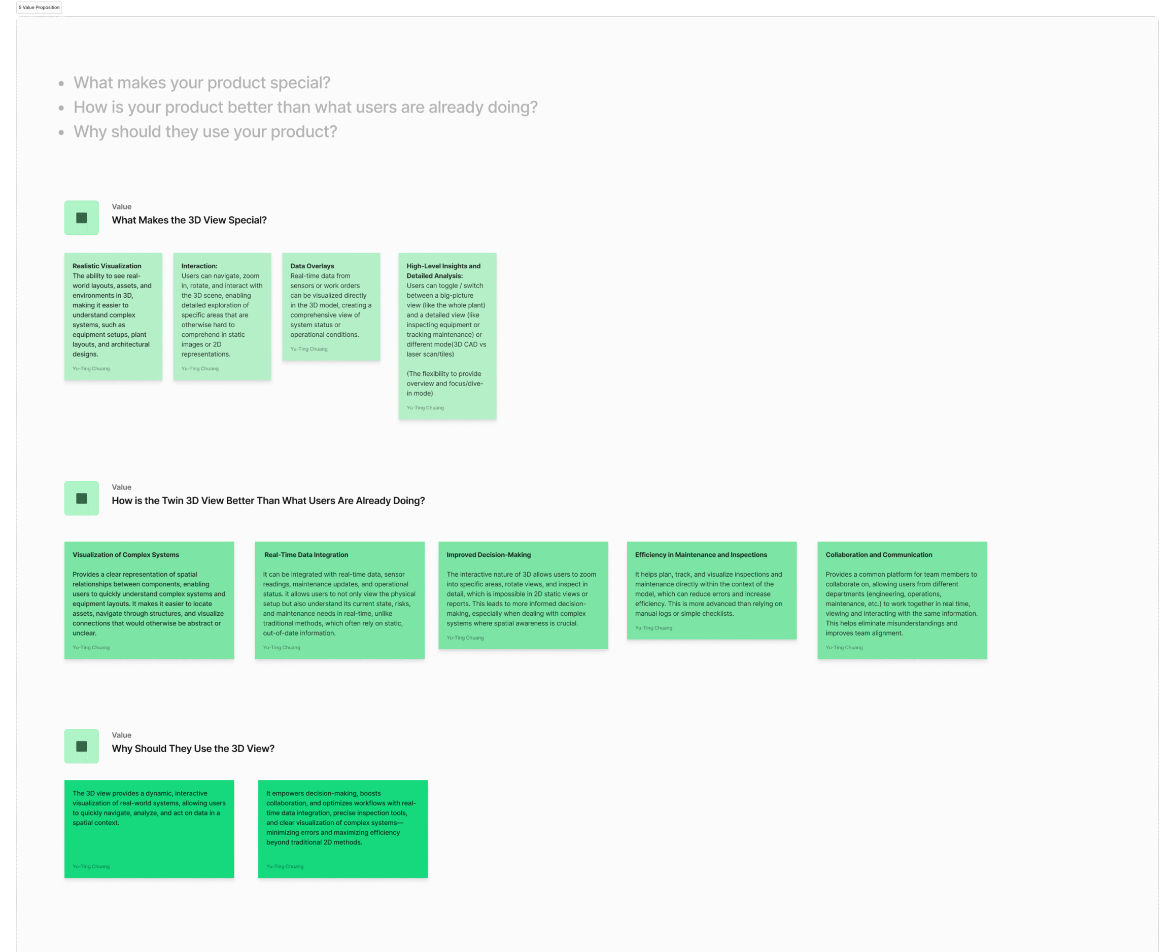
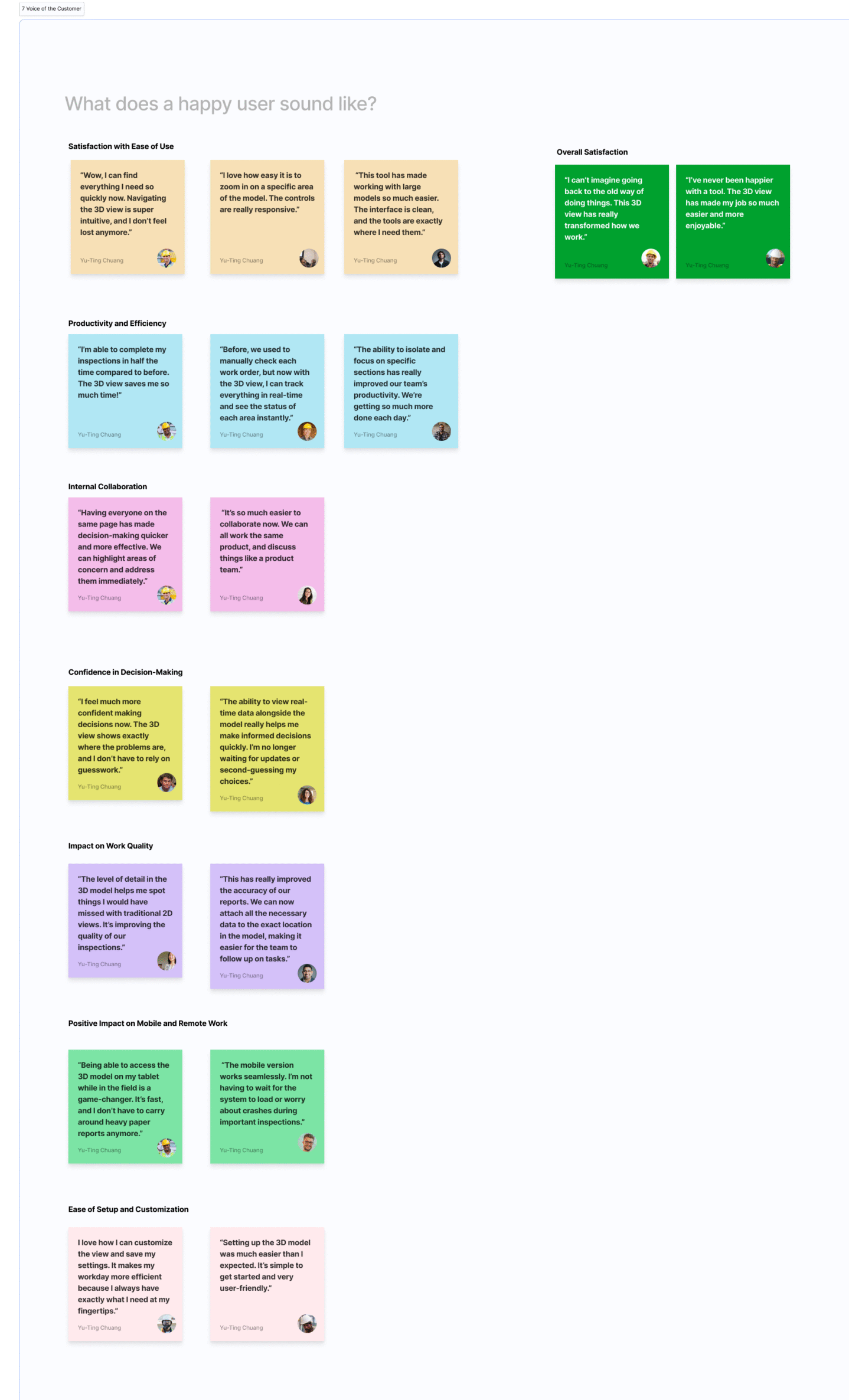
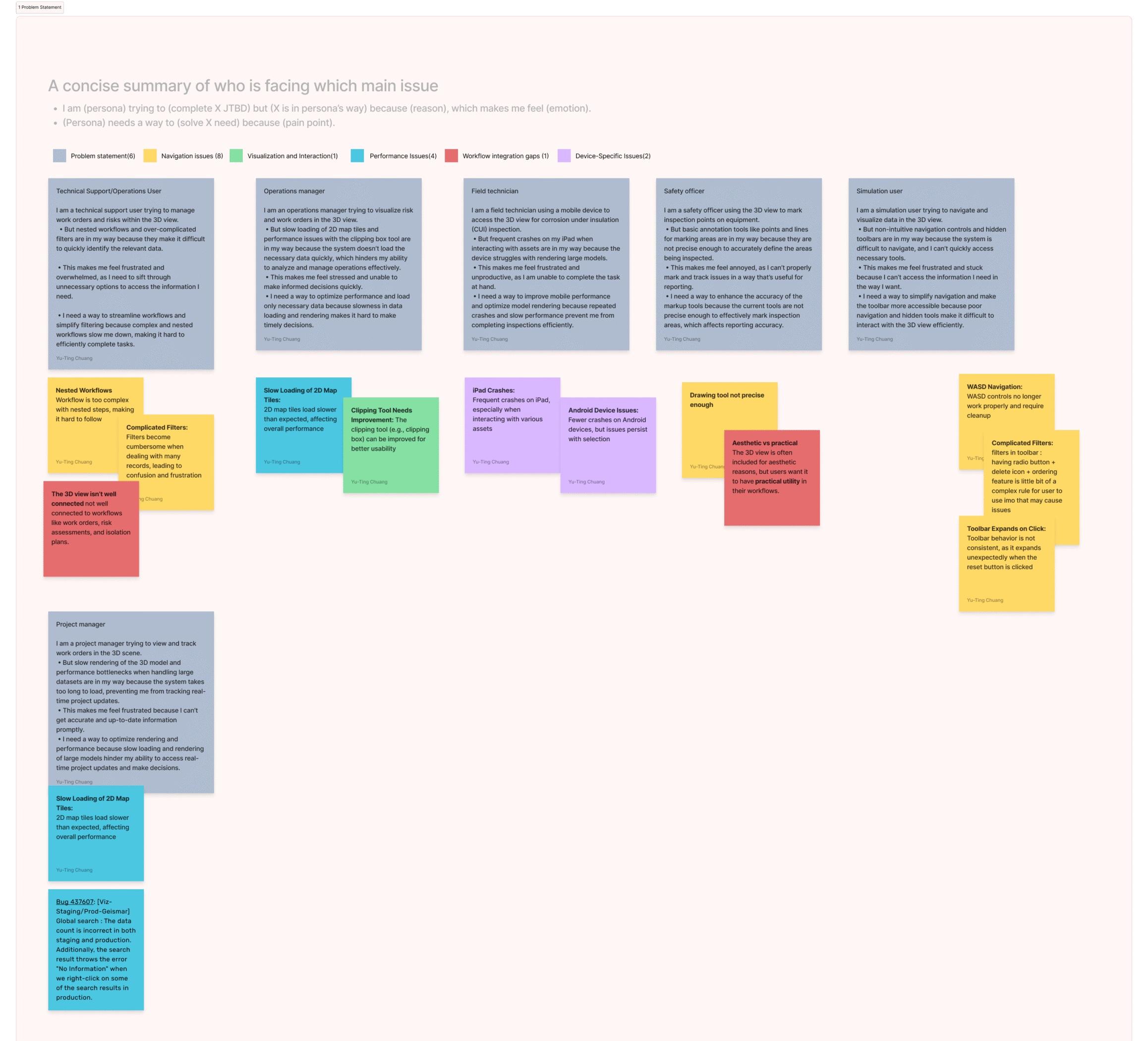
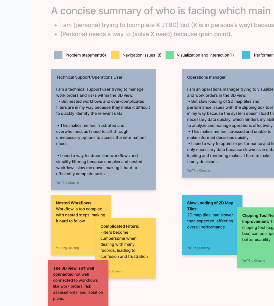
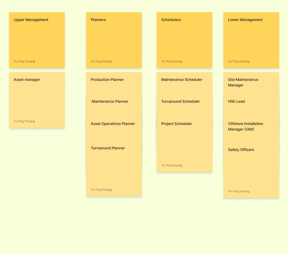
Mapped insights using Vision Type categorization and OOUX (Object-Oriented UX) mapping to connect user roles with their core challenges , such as navigation friction, workflow misalignment, and device-specific limitations. This structured synthesis clarified how key objects, actions, and relationships shape user experience, revealing where design interventions could create the most impact across the 3D ecosystem.
1 . Problem Statement
2. Target Audience
3. Audience needs
4.Features
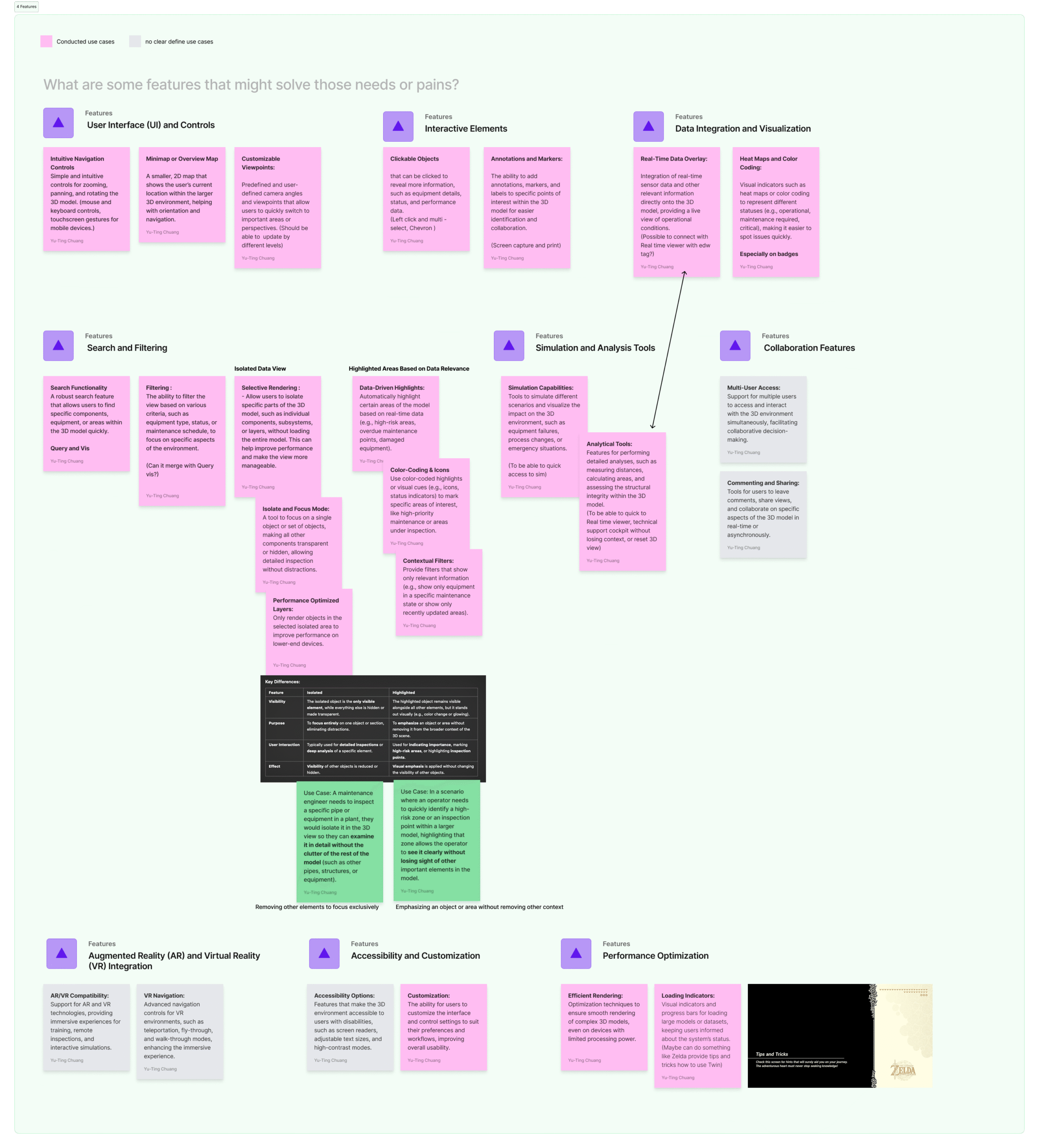
5. Value Proposition
6. Experience Goals and Metrics
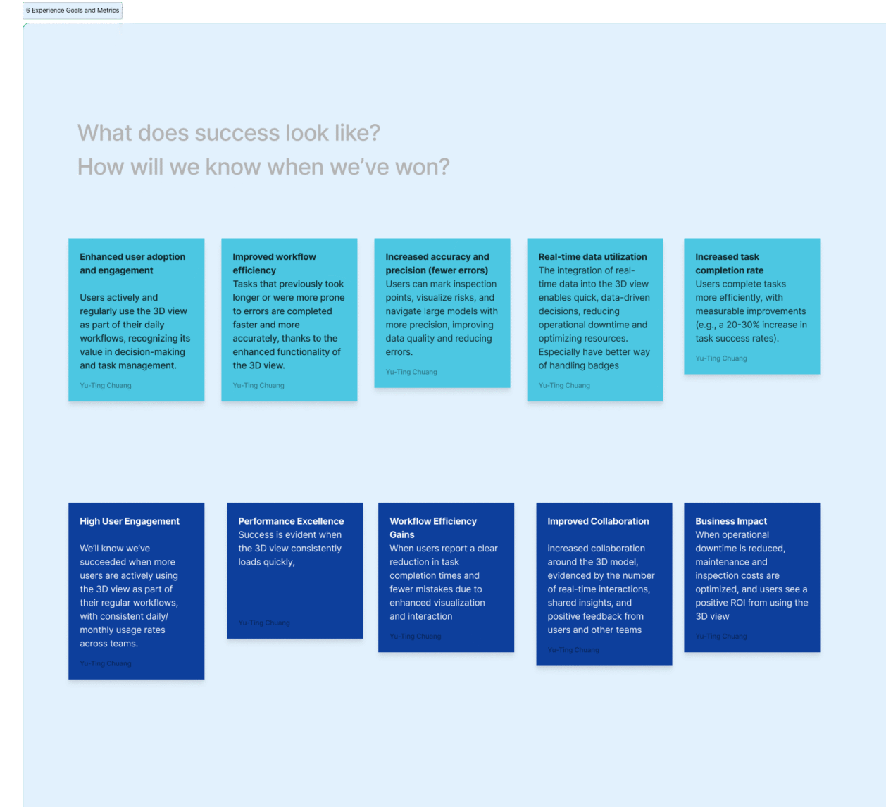
7. Voice of the Customer
8.Design Principles
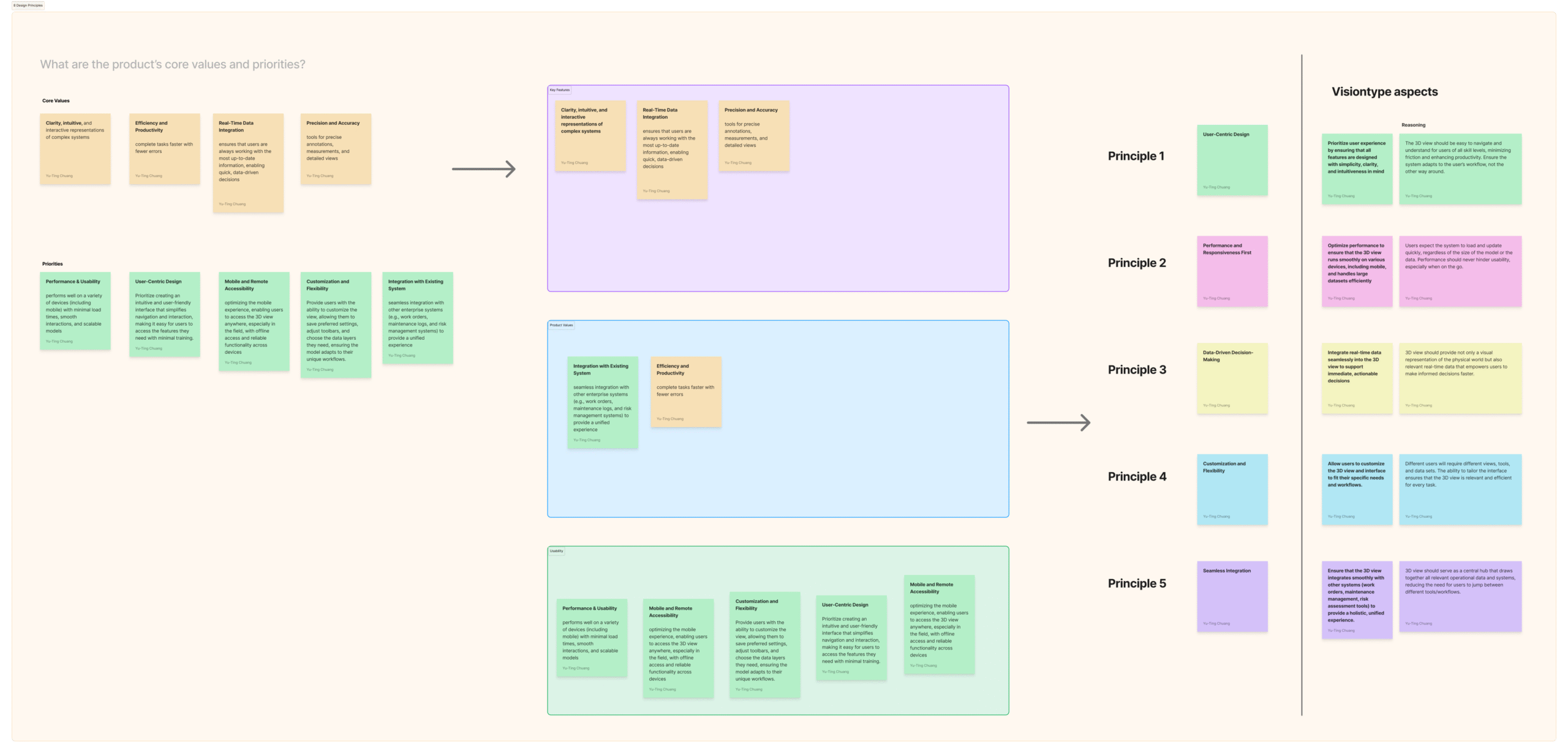
Mapping the Objects
To ground the concept work, I started by mapping how different users interact with the twin:
-
Field engineers: need to verify and compare 3D asset states.
-
Integration developers: connect incoming data streams and maintain object hierarchies.
-
Product owners: track asset readiness across multiple projects.
I reviewed existing workflows, sat in on integration sessions, and captured where things fell apart.
The biggest insight:
Everyone talked about “assets” — but each team meant something different.
That realization made OOUX the right framing tool. Instead of debating features, we could align around shared nouns — the objects our system actually contains.
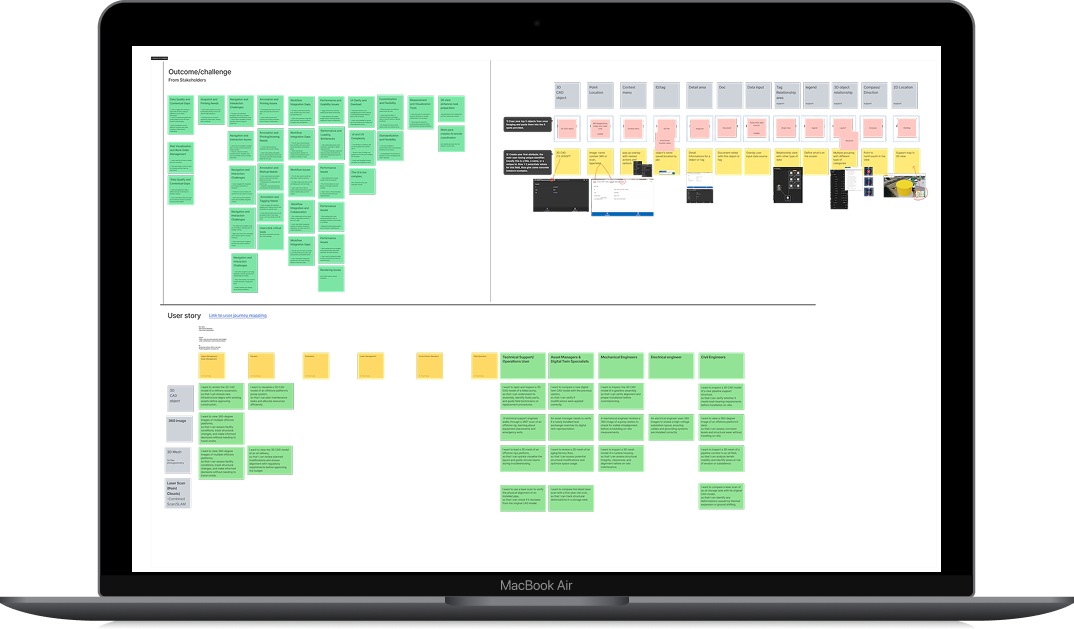
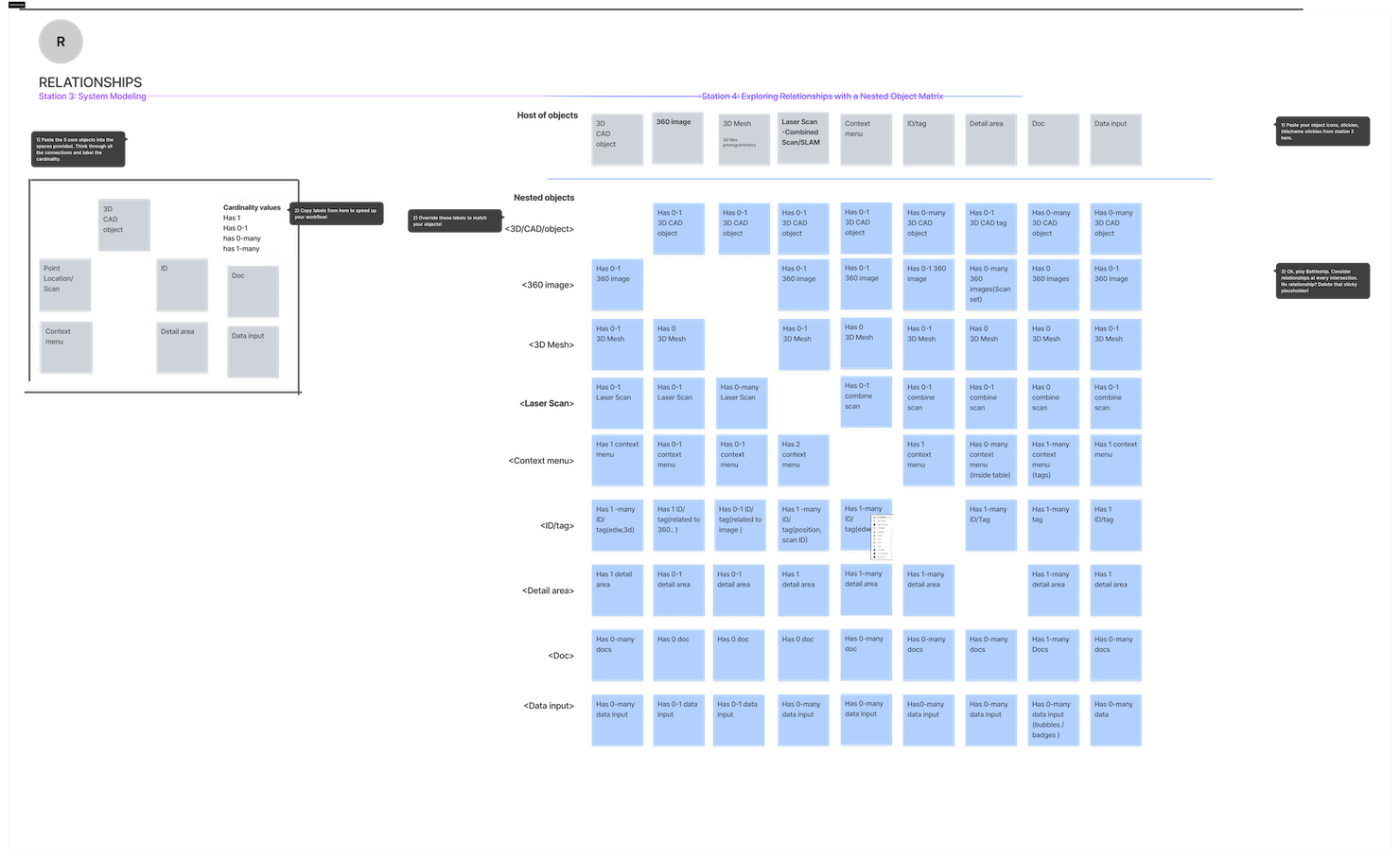
I facilitated a series of quick workshops using the OOUX method — identifying the core nouns (Objects), their attributes, and relationships.
Objects identified: Project → Asset → Model → Document → Instance
We also exposed hidden relationships:
-
Assets belong to projects
-
Models visualize assets
-
Documents describe or verify them
By mapping these dependencies, the team finally had a single view of how everything connects — UX, 3D, and backend alike.
OOUX (Object-Oriented UX) mapping
1. Noun foraging
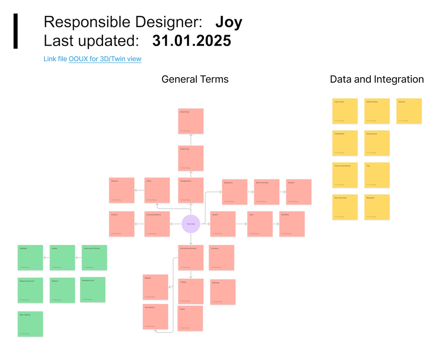
2. Outcome and challenges
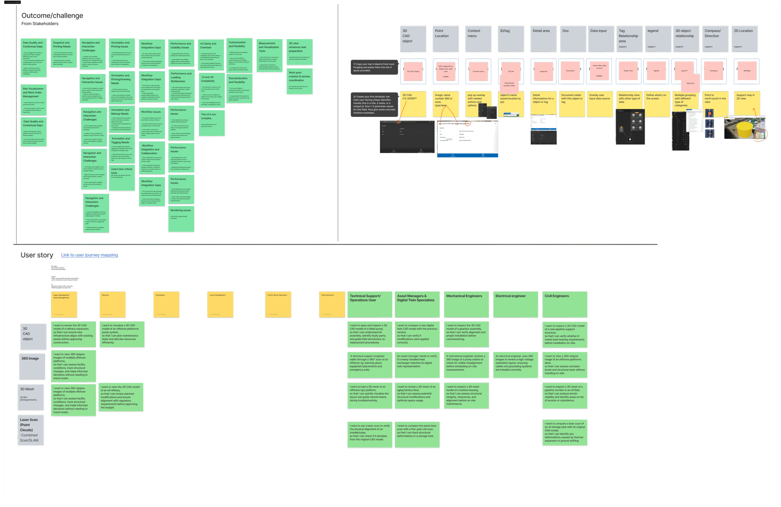
3. Objects sense making
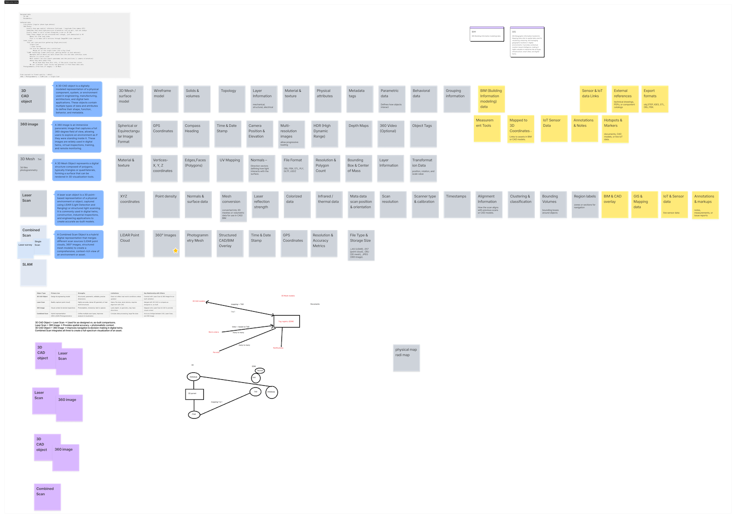
4. Define relationships
5. Call to Action
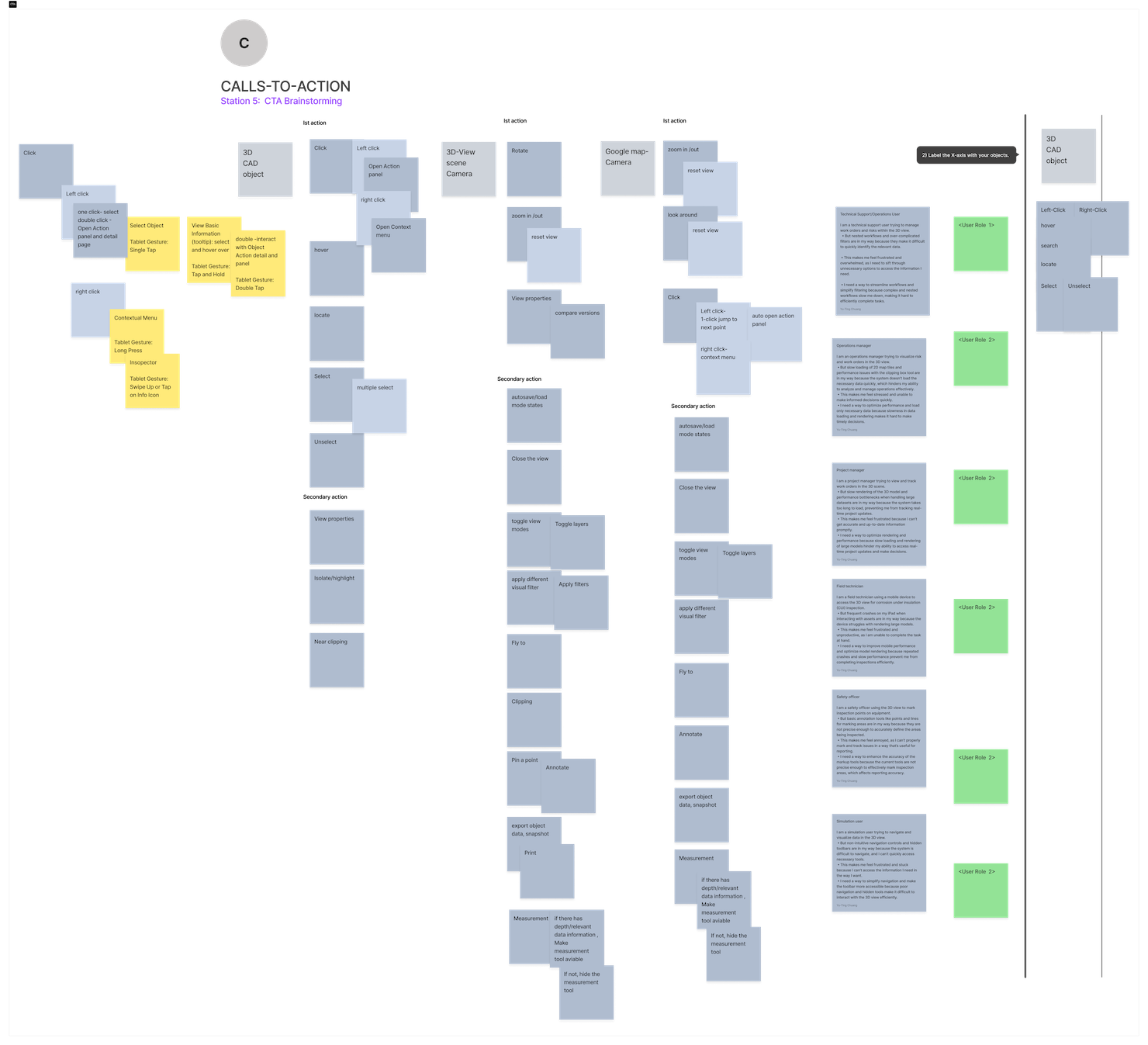
From Object Map to Interaction Model
Once alignment was established, we used the object model to drive design discussions on how users should navigate and interact with 3D data. Instead of file-based navigation, we introduced object-based exploration — where selecting an asset reveals all connected models, documents, and metadata in context.
This new framing reduced cognitive load and connected user actions to the system’s underlying logic.
Example: Selecting an Asset now reveals all related 3D models, documents, and metadata — in one contextual view, not spread across separate modules.
Design focus areas:
-
Contextual filtering by object type
-
Unified object panels for 3D, 2D, and data attributes
-
Relationship-based breadcrumbs (so users always know where they are)
Testing and Iteration
Because the product was still mid-build, we ran fast internal usability rounds — small tests with designers, developers, and field users.
Key learnings
-
The term Instance confused non-technical users → renamed to Object.
-
Deep hierarchies caused navigation fatigue → simplified to two relationship levels.
-
Users wanted context visible in 3D view → added persistent metadata sidebar.
(I will showcase more on System design documentation)
We iterated prototypes weekly and captured changes directly in Figma using comment threads tied to object components. I also have a monthly Design review huddle in Slack ( it is in the development team channel but open to everyone) I use this as one of my yearly KPI, We discuss relevant topics and review design, gathering feedback, etc.
Use Cases Extracted from Findings
Operations & Maintenance – Isolation & Documentation
As a Maintenance Engineer,
I want to isolate a pump and annotate the issue
so that I can record maintenance findings without distractions from other equipment.
Pain Points:
• Confusing isolation vs. highlight modes
• Lack of mode feedback or exit cues
• Annotation tools not discoverable in 3D mode
UX Opportunities:
• Introduce visual “mode indicator” system
• Inline annotation layer tied to object context
• Add breadcrumbs for state recovery
Cross-Theme Findings
| Category | Description |
| Data Quality & Contextual Gaps | Missing contextual cues reduce confidence in decision-making. |
| Navigation & Interaction | Inconsistent behavior across platforms. |
| Workflow Integration | Disconnected from surrounding tools (e.g., Integrity Dashboard, InfoGraph). |
| Annotation & Tagging | No shared standard or visual language. |
| Performance & Usability | Especially problematic on mobile and offshore environments. |
Implementation Collaboration
OOUX made it much easier to align with engineering.
We co-created a shared Object Glossary mapping design terminology to API schemas — now referenced by both teams during development.
Artifacts produced:
-
Object glossary (Figma + Confluence)
-
UI component spec linking to data models
-
Interaction patterns for relationship handling
This documentation(System design documentation) became a living contract — design and backend finally speaking the same language.
Measuring Impact (within enterprise constraints)
Working on an enterprise-scale system meant that direct product analytics and user telemetry were outside our team’s control.
Instead of raw data, we tracked behavioral signals, cross-team adoption, and qualitative validation to understand how the new structure performed in practice.
Our focus was to ensure that the OOUX framework and navigation design helped users feel more in control — and helped developers, designers, and domain experts speak the same design language.
|
Challenge |
Change Introduced |
Evidence of Impact |
|---|---|---|
|
Confusion in navigation modes |
Introduced contextual toggle with visual state feedback |
Internal testers reported smoother flow and fewer accidental mode switches |
|
Inconsistent naming and object definitions |
Built a shared OOUX glossary linking UI and API terminology |
Backend and UX teams now use a unified object model in discussions and documentation |
|
Fragmented access to 3D, 360, and document data |
Designed integrated panels with relationship-based navigation |
Stakeholders noted fewer context losses during internal demos and validation sessions |
|
Slow onboarding for new designers and engineers |
Created visual object maps and system documentation |
New team members use the object model to understand product logic faster and with fewer clarifications |
Even without quantitative metrics, these signals demonstrated measurable alignment across disciplines.
By shifting the system from file-based thinking to object-based interaction, the team began to experience the product as a connected ecosystem — not a collection of disconnected views.
“We finally talk about the same objects, not just the same screens.” — Backend Engineer
The next phase of the project will include more formal usability testing and analytics tracking, measuring:
• Task completion rate in 3D and 360 workflows
• Frequency of navigation errors or resets
• Cross-view linking efficiency (3D ↔ document access time)
These metrics will help confirm what our qualitative signals already suggest — that clarity and consistency in structure reduce friction and improve trust in the system.
Impact/Outcome
Although we’re still testing internally, early feedback is promising:
√ Developers: report fewer mismatches between design and backend objects.
√ Designers: find it easier to reuse components and maintain naming consistency.
√ Stakeholders: understand the system faster through object maps instead of wireframes.
Applying Vision Type, OOUX, and other discovery methods, I conducted a structured deep dive to uncover how different users interact with the 3D environment. It was challenging to introduce a new, research-driven approach within the organization, but the visualization team provided strong support by sharing insights, giving feedback, and allowing time for proper exploration.
Together, we held a co-creation workshop that not only generated ideas for how the 3D view could evolve but also helped align the team around a shared vision for the future of spatial UX in our digital twin platform. This foundational research became the UX baseline for the 2025 3D revamp roadmap, directly influencing component-level designs such as the Layer Panel, Isolation System, and Side Panel UX.
What I Learned
This project reminded me that scalable UX begins with shared language, not just polished interfaces or journey maps.
In complex systems like digital twins, every screen represents a web of data relationships, and alignment across those relationships is the real design challenge. By combining Vision Typing with Object-Oriented UX, I learned to bridge system thinking and human understanding.
The work wasn’t about rendering 3D models; it was about making invisible structures visible and navigable, turning abstract system logic into a shared story that leadership, designers, and engineers could all believe in and build from.
Design leadership means creating clarity before creation.
Final Stats
|
Duration |
3 months (ongoing iteration) |
|
Team: |
UX Designer (me), 3 developers, 1 PO, 1 domain expert |
|
Focus: |
Object-oriented design for scalability |
|
Artifacts: |
Object map, glossary, prototype, System Design documentation |
|
Status: |
In internal testing and continuous iteration |
Follow more on
Step 4: Workshop with 3D VisionType (Link to other post), Opportunity Solution Tree mapping (Link to other post)

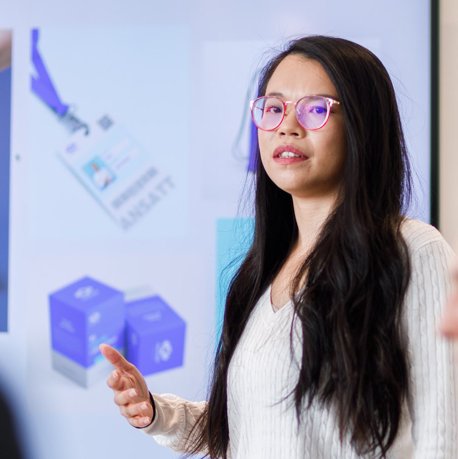
Facilitating a sprint workshop for 3D View
Aligning teams through vision exploration
From problems to priorities: using the opportunity solution tree in core teams
(47) 41 33 16 51
Reach Me By Phone
contact@yutingchuang.com
Email Me
Rølivegen 367, Steinkjer, 7718, Trøndelag
📍 Based in Norway

