
Product Design: Scenario-Based for Smarter Decisions in Digital Twin
Project type: Enterprise UX — Scenario Simulation Platform
Team: Core UX & Engineering Team
My role: UX Lead — Discovery, Research, Information Architecture, Wireframing, end to end product design.
Timeline: 2023–2024
Goal: Help industrial users explore multiple outcomes quickly and confidently
Confidentiality Notice
This case study has been anonymised to comply with confidentiality obligations under the Company Personal Declaration of Secrecy. All product, team, and system names have been replaced or generalised. Visuals are shared privately for portfolio review only.
The Situation
Industrial data systems are powerful yet complex — and decision-makers often struggle to translate data into action.
Our objective was to design a more intuitive way for users to experiment, simulate, and understand possible outcomes before making critical decisions.
The existing workflows required constant switching between dashboards and tools, which supported technical accuracy but not clarity.
Through discovery and iteration, we transformed fragmented workflows into a guided, scenario-based experience that made complex analysis both accessible and interactive.
Design Context
Traditional digital-twin tools visualise “what is” — live data and historical states , but real-world decisions depend on exploring “what could be.”
During discovery, we explored how a scenario-driven approach could allow engineers to test assumptions, simulate consequences, and evaluate alternatives directly inside a unified workspace.
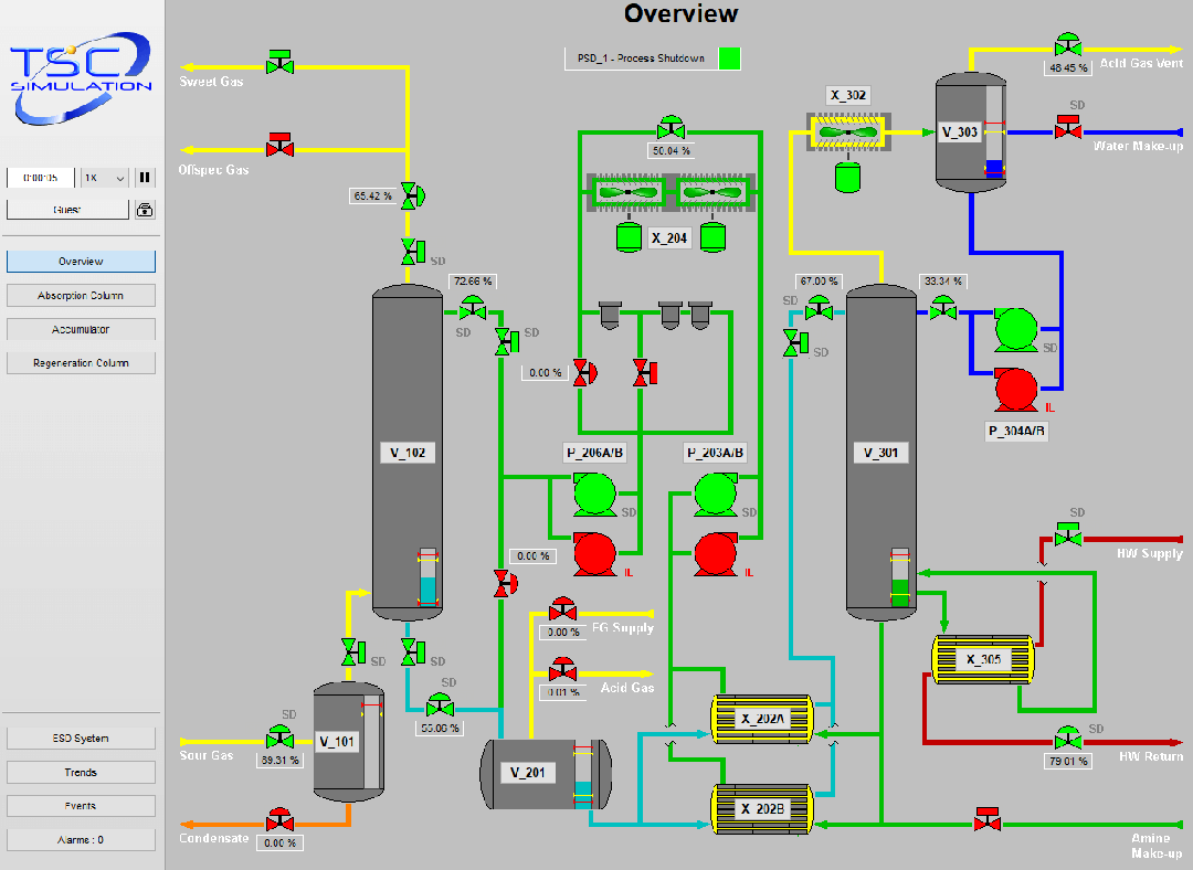
SIM 4200 Amine System – TSC Simulation
The Discovery Phase — Finding the real problem
Interviews and workflow observations revealed that engineers were:
-
Manually cross-checking results across multiple tools.
-
Re-running simulations outside the main platform, then re-importing results.
-
Unsure whether baseline data was reliable enough to trust.
Insight: Users didn’t need more visualisation — they needed a safer, guided space to think through decisions.
Mapping these insights produced a user flow connecting every step of the decision process — discover → observe → create → explore → compare → finalise — highlighting friction points in data validation and comparison.
Defining the Scenario Concept
A scenario allows users to adjust parameters such as temperature, production rate, or maintenance schedule and immediately see projected outcomes.
Each scenario acts as a temporary, non-destructive layer:
It can be saved, compared, or shared.
It encourages experimentation within safe boundaries.
It enables users to ask “what if ?” and instantly see the impact — all inside the same visual environment.
Use cases
Use Case 1 : Multi-level drill-down visualization
Goal:
Enable users to navigate 2D/3D visuals with drill-down capability across multiple levels (e.g., plant, train, equipment).
Flow Summary:
-
User opens visualization at the top (plant) level to see statuses and datasets.
-
User drills down from plant → train → unit → equipment level.
-
Each level shows relevant pre-set statuses, monitored conditions, and datasets.
Use Case 2 : Scenario visualization with simulation models
Goal:
Allow users to view, set up, and trigger simulation runs within the same visualization environment.
Flow Summary:
-
User logs in to view simulation models.
-
User sets up a scenario in the interface, selecting a point in time and adjusting variables.
-
The simulation runs and results are visualized in the platform.
Use Case 3 — Integration of data sets
Goal:
Provide users with access to associated process data and contextual information linked to equipment or assets.
Flow Summary:
-
From the visualization, user selects equipment to access related datasets (e.g., logs, lab data, reports).
-
Some data is summarized directly; full datasets can be opened in an external interface.
Use Case 4 — Aggregated key information
Goal:
Display aggregated KPIs and alarms across multiple levels for situational awareness.
Flow Summary:
-
User opens visualization at the plant level to see KPIs and alarm heatmaps.
-
User navigates progressively (plant → train → unit → equipment) to view KPIs relevant to each level.

Design Challenge
Our core challenge:
The challenge was to create a unified, intuitive workflow for scenario assessment without overloading users.
So we started from first principles:
- One entry point: All scenario creation — baseline, what-if, or assessment — starts from a single menu.
- Step-by-step flow: Users move through a logical sequence — decide → collect → assess → compare.
- Clarity of states: The interface always answers “Where am I?” and “What happens next?”
Goal: To reduce cognitive load and support fast, reliable decision-making in a complex industrial environment.
User Flow
Whiteboard sessions and early prototypes with stakeholders helped visualise how scenario building would work in practice.
The flow evolved into five clear phases:
- Discover: Locate relevant data or process.
- Observe: Check real-time or historical data for readiness.
- Create: Define or modify baseline conditions.
- Explore: Run simulations and compare outcomes.
- Decide: Review results and communicate actions.
This systematic structure balanced precision with simplicity, making the tool effective for both expert engineers and occasional users.
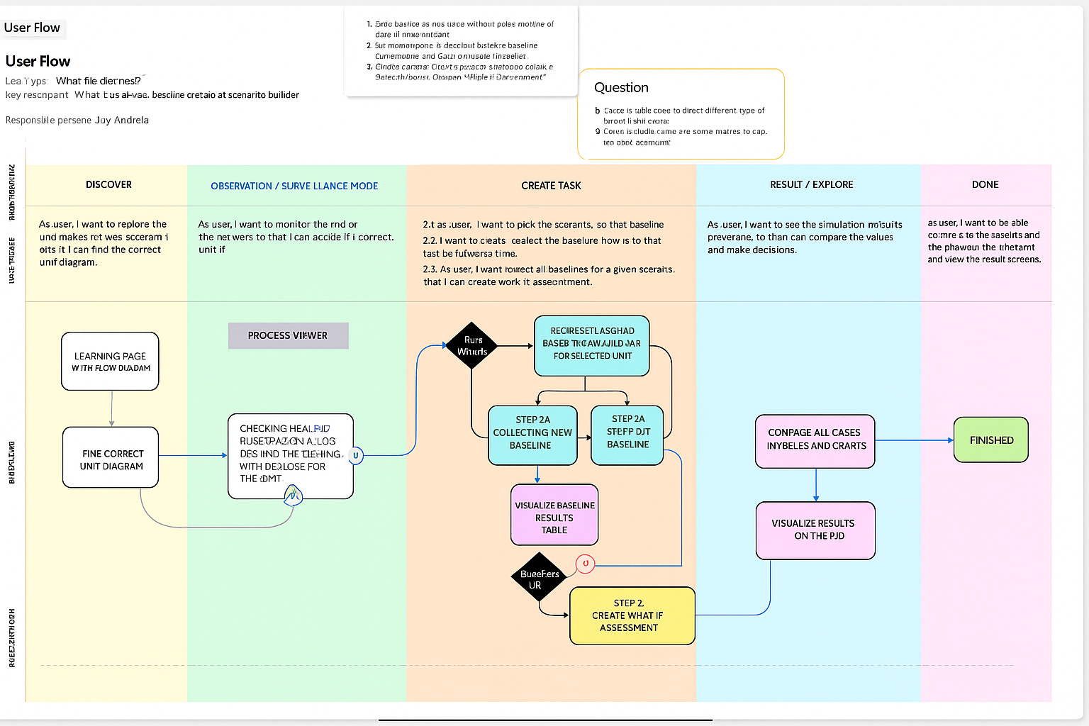
This is an AI-generated image.
Continuous Collaboration
Regular workshops and feedback sessions with cross-disciplinary users ensured transparency and alignment throughout the process.
By co-creating early prototypes with domain experts, we validated workflows continuously instead of waiting for late-stage review.
Testing Insights
Key takeaways from iterative testing:
-
Users valued consistency over flexibility; too many paths caused confusion.
-
Trust in the baseline was more critical than the scenario itself.
-
A visible progress indicator made complex flows feel predictable.
The design evolved to simplify menus and align interaction logic with user reasoning. Early collaboration and testing helped the final solution match users’ mental models and expectations.
UX improvments
Before — disconnected systems and fragmented workflows
Previously, users had to work in silos with little to no data integration. The lack of connected systems forced them to switch constantly between multiple applications, slowing progress and breaking focus.
After — unified platform for insight and action
Now, all data and tools are connected in one seamless environment. Users can create case studies, run simulations, and visualize results on the same interface — transforming analysis from a fragmented process into an integrated, insight-driven experience.
Outcome
The redesigned workflow created a single, integrated environment where users can simulate, compare, and visualise results without switching tools.
Teams can now conduct analysis in hours instead of days, with clearer confidence in each decision.
Reflections
The final workflow proved that experimentation can be both technical and intuitive. What began as a challenge to simplify digital-twin experimentation evolved into a system that mirrors how engineers think.
Working across time zones with a diverse team of designers, engineers, and domain experts was deeply rewarding. Despite remote collaboration, the shared commitment to UX thinking built genuine trust and alignment.
This product reaffirmed that human-centred design, paired with strong teamwork, can simplify even the most complex technical systems , delivering clarity, confidence, and measurable business value.

From problems to priorities: Using the Opportunity Solution Tree to align core teams

Designing Scalable UX Architecture for Visualization Systems
Designing for millions: Product Research on Taiwan’s NHI (National Health Insurance)App
(47) 41 33 16 51
Reach Me By Phone
Email Me
Rølivegen 367, Steinkjer, 7718, Trøndelag
📍 Based in Norway