Component UX Case Study- Split Screen
Digital Twins product
When I first hired as senior UX designer in KDi (Kongsberf digital AS) I been assigned with split screen strategy from my manager. I was to take ownership of the Split view user experience design, from concept to hands-off to front-end developer, documentation and support. The task was assigned to me by UX group manager. My responsibilities included: collaborate with stakeholders, gathering most relative use cases. user research, wireframing, prototyping, testing, iteration, and support the developers who has specific use case and documenting the process and result.
Project date :2021 April
Stakeholders:
-
Project developer lead – Scotford
-
Tech Vice President
-
Customer solution team
-
Oil & gas field client
Project duration
- April 2021
Deliverables
-
Sketch
-
UX Research
-
Prototype
-
Usability study
- Documentation
Use case information
One of my work case while I work in the digital Twins product in a Norwegian enterprise company.
What is a digital twin?
A digital twin is a virtual representation of an object or system that spans its lifecycle, is updated from real-time data, and uses simulation, machine learning and reasoning to help decision-making – IBM
The Goal
Provide user smooth experience of switching view, assign view etc in digital twins platform. We would like to design the way that has common use behaviour/functionality for user such as the way it works in his/her own computer/tablet.
For confidential reason all the related screens are remade, I tried my best to show the original user flow and keep the main layout without giving any sensitive information.
My Role
My role in this case as a senior UX designer was to take ownership of the Split view user experience design, from concept to hands-off to front-end developer, documentation and support. The task was assigned to me by UX group manager. My responsibilities included: collaborate with stakeholders, gathering most relative use cases. user research, wireframing, prototyping, testing, iteration, and support the developers who has specific use case and documenting the process and result.
The problem
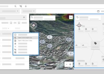
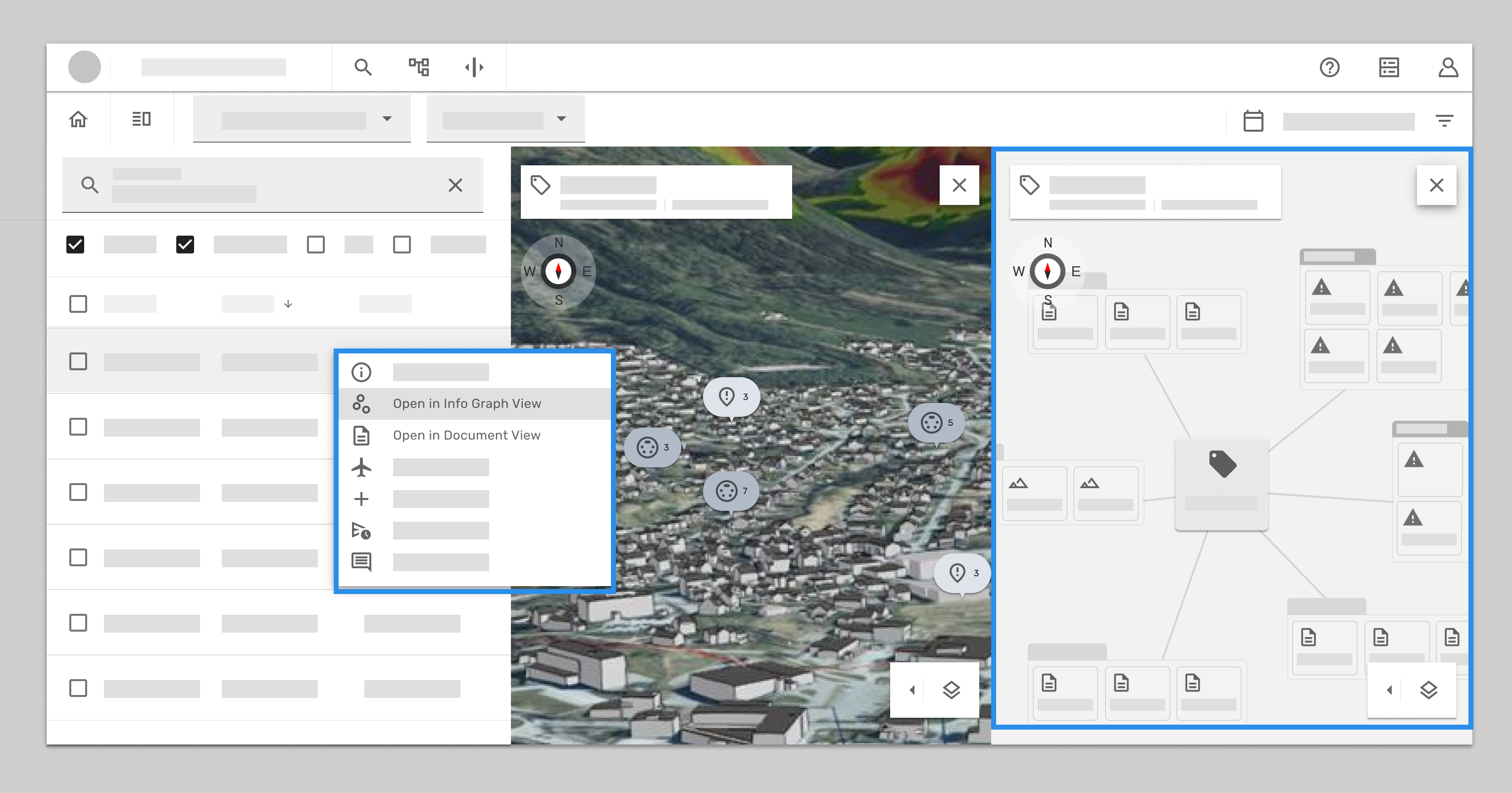
In Twins “Simultaneous Operations” workflow , when user first landed in this workflow the screen shows 3D map view, User can search or find the result inside the table , when user right click the the task to open the document view , the info graph view comes together with it. And when user wants to go back to see 3D view, has to close both views (Document and info graph view) to go back to 3D view, but not an other way around. This inconstant behaviour was not obvious for user , most user found themselves lost in the flow and feel frustrate.

*first landed in the workflow. The screen shows default 3D map view, following thorough the trigger from the table result, the 3D view will automatically zoom in to whatever tag/3D object that user select.

Where did 3D view went?
*User can right click to open a context menu, and select open the tag/object in the document view. When user trigger this function, the info graph view comes with the document view and automatically took over the screen to a split screen. But if user right click the task to open the tag in info graph view, it only open graph view but not with document view.
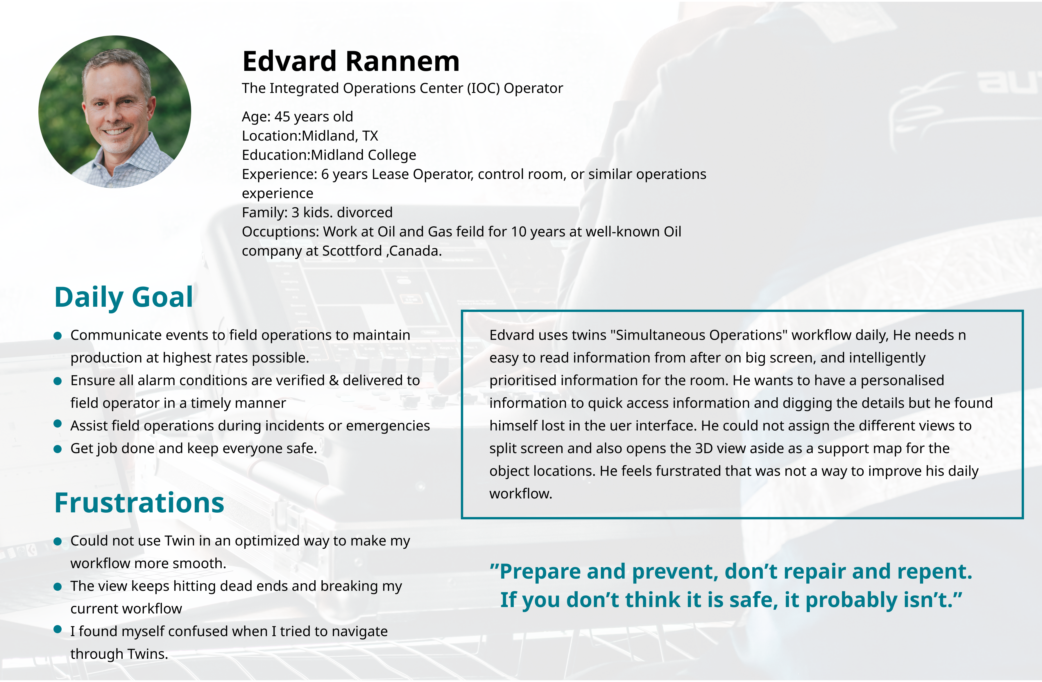
Persona -IOC operator
User :
Employee who working at control room that has to observing work climate and understand goals of the operation and has overview of collective tasks.
The User flow:
- First glance:
- Before dive-in to work: A clear, unobstructed view of the whole control room, and being able to talk to colleagues.
- Need an easy to read information from after on big screen, and intelligently prioritised information for the room.
- Arriving at work terminal:
- Need to check IOC’s big screen to identifying free workstations, need to have a personalised information to quick access information and digging the details.
- Starting work routing :
- Track back the previous tasks. visualised current status of operations, access alert, messages etc. He/she needs shortcuts to common accessed informations.
- Prepared to execute the next activities, need to analyst and observing crossing different information at the same time.
- Need to prioritised activities, help in order to asses what is more urgent.
- Optimising the production: Drilling down to data ex. PnID, work permit. Need to visualised all the needed data sets and relationship in between objects.
- Preparing for a planning meeting:
- Visualised different documents from the applications.
- Easy search all the relevant documents or maintenance history objects, notifications . annotations. Need to be able to attach items, layering notification/ annotations on the view or document.
In this case- we focus on Number 1. The first glance user flow
UX Research
The customer success team and project owner ran a user feedback session for few IOC operators. We used the research insights to discovered the pain points, most user were suffering the confusion of inconsistent behaviours of split screen function.
The landing screen:
- User has no use to land in 3D view before doing any search or knowing what’s going on.
The Split screen:
- After user found the tag or document and wants to dig more for data relationships and assign the view beside each other, in this process has unwanted and inconstant behaviours of how the view been opened or assigned to split view.
- Unwanted screen opens by itself.
The flow:
- It’s often to hit the error and there has no way to reverse,. this gives user frustrations and annoying feels. Most user think they can not find what they need in twins.
- Too much dead-end and hard to know how to go back to the default.
- Show me what I ask for and allow me to hide it and bring it back easily.

Goal statment
Our split screen will let users assign the relevant screens to the split view which will affect the workflow and give the supportive informations that user needs by providing consistent split screen functionalities behaviours that are clear and easy to use. We will measure effectiveness by collecting user’s feedback based on use cases.
Problem statment
Ole is an IOC operator who coming to control room in the morning who needs a way to see different views to get the overview of collective tasks because the user has to observing work climate and understand goals of the operation.
While the first attempt, I start digging in detail into how does the split-screen works in Digital Twins.
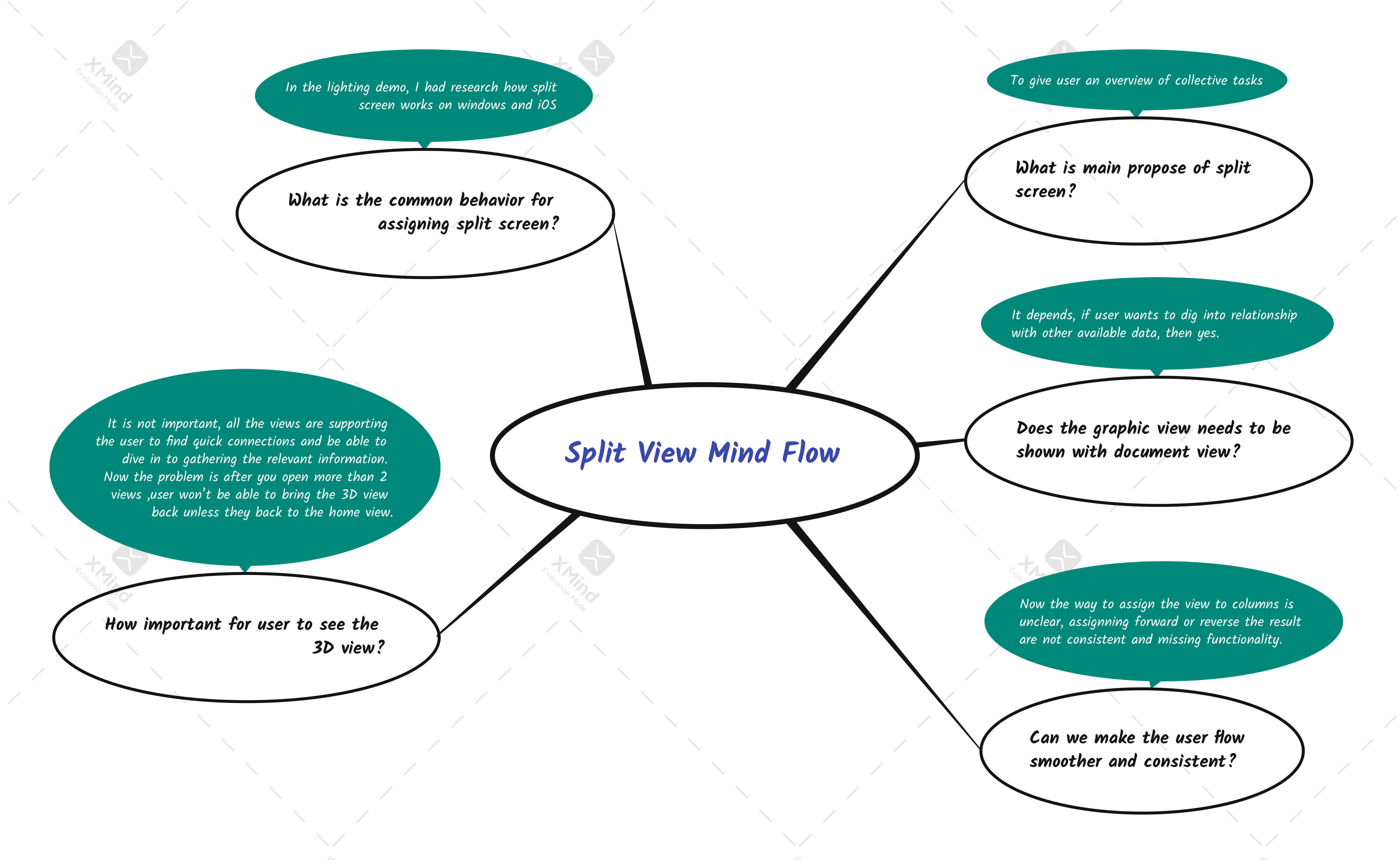
Question:
-
Does the graph view necessary needs to show with Doc view? And what is the relationship between these two views?
-
Can we make the user flow smooth and consistent?
-
How might we make it less confused visually ?
-
How important for user to see 3D view?
-
What is the common behaviours for assign the window to split view?
Design process
Mind map
Brainstorm sketches
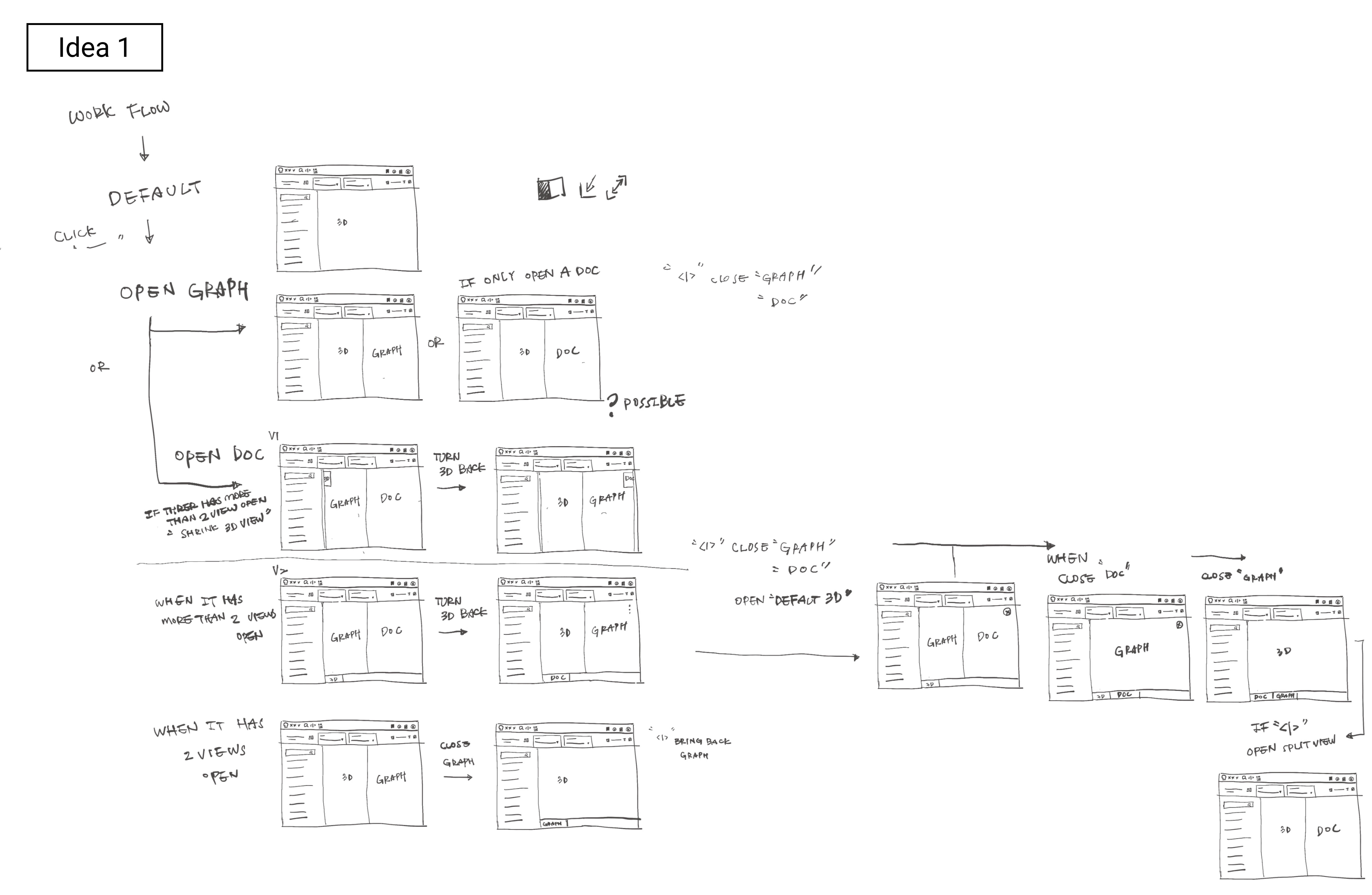
Idea 1
Explanation:
In the first idea sketch, I tried to draw down what we have today in the product. I wanted to see how much construction work need to be done before I do the visual design.
Step 1:
Landed in SimOps workflow and viewing all the tasks badges on the 3D view. (3D view is sets as default)
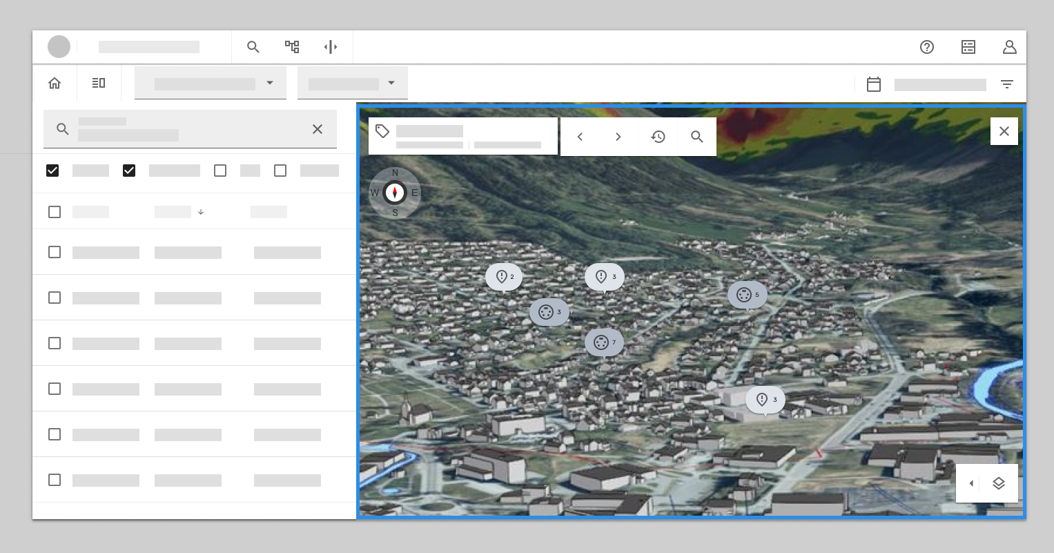
Step 2:
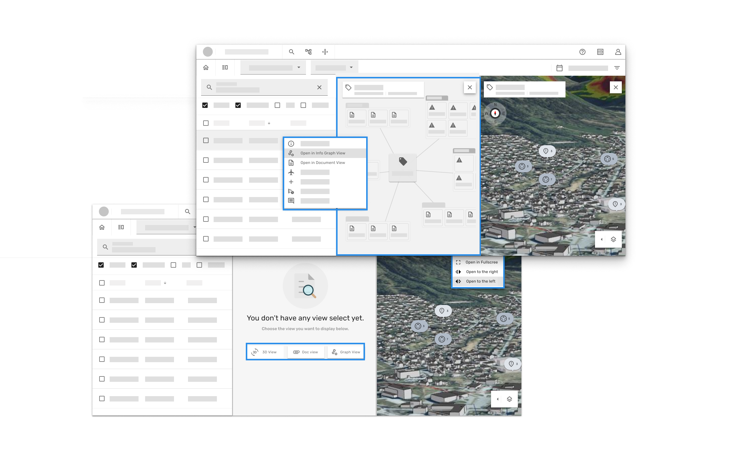
Find relevant tag and right click to open a “context menu”, open “Info Graph” system automatic open the graph view as split view in the right side of 3D view. Or can be open “Document view” , same as open info graph view.
Thought 1:
Treat 3D as an individual tab, either fully open or close when there has other view open.
Thought 2:
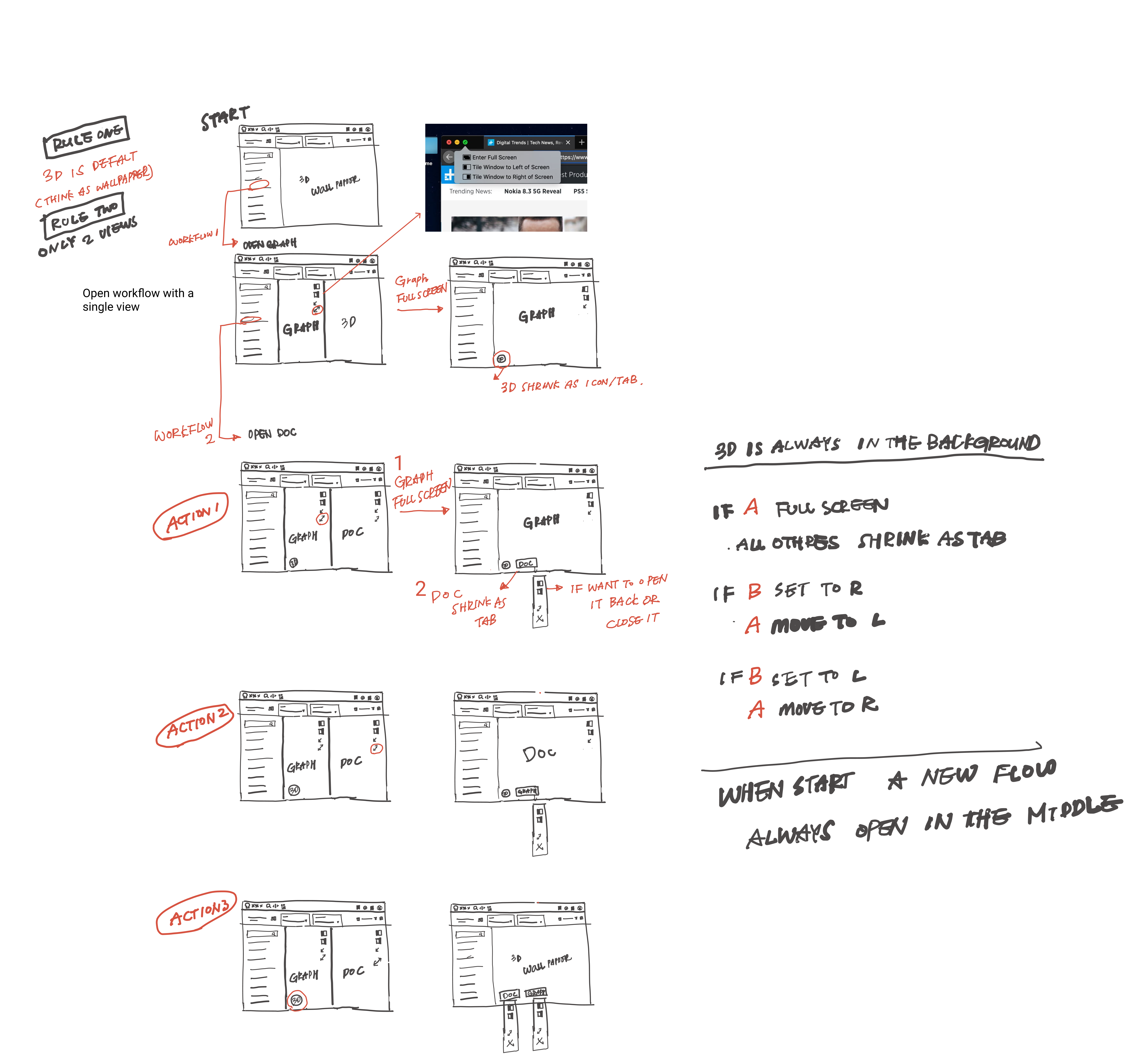
Treat all the views as an individual tab. It can rotate and be assign in any column. Give it a rule the last open is always on the right side. if is more than 2 view open at the same time shrink the earliest view.
If statement :
if it has the info graph view opened and wanted to open document view as well. the last open view will be add on the right column(in this case will be document view). If is more than 2 screens opened, the left screen will shrink as a “tab”(In this case is 3D view)
if you click the tab (In this case is 3D view) then it will add on the right column, and the view was on the right column before will be shrink as tab.
Issues occur here:
It wont be clear enough when user click the shrink tab, and the right column view gets shrink down. The flow isn’t smooth and I can see the confusion there.
So I had the other meeting with developer. As result I had second attempt to clear the logic and try to make better experience.
After I sketched out the idea 2 , I had meeting with front-end and back-end developers to discuss the possibilities for the solutions. Logically seems make sense, so we agree to make simple test run to see if this will works in product.
We agree with should set up the rule for how the split should function.
Rule 1: Treat one view as default (Can be any view), in this case we chose 3D and treat it as wallpaper on your PC.
Rule 2: Only allow 2 views open in the split view, the 3rd one must shrink as tab.
The next things I did: After the discussion, I had drawn the new sketch that collected all the thoughts and concerns. I tried to find a sweet spot that is scalable and also easy to use for users.
We also trying to answer these questions in the sketch 2
- When you close one view, does the other take full width (even though it was originally resized)?
- When, why (not) deep nesting?
- Empty state?
- Open/close, push to left/right? Keep position?
- Open options – Right/left/fullscreen
Idea 2
I got inspiration from how iOs assign the split view.
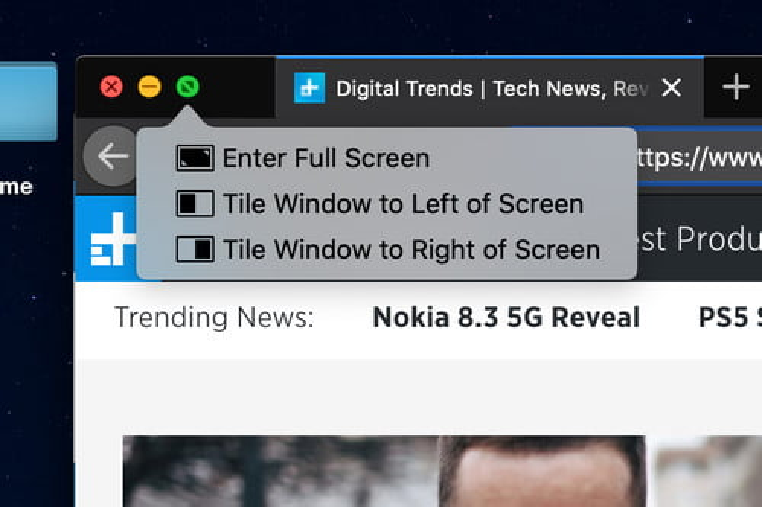
Tab functionalities :
the tab either can assign the view to right or left, open as full screen. Instead of assign the last open to the right column, I think the last open information is more important for the user at the moment compare to current view, so I moved the last assign view from right column to the left column.(to keep most relevant information in the middle of screen)
Here comes the simple prototype
Step 1:
Landed in SimOps screen

Step 2:
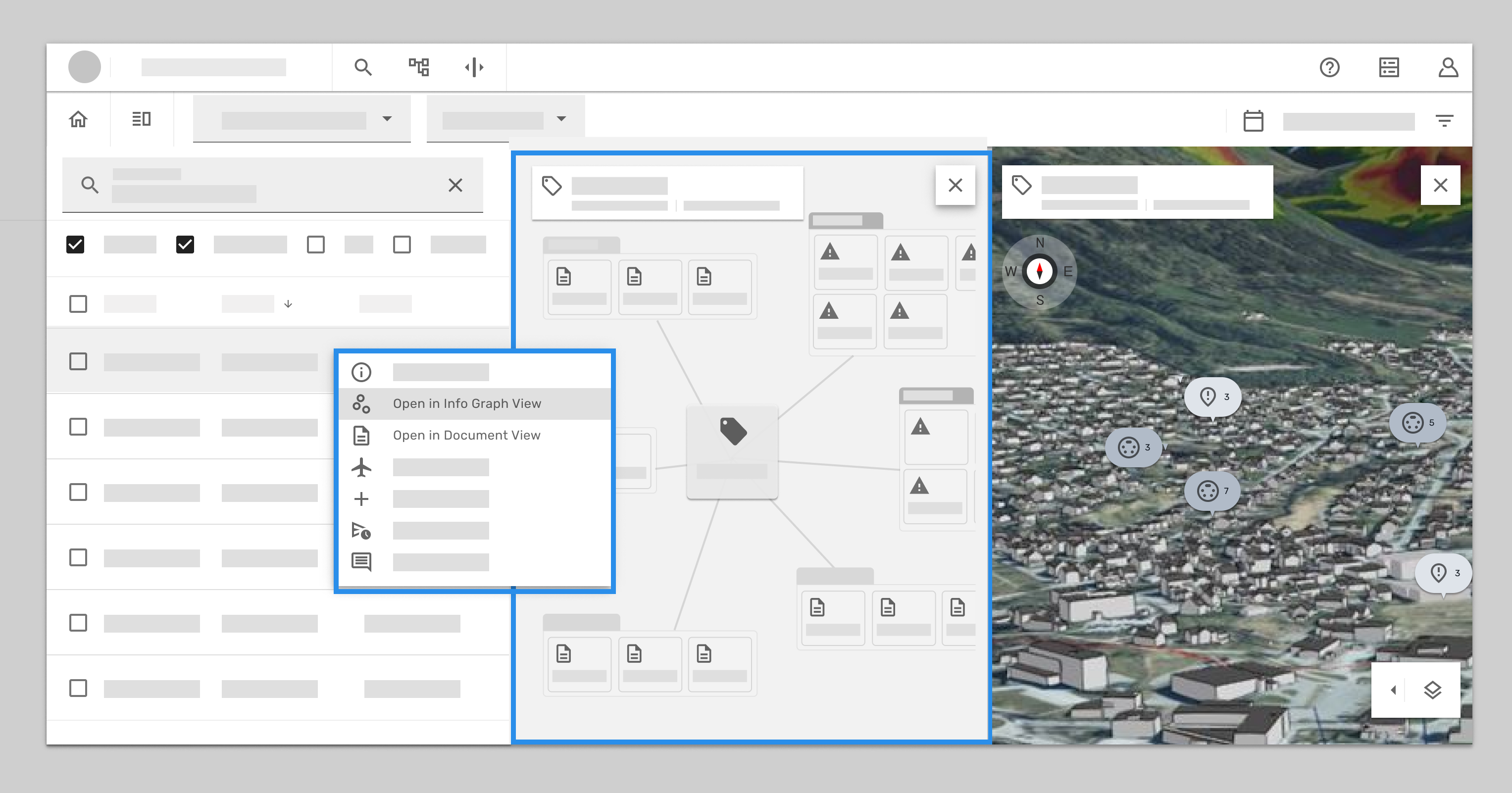
Find the relevant tag and open info graph view- 3D view got pushed to the right.
Step 3:
Open document view – the info graph view got pushed to the right, and the 3D view got shank down as tab.
if user want to bring the 3D back, when you click the tab will pop up an option menu, can open in full screen or assign the screen to the right or left.
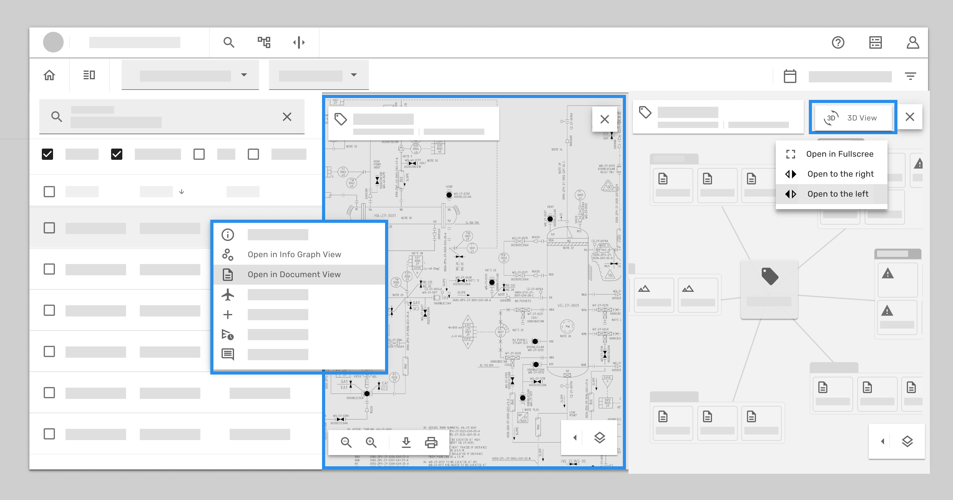
In this case we choice to open the 3D view to the left screen. so the document view got pushed to the right column, and shrink the info graph view.
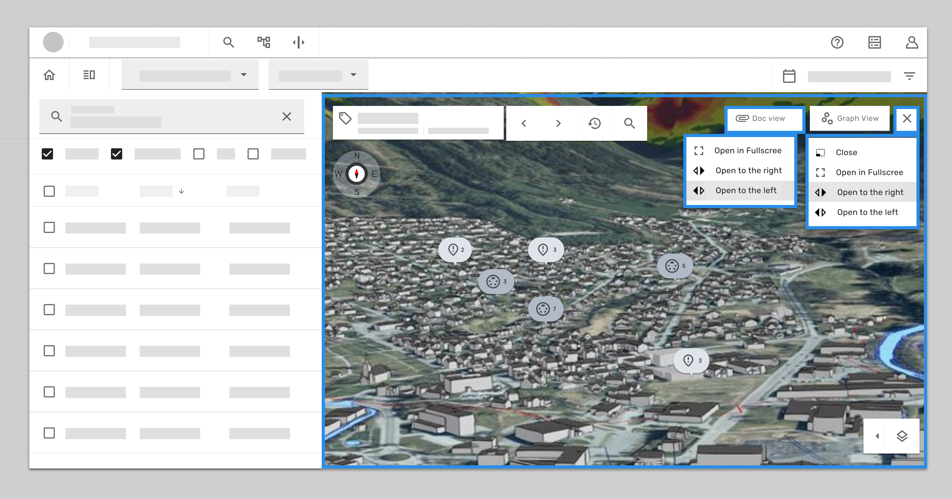
When user assigned the view , user can also click the cross icon to select option.
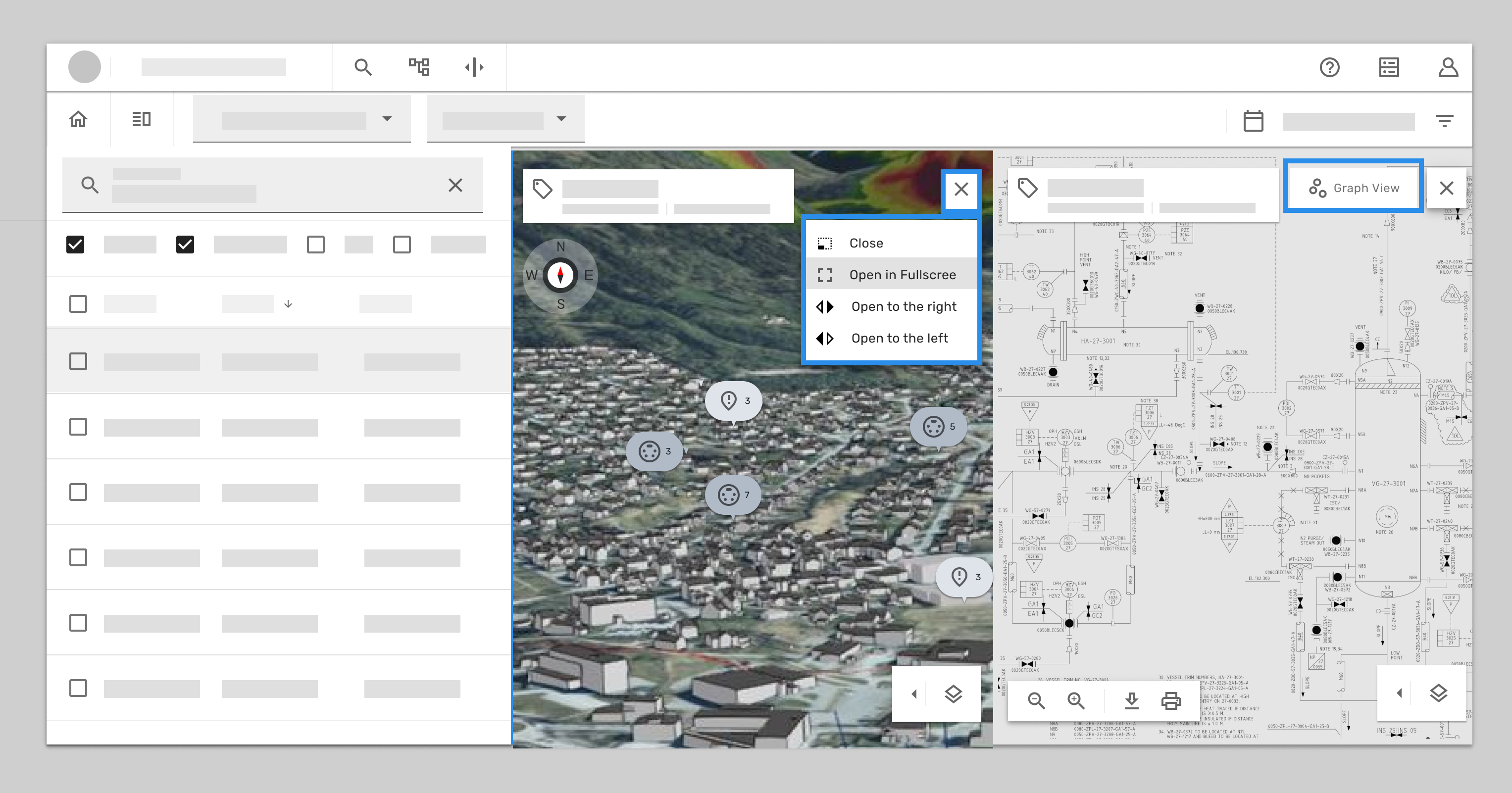
In this case we can bring the 3D back to full screen.
when the 3D is in place of full screen , both info graph view and document view got shrink to tabs.
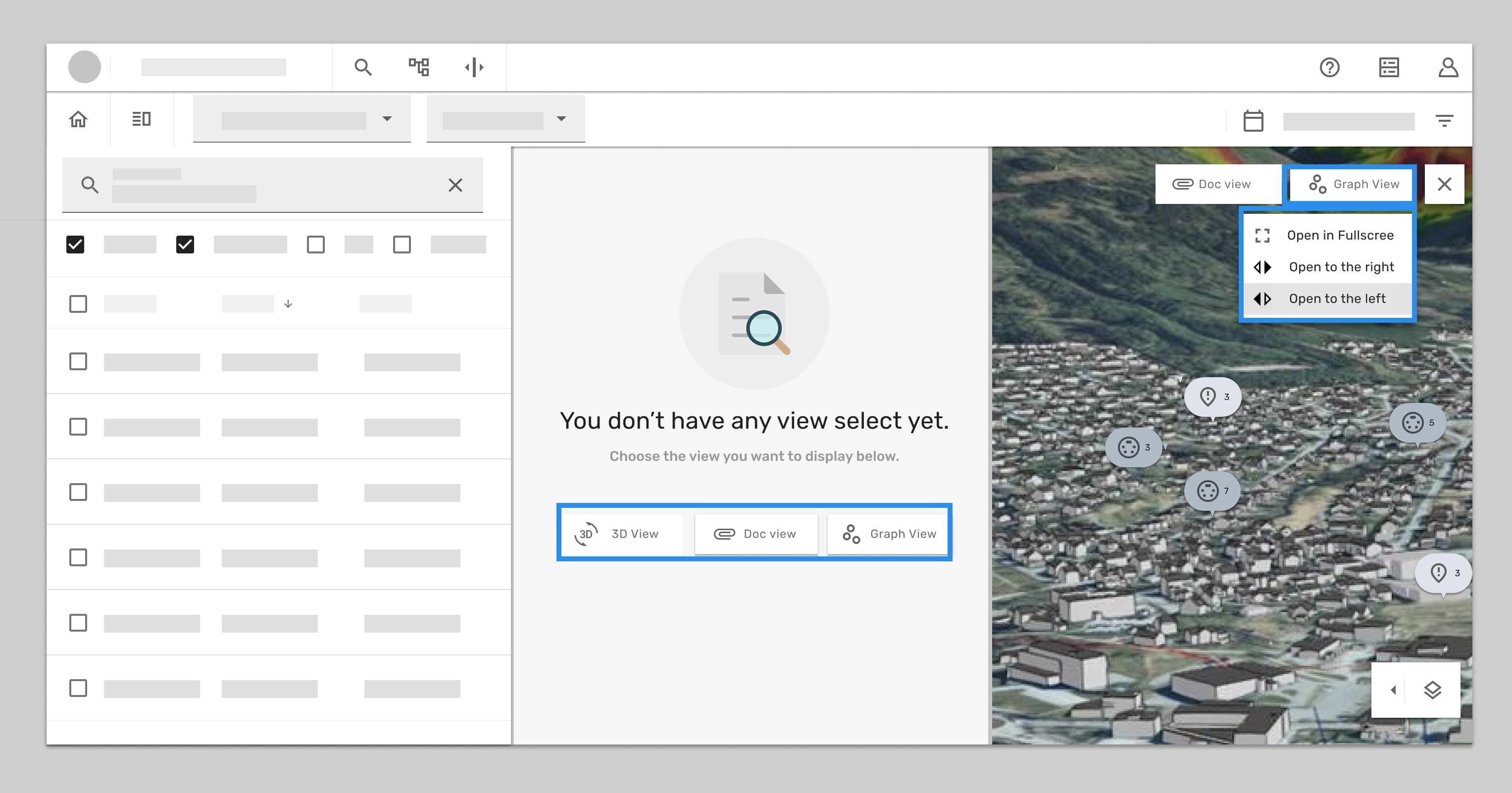
And when click the cross icon, in the option menu, you can assign the 3D back to right column.
Because the left column does not have any view assigned so it will shows empty state, which give you the short cut of all the available views.
Continuously problem solving
After full test run with developers, we found we need to rethink
How we categorise the tools, visualisations on the minimised all the icons and. tool panel to release the screen space while have multiple screen opened.
Here is the rough concept: (Not going to dig more in this case study)
Documentation
Split layouts allow us to better utilized the available viewport in our workflows by making it possible to toggle the visibility of the components inside of them. This gives more control to the end-user by allowing them to choose what information is most important for them to see in a given moment. It can split into horizontal or vertical depends on which is more suitable for the use case.

Summary of what I have learned from this project
I was trying to use design thinking approach to solve problem in this project, but I quick realized the collaboration between teams and find the middle ground with the minimum changes in the product is the end goal here. Because it doesn’t matter how pretty I can design in Figma if it doesn’t get into the product it won’t have any influence for the user. I had great opportunity found the gap in between developers calendar so the demo got made. And we decided to show the demo prototype in the sprint demo meeting with other developer from other deployments. That was a good kick to get other team interested and quick went to pull request.
I have also learned it’s good to have design vision but always keep reality check with the current situation, resource, expectations etc. somehow the task always boiled down to the basic components level or the pure user flow. Gathering information, data, and what we have and don’t was more important than the research in this case.
As my professor in university tells : K.I.S.S keep it stupid simple.
Especially in the complex product like oil and gas digital twin, the easiest way to let user understand the best it will be.
Even though I didn’t have chance to interview user this time, but I got good feedback from product owner and previous users, in this case the production team was moving so fast, having sprint every second week, I have to change my strategy to get the design into production line, so I based on the feedback I got from product manager and owner to adjust my design and made the quick decision for test. It was quick and dirty but made a lot of progress in one sprint.
In general this case gave me a boost to get to know other teams and how they work, I had great fun collaborating across the squad.
Thanks for your time!


