NHIT App Case Study
National Health insurance app
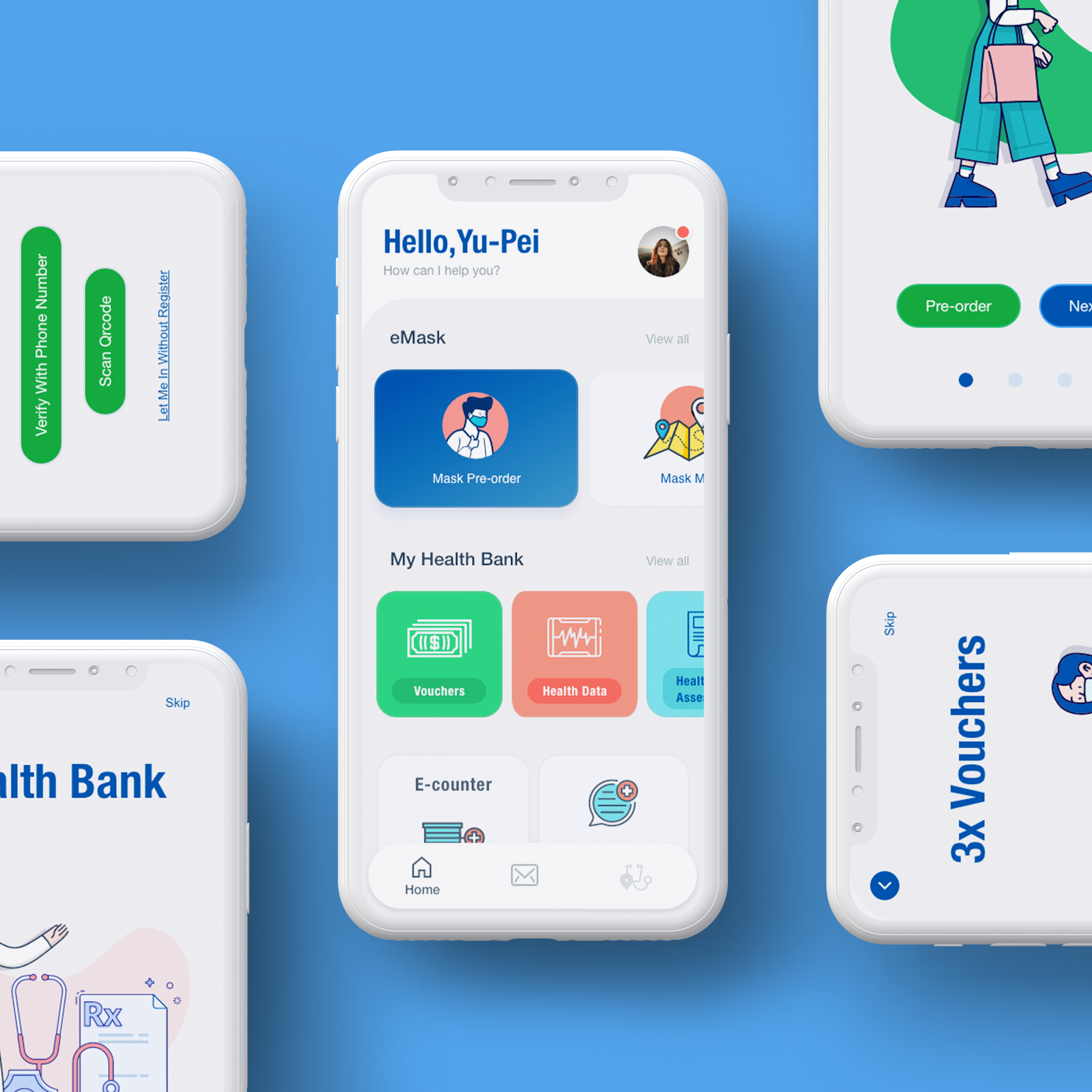
During Covid pandemic . We found a lot of users don’t want to wait in-line for hours to get the mask and it increases the risk of gathering people in-line. So the government built a feature inside the app to let people order the mask online and go get the mask in the closest pick-up point with an express line. We would like to understand what specific challenges users face in the ordering, payment, and pick-up process, and how we can help them fix those.
Project date :2021.March – April

Contents:
Quick view for each sections
Stakeholders:
- NHIT organizationNational Taiwan University of Science and Technology
- Department of Electrical Engineering (Product team)
Project duration
- February 2021 to May 2021
Deliverables
- Persona
- UX Research
- Competitive Audit
- Prototype
- Usability study
Project Info
The Goal
We’d like to know what specific difficulties users encounter when they try to place the emask order on NHIT app: from navigation to ordering, locate pick-up point, and pickup process.
My Role
My name is Yu-Ting,Chuang. I grew up in Nantou, Taiwan. Nantou City is in the middle of Taiwan surrounded by mountains, its beautiful and peaceful place to live.
I moved to Norway two and half years ago. During this COVID pandemic, I couldn’t travel back to Taiwan but I heard and saw a lot of good things Taiwanese government did to control COVID situation when it first appeared. When other countries are still under pandemic, Taiwan is back to normal, citizens have stable economies and live freely just like before. I’m glad the Government did something right and that makes me want to use my knowledge to contribute to the National Health insurance app, I think this app helped to lower the risk ,and give citizens the easy way to get the mask.
My role in this project as a UX designer was to take ownership of the app’s visual design and UX, from concept to delivery. My responsibilities included: user research, wireframing, prototyping, usability testing, iteration, and the creation of a final high-fidelity prototype.

The problem
The target customers of NHIT typically want to have a quick way to get the mask without waiting in-line for hours, they must wear a mask in public, but don’t like to go to the clinic and feel uncomfortable standing in-line.
Persona
Group 1 :
Working adults who care about family health but are busy during workdays have no time to wait in line to get a mask or book an appointment with a doctor.
These users:
- Tend to be more advanced in their careers and pay highly attention on family and their own health.
- Often work late hours and have limited time to get in line to wait to get the government supply mask.
- Have additional obligations, interests, or impairments that make it difficult for them to get health information or health service.
- Would use an app to place orders or book appointments while they are “on the go”.

Group 2 :
The university student who has a part-time job need to use public transportation to go to work.
These users:
-
- Tend to be new residents in areas that are unfamiliar with local clinic options.
- Rent share housing and stay in the common area very often to be socialized with roommates before covid.
- Often feel uncomfortable going to their local clinic.
- Would like an app to help them to see the clinic review, location and can have online chat before showing up at such a-counter to keep tracking the waiting number.
- Would like to have some of their personal history available such as Health bank, purchase history

In this case story, I choose group 2 as the main research target.
UX Research
We conducted interviews and online testing with target users, then we drilled it down to what we learned into actionable steps. We used the insights we discovered to identify pain points our users were experiencing. We entered our research with a set of assumptions, but those assumptions changed as we spoke to real people who deal with the topic we were researching.
The most important pain points we uncovered were:
- The eMask: users want to see the closest pick-up point before ordering.
- The app needs to have better visual and content hirechy.
- Some items link to external websites and don’t give users a consistent experience.
- The inconsistent visual style and User flow.
- The app visually feels old and outdated..
The information we uncovered helped us realize we needed to do more to make ordering easy and engaging for users.


Styel guide
Color Palette
Primary colors
004B9E
#f77e5e
#1C9A3A
Secondary colors
#CADDF0
#FACEC8
Background/ neutral colors
#E5E1E2
#F0F0F3
#A99D9C

illustrations


Competitive Audit Comparison Spreadsheet
Competitor Audit information
Research insights
Usability study
- Moderated usability study
- Location: Taiwan, remote (participants will go through the usability study on their app at home)
- Date: Sessions will take place between April 5-9.
- 5 Participants were asked to perform tasks in low-fidelity prototype to order masks online and pick up the mask at the pickup point that is nearby. Each participant will then complete a questionnaire on their experience privately on their phone.
- Each session was 5-10 minutes, based on a list of prompts
- Rate the order service at the end of the pickup screen(scan QRcode screen), we will track the rating.
- Reside in urban, suburban, and rural areas. With any gender, age 16+ (so they have a social ID or active health ID) who have a phone and installed the NHIT app.
- 1 user of student.
- 1 user of employee.
- 1 user lives with a family member.
Research insights
- Most users want to add the pick-up date into their calendar.
- All the users need better contents to explain what happened next.
- Most users need better contents to explain what is the purpose of the QRcode .
Note taking spreadsheet
Script from user search study spreadsheet
Research insights
1. Most users want to add the pick-up date into their calendar.

2. All the users need better contents to explain what happened next.

3. Most users need better contents to explain what is the purpose of the QRcode .


Accessibility considerations
For the NHIT app, the images on each page use Web AIM Color Contrast Checker To check the Colour Accessibility.
In the app color usage ,I find colors that provide maximum contrast, including enough contrast between content and the background, so that text and non-decorative images are legible for anyone with low vision or color deficiencies.
- Ratio: Text and interactive elements should have a color contrast ratio of at least 4.5:1.
- Color as indicator: Color should not be the only indicator for interactive elements. For example, underline links on hover, or mark a required field with an asterisk.
- Color blindness: Red/green color blindness is the most common, so avoid green on red or red on green. (Think especially about avoiding using red and green for “bad” and “good” indicators).

What I learned
In this app, I started with the existing app, which while I was doing the “Competitive Audit” research , it can find out what ideciate the difference from the NHIT app to other competitors. For the persona, I was lucky to have data collected from the app usages, so it’s defined to two main groups as active user groups. I created a persona based on these two groups, and have characteristic person matches that I can have interviews with.
There are many functions and user flows in the existing app that I can re-design, but I choose the eMask ordering function as a start point, and also revisit the Home screen to organize the visual hierarchy and align the style. When I started doing the crazy eight after the research competitive audit ,even though I already knew which flow I wanted to improve, it’s still far away from the high-fidelity prototype I made. I learned in the process constantly iterating the idea, doing more research and redefining, testing and then doing it again.
The most challenging part in the process was “I don’t know if this is the right iteration before you tested with a real user”, under the time consuming, usually it can get frustrating after building a low-fi prototype then finding out that is not the correct approach or leads to other issues in the user testing. When those happen then the team will quickly ditch it and circle back to the defined goal and problem statement. It didn’t happen in this project, but I had experience from other projects.
Thanks for your time!