
Designing SaaS for Industrial Data Visualization How discovery shaped the solution
Project type: SaaS UX for large-scale data deployment
Team: Core UX and Engineering Team
My role: UX Lead — Discovery, User Research, OOUX, Wireframing
Timeline: 2025 (Ongoing)
Goal: Enable deployment of complex models within days instead of weeks.
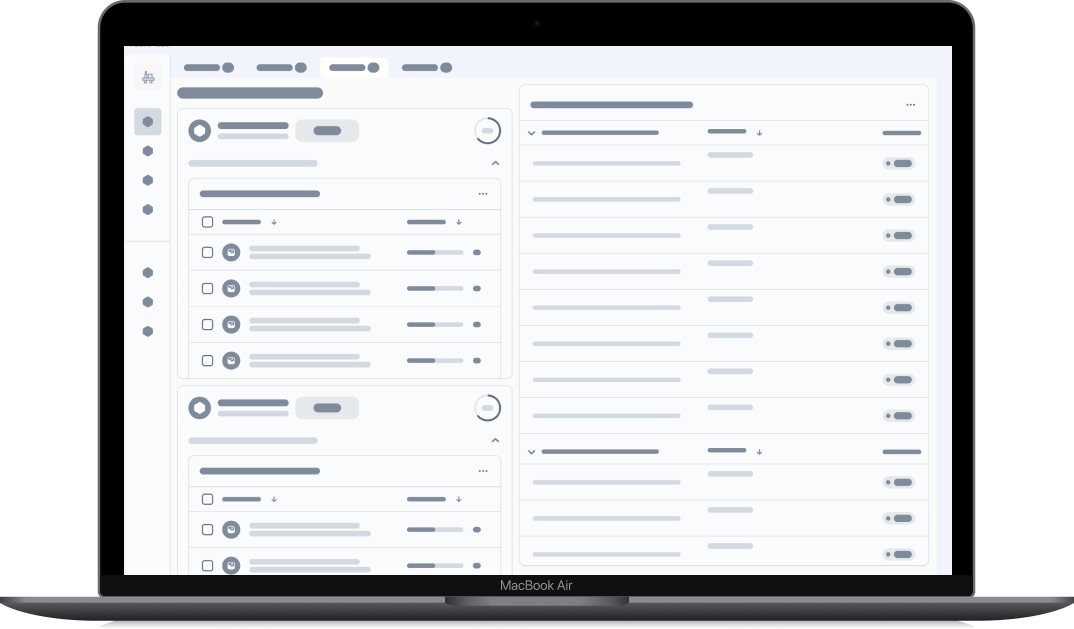

Background
The initiative began with a clear mission to shorten the time it takes to deploy large technical data models from weeks to just a few days.
The existing import process could handle complex 3D information, but it lacked automation, clarity, and integration across the wider platform ecosystem. Much of the workflow relied on manual setup and deep technical expertise.
Our task was to uncover what created friction and design a guided, unified import experience for 3D, 2D, and laser-scan data. This wasn’t just about usability; it was about transforming a technical workflow into an accessible SaaS experience that connects engineering data to deployment at scale.
Confidentiality Notice
This case study has been anonymised to comply with confidentiality obligations under the Personal Declaration of Secrecy. All product, team, and system names have been replaced or generalised. Visuals are password-protected and intended only for private portfolio review.
Discovery — Framing the problem
To deeply understand the import process, I led a focused discovery sprint combining interviews, mental-model mapping, and Object-Oriented UX (OOUX).
I interviewed deployment specialists and domain experts to map how they currently manage imports, which tools they rely on, and where friction occurs.
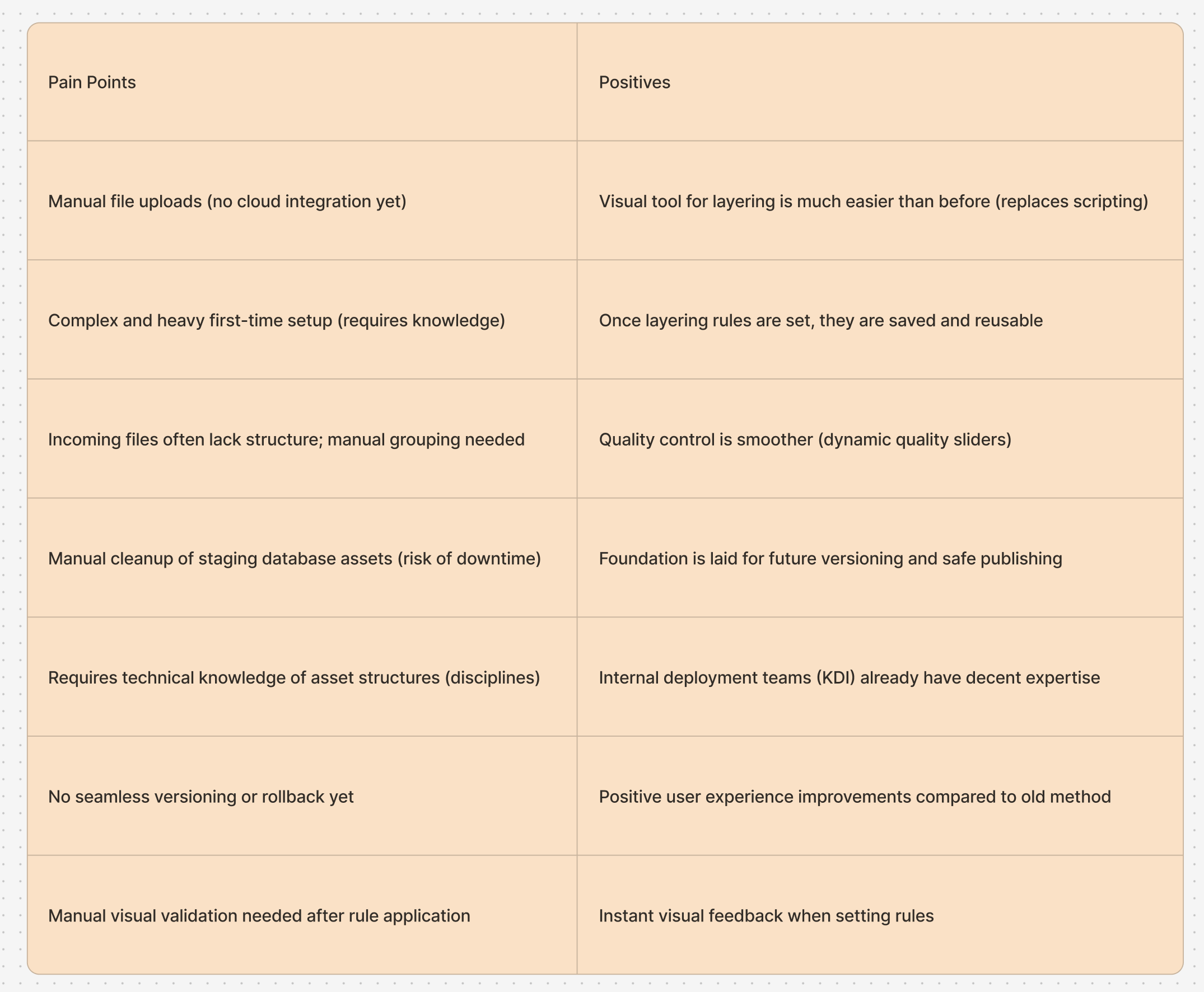
The findings were visualised on a discovery canvas that helped align the team around real user pain points instead of assumptions.
Key challenges identified
-
File uploads were manual and inconsistent, requiring technical support.
-
Layering and rule setup demanded scripting knowledge.
-
No version control existed — re-uploads could overwrite previous data.
-
Quality checks were visual and manual, often using multiple tools.
-
Cleanup and staging were risky and time-consuming.
These insights became the foundation for defining both the current reality and the future desired experience.
User Personas
Phase 1 — Internal Deployment Teams (current users)
Who they are:
Engineers and specialists responsible for bringing large data assets online. They work with multiple data sources (3D models, 2D drawings, and laser scans) and manage validation and contextualisation before deployment.
Goals:
-
Reduce manual setup and data cleanup
-
Validate file accuracy and structure with minimal technical overhead
-
Maintain confidence that each import stage is correct and traceable
Pain points:
-
Fragmented workflows requiring deep system knowledge
-
Manual uploads, file cleanup, and quality checks that slow progress
-
Lack of version control or visual confirmation during imports
How the redesign helps:
A unified import interface gives internal users a guided, visual process for handling all data types in one place. It replaces repetitive manual tasks with clear steps, visual validation, and automatic version handling — reducing friction and cognitive load during deployment.
Phase 2 — External Enterprise Users (future rollout)
Who they are:
Enterprise clients and domain experts who manage data models across operations, maintenance, and engineering projects. They depend on accurate models to support decision-making and collaboration within their own organisations.
Goals:
-
Import and update data independently, without developer support
-
Visualise model health, version history, and contextual links
-
Quickly identify what’s ready for production and what needs action
Pain points:
-
Current tools are too technical or disconnected from workflows
-
Difficulty understanding data readiness or setup errors
-
Limited visibility into data lineage or dependencies
How the redesign helps:
The next phase extends the unified import interface to external users as a self-service tool. It provides transparent progress tracking, actionable feedback, and a simplified deployment view — empowering clients to manage updates confidently and safely.
Insights from User Research
Through interviews and mapping, three recurring themes surfaced across all workflows:
1. Manual dependency
Every step — from file upload to cleanup — depended on manual handling or external support.
“Today we get the files manually, drop them into the portal, and import. It’s never consistent.”
2. Knowledge-heavy setup
Layering and quality checks were done by experts using scripts and rules. Even with visual tools replacing scripts, the setup still required deep knowledge.
3. Disconnected feedback loop
Users couldn’t confirm success or failure until late in the process, making iteration slow and error-prone. These insights reframed our design direction — the goal wasn’t to add features, but to make complexity feel simple, visible, and recoverable.
Design Strategy — A Unified Import Interface
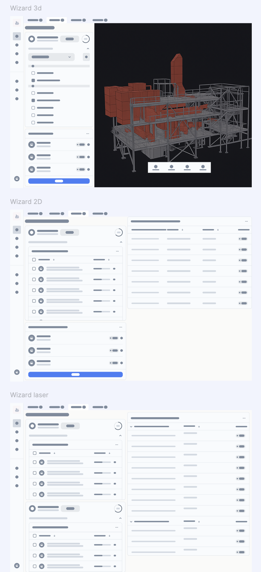
The redesigned interface was built to unify three workflows — 3D, 2D, and laser-scan imports — under one adaptable structure reflecting how users actually work.
The layout focuses on task-first interaction rather than data type:
-
A persistent sidebar provides global navigation and orientation across import tools.
-
The main task panel adapts to each step — from file upload to version control — allowing users to focus on one clear action at a time.
-
A contextual display area dynamically shows the relevant preview: a 3D model, 2D schematic, or point-cloud visual.
This structure ensures every workflow feels familiar yet context-aware. Instead of switching tools, users remain in one workspace while the UI adjusts to the data and task. The goal is to make complex imports feel intuitive and visually guided — bridging the gap between engineering precision and design clarity.
Deep Dive — Three workflows, one experience
1. Clear current entry point.
Before – Hidden entry point for tool.No clear way of start import asset.
Action: Find right country name and right click to trigger tool.
After – Start collecting and creating asset under scope.
First time user: click asset name under country-> open the wizard tool
1. Dashboard Landing — One entry for all imports
The Import Dashboard acts as the command center for deployment teams.
From here, users can:
-
View the status of all import types
-
Identify what’s completed, in progress, or pending
-
Launch the appropriate import flow directly
The design was informed by research with deployment users who needed to quickly answer:
“What’s ready? What’s missing? Can we deploy yet?”
Each import category includes a checklist and progress indicator, leading users to contextual actions like Run Process, Upload, or Review Requirements.
This high-level overview simplifies planning and gives users clear control across multiple scopes or projects.
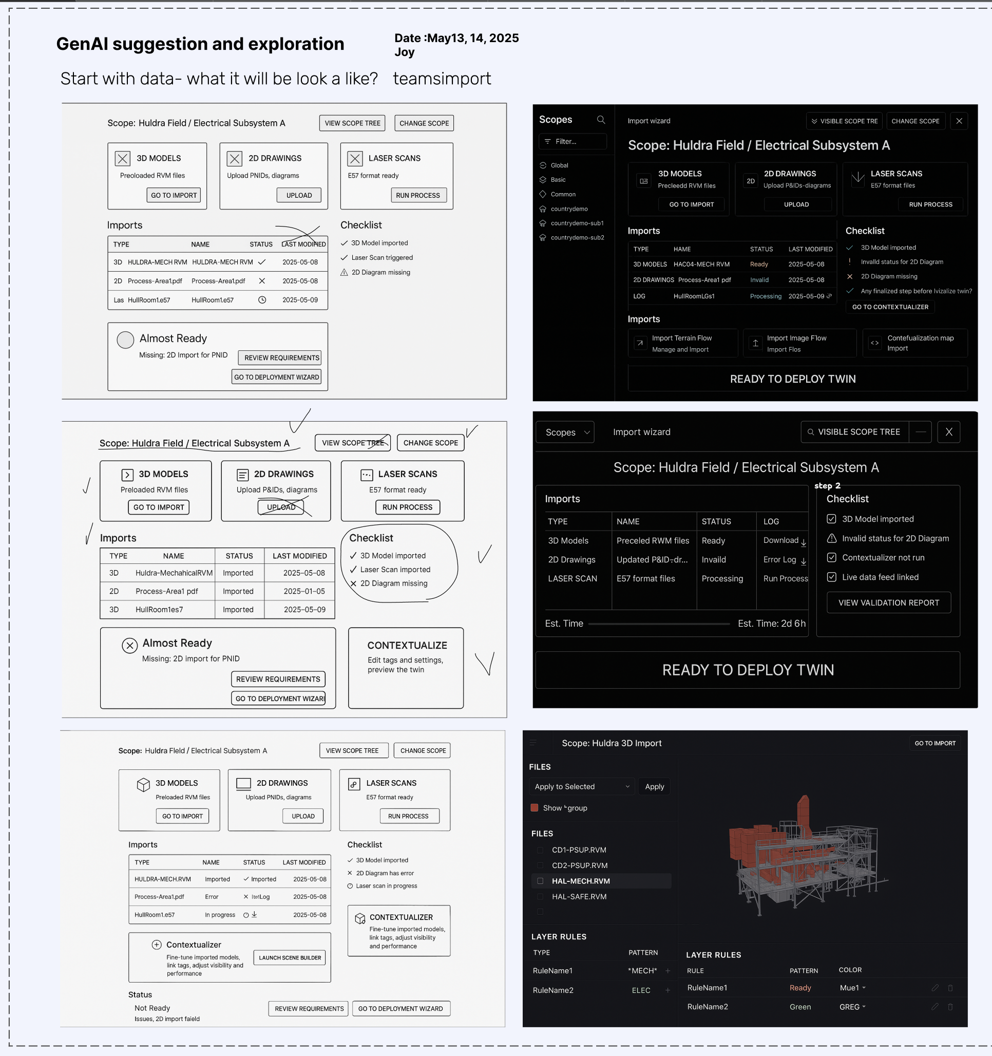
Lo-fi
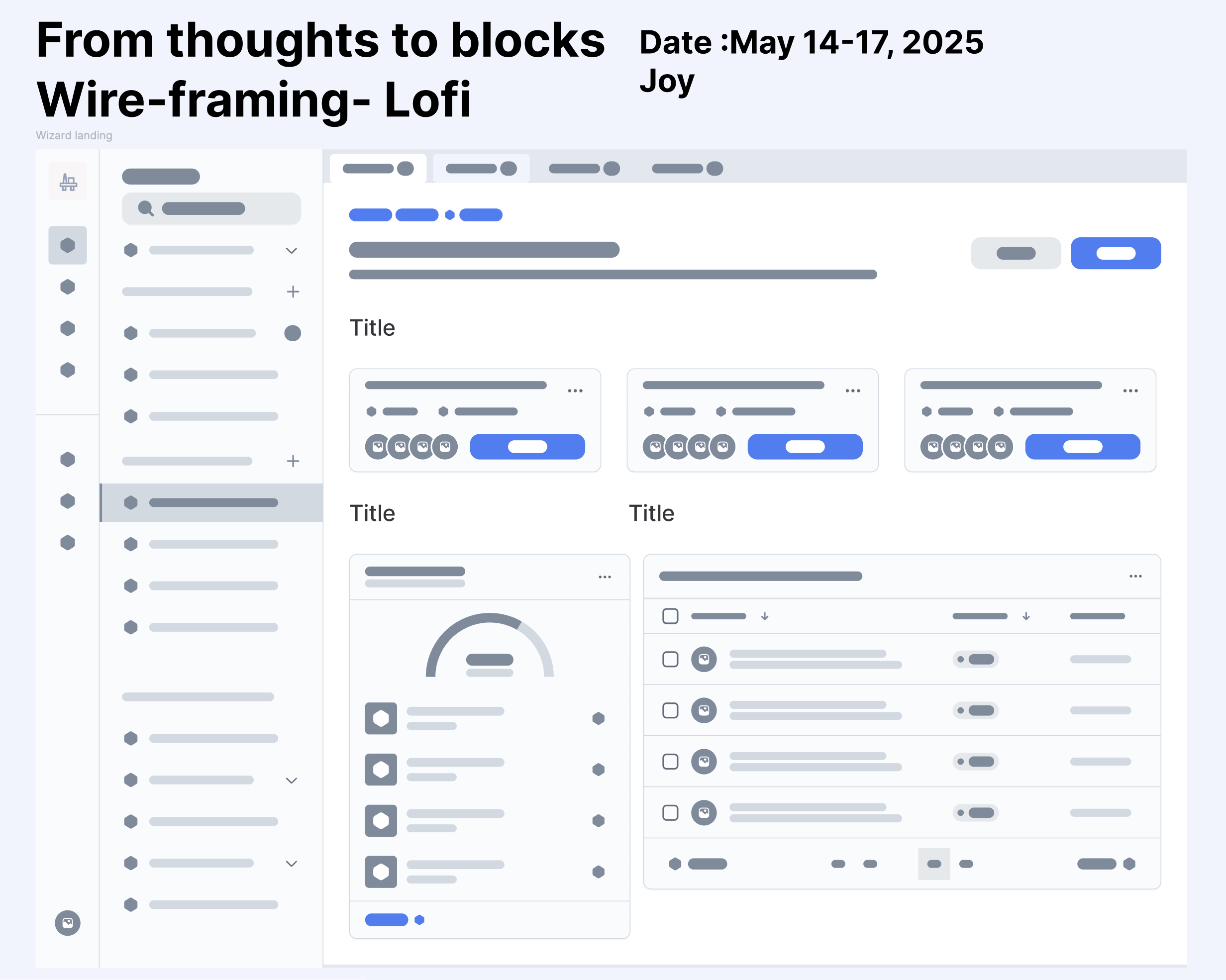
Hi-Fi
2. 3D Import — Turning Complexity into Clarity
3D imports are the most data-heavy workflow, involving layering, validation, and version control.
Previously, the process relied on multiple tools and manual scripts.
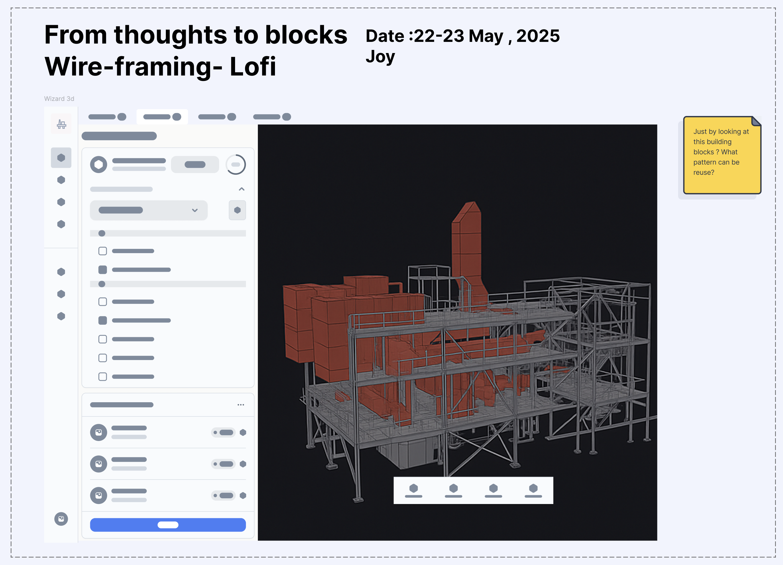
The new 3D import view integrates everything in one space — a task-based panel for actions and a visual feedback area for instant validation. Users can drag and drop files, verify geometry visually, and track progress without leaving the workspace.
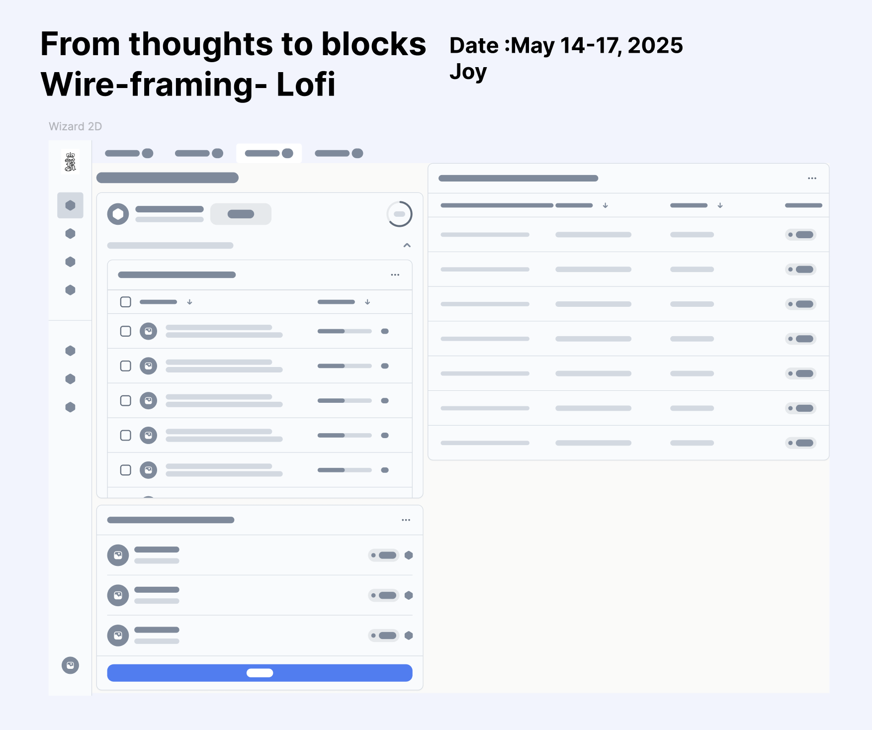
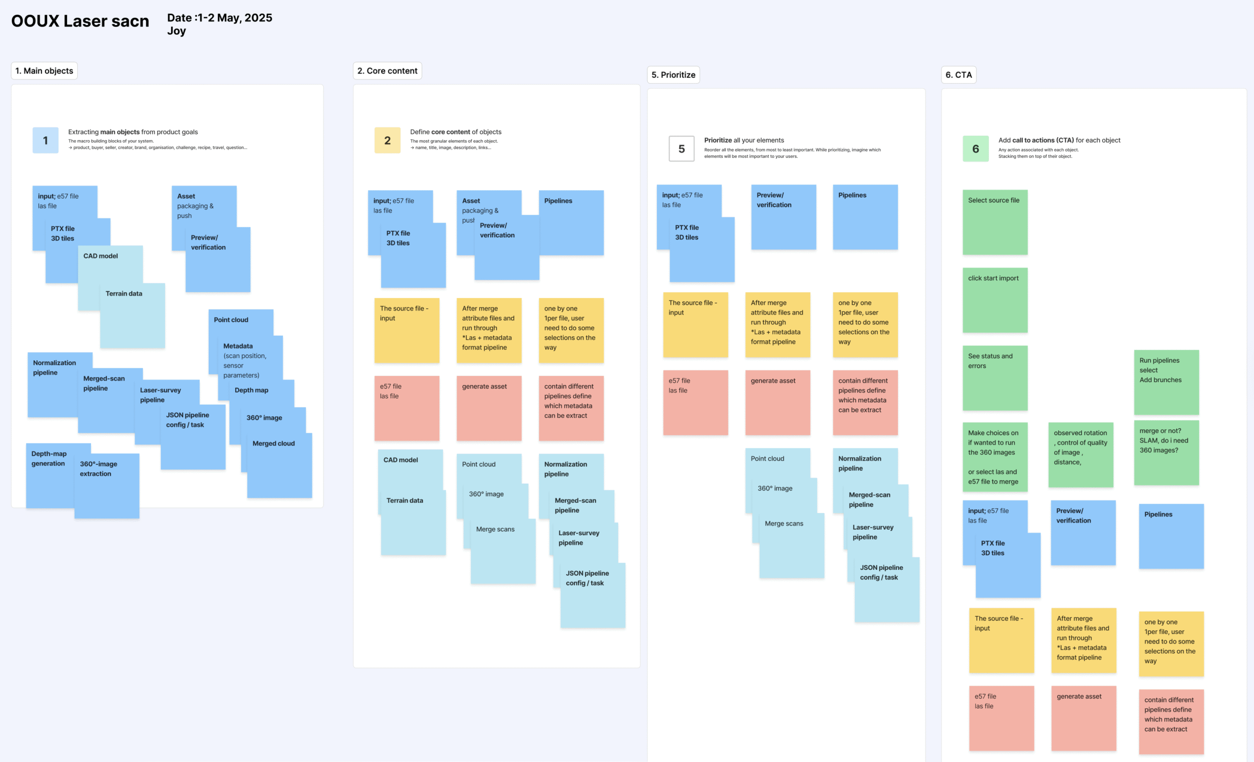
I used OOUX mapping to clarify the objects, relationships, and actions at play, and experimented with generative-AI-assisted sketches to explore layout variations quickly. These explorations helped stakeholders align on information hierarchy and terminology early in the process.
I used OOUX mapping to clarify the objects, relationships, and actions at play, and experimented with generative-AI-assisted sketches to explore layout variations quickly. These explorations helped stakeholders align on information hierarchy and terminology early in the process.
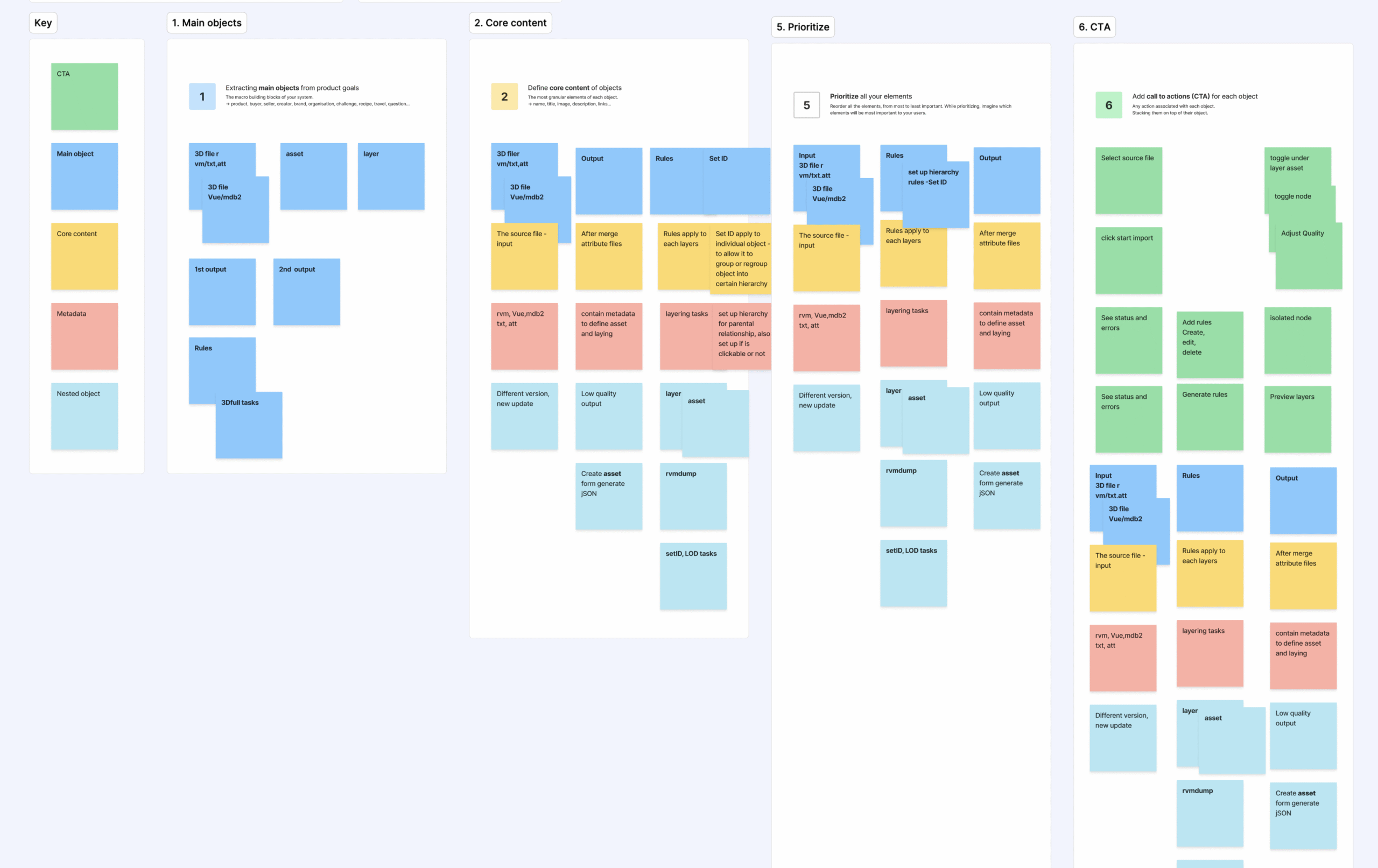
Experiment with Gen AI
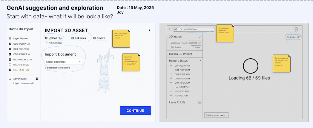
During early ideation, I experimented with Generative AI tools to visualize potential dashboard states and task hierarchies.
Instead of starting from static wireframes, AI-assisted sketches helped me rapidly compare interface options — testing variations in information hierarchy, visual density, and labeling language.
This accelerated exploration made it easier to align stakeholders around the design direction before committing to detailed wireframes.
Note:
– Does the stepper helps in this screen?
– Should the selected document should be always here?
– How does user navigate in between tools?
– Do we need show the loading if use table list component ?
3. 2D Import — Linking Documents to the Twin
For 2D drawings and schematics, the focus was on connection rather than complexity.
The redesigned interface allows users to upload, preview, and map drawings directly to 3D assets or hierarchical structures. By integrating contextual metadata, it bridges documents and geometry, creating a traceable, verifiable workflow.
4. Laser Scan Import — managing data intensity
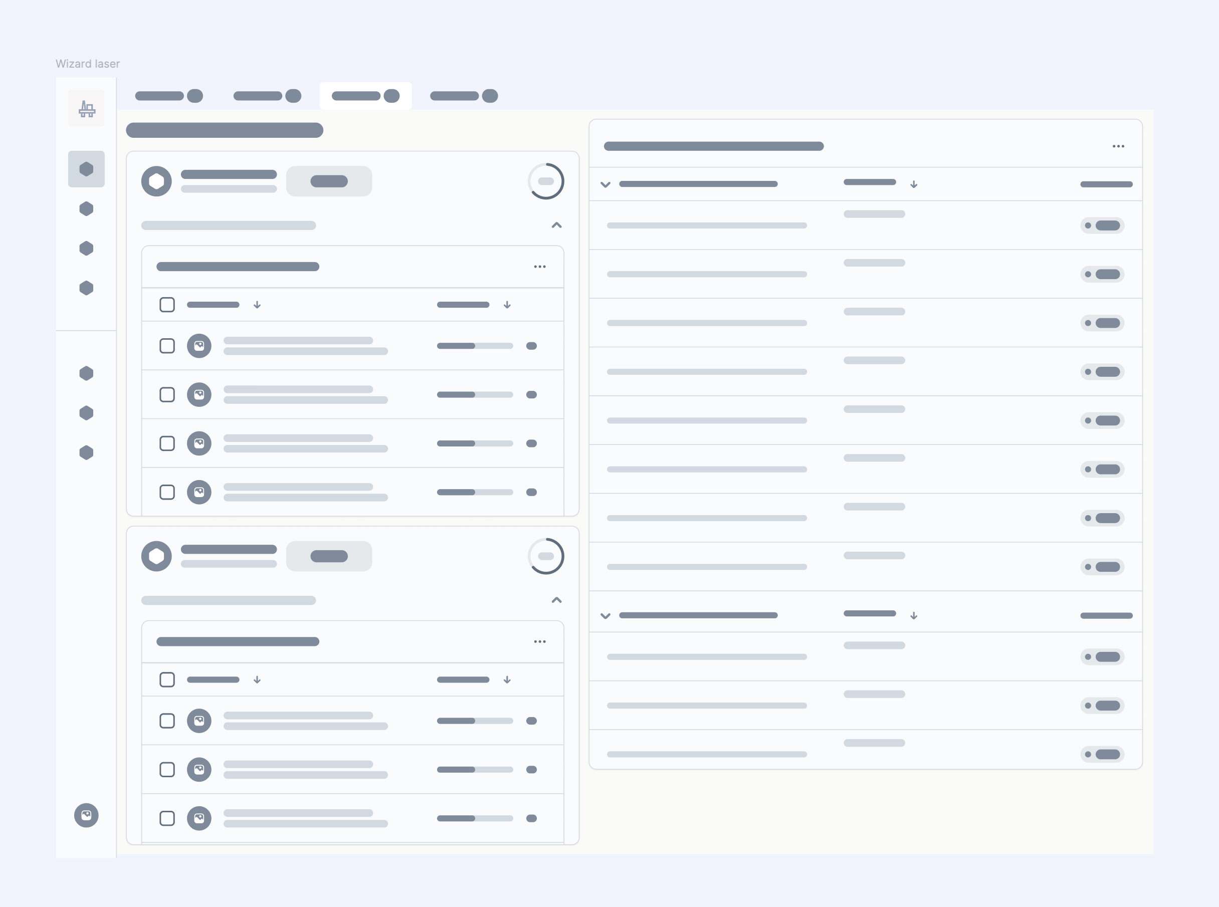
Laser scans presented challenges in performance and usability due to their large file sizes.
The new workflow introduces staged uploading and lightweight previews, giving users confidence before committing data to storage.
Real-time validation indicators reduce the need for external tools and shorten iteration cycles.
Building Blocks – Lo-Fi
Outcome
The discovery-driven design produced several measurable improvements:
-
Consistency: A shared UX pattern across all import types.
-
Clarity: Step indicators and contextual previews help users understand where they are in the process.
-
Efficiency: Reduced manual dependency and faster handover between deployment and customer success teams.
-
Scalability: A modular system that can extend to new asset types or automation layers.
The project demonstrates how aligning workflow structure and user expectations early creates a foundation that scales with both technical complexity and organisational growth.
Reflection
Even in early stages, the unified import experience has proven transformative for internal teams , improving visibility, reducing manual effort, and strengthening collaboration across disciplines.
This project reminded me that meaningful UX impact often begins long before release. By aligning structure, language, and mental models early, we set the foundation for a system that grows with both technology and people.
The next phase will continue to refine usability through pilot testing and iterative feedback, ensuring the solution remains efficient and intuitive as it scales.

From problems to priorities: Using the Opportunity Solution Tree to align core teams

Designing Scalable UX Architecture for Visualization Systems
Product discovery: what-if scenarios for smarter decisions in digital twin
Designing for millions: Product Research on Taiwan’s NHI (National Health Insurance)App
(47) 41 33 16 51
Reach Me By Phone
Email Me
Rølivegen 367, Steinkjer, 7718, Trøndelag
📍 Based in Norway